
Thank you for all your outstanding entries!
We received over 1,964 illustration and comic entries from 1,481 participating schools in 89 countries and regions around the world.
View all entries

Comments from Judging Panel & Winners

Watch the video for words from the judges on the contest, as well as specific critiques on the winners of the Grand Prize and individual category prizes.
Justine Cunha Graphic novelist, character designer, and artistic director

ArtStation / Instagram / linkedin

Hello everyone, congratulations to the candidates around the world for your participation. I'm always impressed to see the level of students, the bar is always raising, almost reaching a professional level for many, so, you have my applause. Don't forget however that beyond your drawing skills, or the story you want to tell, what will be crucial for you is to work on the setting. It is thanks to the setting that you will be able to transmit not only narrative comprehension but also the intentions and emotions you want to convey. Because yes, it is necessary to put a piece of your soul in your work to become an accomplished author, you will have to talk about your emotions and your own human experience, do not hesitate to reveal yourself, the reader can tell when an author is doing so, and it's much more important to try to achieve that rather than trying to make the perfect drawing. From what I have read, I have no doubts that in the years to come, I will find your works on this bookshelf I can't wait to buy your books. Keep up your efforts, and never give up.
Taichi Toya

Shueisha 3rd Editorial Department Dash X Bunko/Webtoon Editorial Department
https://www.shueisha.co.jp/

Looking at all your entries this year that were filled with creativity was extremely fun to judge and it was also a learning experience for me. I got to see a lot of different methods of expression that I don't normally see it was especially great for me as someone who is surrounded by manga and webtoons in my work. At our JumpTOON webtoon editorial department we work to create vertical-scrolling manga. I hope that through this, we can work together to create the future of JumpTOONs. Thank you for this experience. I look forward to everyone's future creations.
Takashi Hijikata

Kadokawa 4th Comic Editorial Department Manager & Webtoon Department Content Producer

https://group.kadokawa.co.jp/

Hello! I had a lot of fun judging because I got to come into contact with so much talent. The theme and page number pushed you to think of ways to tackle the challenge and it was eye-opening. There were some people who could debut right away and there were a lot that still needed to work on how to draw what you wanted to say. If you want to continue try for this field of work, I urge you to not stop drawing. You will never improve if you stop. If you draw you can improve in different areas and continue to grow. I want you to especially focus on perfecting your ability to draw expressions. Your readers can't hear your characters so you need them to speak through their expressions. I look forward to your future endeavors. Thank you for including me in this year's judge panel.
Takuya Kashima

Editor-in-Chief, BookLive Content Div. 2nd Comic Editorial Dept.

https://booklive.jp/
https://www.manga-nino.com/

Good work on all your entries! This contest brings in entries from all over and every year the skill level keeps going up. The award-winning works were stand-out and very interesting. The internet has brought us closer together but many elements come into play in your creations: country, culture, religion, it felt like I was experiencing how big the world is while judging. To everyone who did not place, showing your work is the first step to becoming a pro, and you have taken that step by participating. It is hard to express yourself, but please keep working on that ability.
Haruna Ikeda

pixiv Manga Editorial Department

https://www.pixiv.net/

The creative environment is changing but the entries were unchanging in the amount of passion. Comics are a craft that demands more, you need rendering, storytelling, character design, and paneling skills. Working on it all alone might have felt impossible at times. No matter what you thought about your entry, just the act of entering is a truth that is the most valuable thing. I hope that you continue to draw comics with confidence.
Kim Bedenne

Ki-oon Tokyo Office Representative

Official website:http://www.ki-oon.com/
Twitter: https://twitter.com/kim_ki_oon

Hello and thank you for all your applications. I found that there were entries of an almost professional level this year. In the comic and bande dessinée categories especially: "Inside The Shadow," "The light of the sea," "Her Crown" all had the artwork and the colors truly well done. However, there is still an aspect that I think needs a little more work to make the readers immediately connect with the main characters. It is something that, whatever the work, to me it seems to be the most important. It is about creating an interesting character whether they are good or bad with a strong personal motivation. Once that is accomplished, emotions will flow much more easily. In any case, thank you very much for all your hard work.
Koji Yano

VP Creative Business Japan and Marketing JPAP Wacom Co. Ltd.

https://www.wacom.com/

When I looked at all the entries, I felt the passion from all of the students around the world, and I got to see how everyone freely interpreted "Light and Darkness" in their work. I hope that you will use the critiques and other entries to create even greater works. The comic and manga market is growing so I think that your work will spread past your country's border. We at Wacom will continue to support you by making a work environment where you can become immersed in the art of creation to freely express yourself.

Comic / Manga / Bande Dessinée / Webtoon Categories

Grand Prize1 Winner

US$3,300 cash prize / Wacom Cintiq 16 (DTH167) / Three years of Clip Studio Paint EX for a single device

View full screen

Comment from the Winner:

Hi! First of all, I’m so happy and honored to be chosen as the Grand winner of this year’s competition! When I saw the theme of Light and Darkness, the first thing that came to my mind was that light and shadow exist because of each other, and so do evil and goodness. Because of this, I created a brave hero and a kind dragon to break the stereotype in my story. Just like there are two sides to every coin, a creature that sounds evil can also be kind in some way. Also, to depict the theme of light and darkness in the story, the time of the comic was set at dusk, and the story was told using colors and changes in light and dark. I am very happy that the judges appreciated my work. There are still areas where I can improve, and I will continue my efforts to do so! Overall, I want to thank my teachers, family, and friends who supported me during the contest and thank you to the judges and to Clip Studio Paint. Thank you so much!

Critiques from the pros

This entry received detailed critique from Ki-oon.

See critique
I just love both the illustrations and the story. It has some Stephane Fert vibes, I recommend you read the graphic novel Morgane which will be a good reference for you! The use of your brushes, lighting and colors is soft and magical. Your storyboard is simple but very efficient. I feel like your cover doesn't do justice to your pages, even though it is coherent with your title. I wish to have seen the same kind of lighting that you have in your pages with maybe a stronger composition of your hero in front of the gate with a low angle shot for example. Great work.

Justine Cunha

First off, the art is amazing! You make good use of colors to set the scenes. Each page creates the opportunity to change up the tone and makes this a pleasant reading experience.

SHUEISHA

Everything combined, including the color use gives this story a great vibe. The story is solid enough but didn't quite bring me in emotionally. The main reason is that the internal pressure build-up that unleashes at the end, fell flat. The main character didn't seem to be channeling the feelings of doubt towards the baron, doubt towards the entire manor, and the worry for the missing children into rage towards the dragon. The limited pages might have been the problem but there were not enough plot beats in the end.

KADOKAWA

This is, without a doubt, the best work in the final selection. The drawing is magnificent, and the story contains a real plot twist that keeps the reader's interest right to the end. It's a pity that the main character isn't more developed, for example, by explaining why he personally hates dragons or by giving him one or two humanizing characteristics.

Ki-oon

The worldview was well illustrated and the storybook-like style was very charming. I wanted to also read the story from the point of view of the baron.

Wacom

The drawing style is very good, and the color scheme really suits it. I think the narrative could be a bit more dynamic, but the story flows well.

Planeta Cómic

This comic was very nice to look at with its oil painted feel, cohesive use of colors, and contrast that made the scenes easy to visually decipher. However it was easy to tell how this story would end from very early on, so you need to think more about when and where to give information to the readers.

RED SEVEN

I liked how the theme was easy to understand, and the beginning/middle/resolution was clear and matched the fantasy setting. The paneling and composition gave life to the characters and made them easy to understand. The reveal was too obvious from the beginning, which was a bit of a letdown. This was a short story, but if you could lengthen it and restrict the reader's information a bit more, you could give the reader more red herrings. I thought you could have given more info on the family life of the kids and the baron's alibi.

SORAJIMA Inc.

What is evil and what is good? This story made you think about the good and bad of humanity. The hero was led by his belief that he needs to help people. But what if by helping one person you are inflicting harm onto another? How should you act then? This was a good way to pose this question to the reader. I think that if you put more emphasis on the scale of the dragon when he was talking to it, it could have packed a bigger punch visually. I look forward to your future works!

Mangatari

Comic Category Prize1 winner

US$1,700 cash prize / Wacom One / Three-year, single-device code for Clip Studio Paint EX

Comment from the Winner:

I am sincerely grateful to the judges for choosing my comic as the Comic Category award winner. I’ve been super passionate about comics since I was little, so I am very happy. But I had never published a comic of my own before, so I was also very nervous. For this year’s topic, I wanted to explore the relationship between light and darkness. I wanted to write about how not only they are opposites, but also how they coexist. In my comic, I tried to do this by representing light and darkness through life and death. I had no prior story writing experience, so I had to put a lot of effort into this comic. I struggled a lot and I made a lot of mistakes. But in the end, I think it was a very fulfilling experience. I can’t say I’ve achieved perfection, and I know I still have a lot to learn. But this contest has given me an immense amount of confidence and courage. This was my first comic but it won’t be my last. I will keep trying hard to improve my skills so that one day, I too can achieve my dream of finding my own place in the art world.

Critiques from the pros

This entry received detailed critique from SHUEISHA.

See critique
I am impressed by your paneling and how each one is colored in an interesting way. The art style is also catchy and tells a deep story that shook me. I think it is a great piece.

SHUEISHA

The opening illustration is really nice! I felt drawn to this. If you drew the characters in the main pages the same way it would have felt even more polished, but it also might have felt more rigid. The story featured an immortal and a mortal and their meeting and farewell, which is not a new concept but it was drawn well and had me reading right until the end. Something I was personally curious about was if the butterfly lullaby was a famous song or if it was an original creation.

KADOKAWA

The contrasting character composition on the cover was eye-catching, and the theme was consistent and well-presented in a solid composition with detailed artwork. This story had a good balance of story and action and it was easy to tell what you wanted to convey to the reader. I have two points if I had to give advice for improvement. First, there were some parts with a lot of panels per page and a lot of dialogue, which reduced readability. Second, the theme was clear on mortality and immortality and while the fear of the character whose touch brings death was carefully written, the actual mortal character's life was rushed. Maybe this could be resolved by more pages or in how you show it. If you enhanced that part it would speak more to the reader.

BookLive

The theme light and darkness was presented in this story and it was nice how it ended with the familiar symbol of Yin and Yang. The use of color made it very easy to read and the story was carefully laid out for us. The way you expressed how time sped up and made an abridged version of an events was excellent.

Wacom

This story conveyed how immortality can lead to suffering and the grandness of life. The work was polished and panels where the reader was supposed to linger were well established. I liked the visualization of time passing by expressed by the sky changing colors while the immortal remains unchanged and the mortal daughter grows older. The expression of life as light and death as darkness was also striking. However there were parts where the image and line were not matching well and the beginning had a lot of panels that seemed squeezed in.

RED SEVEN

The paneling was amazing. The art was lovely and the large panels were thought out in a way that showed well what you wanted the reader to focus on. I saw that you also laid down paneling on a single illustration, which worked really well. The fact that the main character could cause death by a touch, and the fact that they were immortal lent itself well into the story line of how one views life and death.

SORAJIMA Inc.

I was just happy to read this wonderful story that was so carefully thought out. The girl's growth, the kiss concept, and how when the girl gave birth was reminiscent of when she was a baby, the beats that were presented to us and then recalled again were great in this story. The end felt a bit disconnected, so if you had created more moments throughout the story that would connect to it, then it would have been good. The way that you created the story was masterful, so I'm looking forward to your future work!

Mangatari

Comic Category Runners-up3 winners

Three-year, single-device code for Clip Studio Paint EX

Critiques from the pros

This entry received detailed critique from Mangatari.

See critique
You could say that this is a polished world and art style. I think that you will become better at drawing and will be able to draw on more of this innate style you have. The coloring and style also match well. I want to see a story that more people in our current time period could resonate with.

KADOKAWA

In just 17 pages, you brought not just the main character but also the townsperson to life in a way that brought a smile to my face. There was also some skillful use of paneling and colors for the background that gave an individualistic flair. There are two points that can be improved upon. First, the characters: the design of the characters is very similar, so think about the ways in which you can show the readers their different traits. Second, the pacing: if you want to go all in as a gag comic, then make the punchline scene of the story more apparent. However, this work showed enough individualistic charm that these points didn't hold it down.

BookLive

The drawings have a lot of personality, and the pastel colors are in line with recent trends. Furthermore, the story is interesting, and the narrative is well structured.

Planeta Cómic

The story's beats and pacing made for a very interesting read! This story is not what you think it is at first and it was also interesting story-wise how the part-timer also had another side to her. The characters could fall in love more or they could fall into more sadness. If you gave it more of this contrast then I think the readers would be even more into it!

Mangatari

I appreciated the expressiveness of the characters and the fine color work. The switch to black and white for the bullying scenes is effective in showing the pain felt by the heroine. The layout could be improved, with fewer boxes per page and better placement to guide the reader's eyes. But overall, this is a touching work that highlights local culture without losing sight of the universality of the subject.

Ki-oon

This year's contest favorite. Perhaps this year's best story. It's original, very well told, all the characters are well embodied, and play well. The narrative works well. Good mix of a local setting with its colorful atmospheres and folklore and very contemporary and universal themes (self-acceptance and acceptance of others, friendship, disability). A lot of interesting risk-taking in the cutting, and sometimes a little too busy. The use of sometimes highly saturated colors calls for restful spaces for the eyes, more white, more margin perhaps. We also need to raise the level of drawing on the sets (undecorated, poorly constructed interior rooms), as the weakness of the drawing is strongly felt. All in all, very promising.

BookLive

I liked how the character expressions were so lively. The panel layouts were also arranged in an easy-to-read way. This story touched on a difficult subject for many people and also the bullying that ensues from it. Even though it was a dark theme, you handled it with bright pop-style art, so it overall was an enjoyable read. I think that you could have emphasized the panel where the bull figure gets repaired or try something different to make the ending stand-out more.

RED SEVEN

This was a striking story. It was especially tragic when the bull ceramic was smashed and the panels turned to black and white. There was a part in the middle that was showing a summary of events with a bunch of textless panels. This was not bad by itself but overall the comic had a feeling of too many small panels and too much information. You should try to slow down and edit as much as possible to give more time to the reader to get emotionally invested in the story.

SORAJIMA Inc.

Critiques from the pros

This entry received detailed critique from EVER GLORY PUBLISHING CO.,LTD.

See critique
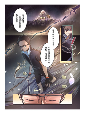
To choose dentistry for your story and show it this way was brilliant. You led the reader to important points and drew them in a striking way. The action was good and the character expression was well drawn, so even though there wasn't enough dialogue, all this made up for it in the end. My one piece of advice for this is to focus on story composition. The feelings of the characters and the action are well drawn, but I needed to feel the theme through the story more.

BookLive

It was fun how such a familiar subject could be turned into a full-fledged fantasy. The quality of the drawings in each panel was amazing and it looked like a professional work that might come out of a studio.

Wacom

This story revolved around the difference between actual light and darkness, and I was awed by when we returned to our world at the end. You brought to life how children have fear and hope in their hearts, and the action in the middle was entertaining. However, when you have so many characters the plot points lose impact, so I would recommend keeping up the tension in the panels leading up to the ending to keep the readers deeply invested in the story.

MangaPlaza / Solmare Publishing (NTT Solmare Corp.)

Very good overall quality of the work (which should clearly be in the manga category). Both the manga and the story are very well mastered, with beautiful coloring. Original and amusing idea of the dentist metaphor. The story would benefit from being a little less talkative, perhaps with fewer monologues. The little action fight scene deserves to be visually clearer and more developed. This would bring better balance to the story.

DUPUIS

View all entries

Manga Category Prize1 winner

US$1,700 cash prize / Wacom One / Three-year, single-device code for Clip Studio Paint EX

Comment from the Winner:

First, I would like to thank the judges for choosing my work out of so many excellent entries. I am truly honored and very happy. I had been doing illustration-related work for a long time before learning about manga creation. After starting to study manga out of curiosity, I was unexpectedly fascinated and realized that drawing manga was really interesting. I like to draw things related to everyday life, so I drew along the theme of little happenings between lovers. The inexperience of a man and woman starting a relationship and testing each other is like exploring a vast dark cave. The word "Lucia" in the title is derived from the traditional Swedish festival, St. Lucia's Day. It is held on the longest and darkest night of the year, and I believe it's meant to welcome light after experiencing darkness.

Critiques from the pros

This entry received detailed critique from BookLive.

See critique
I am a big shōjo fan. So I have to admit this one was impossible to resist. Everything is so neat that I could watch every detail. Everything is masterfully done, beautiful, and expressive. The characters are adorable, yet they are different from the clichés that we see usually in shōjos. The storyboard is dynamic and has some "your name" vibes. I want this manga on my shelves!!

Justine Cunha

The character design earned high points from me, and the style stayed steady, which was really good. We got the feeling of the drama between the girl and boy even in this short format. I love it.

SHUEISHA

That was good! Especially the last page when the girl gets woken up. Overall there was not much diversity in the paneling, but once you add some more variation your work will have exceptional quality.

KADOKAWA

This story made we want more between this contrasting couple of the cool guy and the girl who is full of inner thoughts and outward expressions. There were little bits of light feelings between them sprinkled in and then an explosive climax which was a great story composition. However, I think you can elevate your work to the next level if you focus more on the goal of leaving a lasting impression on the readers.

BookLive

The care taken to draw the character expressions, backgrounds, and props was very nice. There was also a contrast between the serious scenes and comical scenes, good amount of dialogue, and a good tempo with paneling. I think in the last scene you could have created more of a change in the boy's expression to give a bigger punch.

MangaPlaza / Solmare Publishing (NTT Solmare Corp.)

The most noteworthy aspect of this manga is its narrative. It is original and delicate. In particular, I find the three frames in which the two bring their hands together extremely sensitive and beautiful.

Planeta Cómic

That was a delightful story! It was very appealing how you don't know what is going on internally with the boy, but then you get to see it all change at the end when the boy reveals his feelings. However, I think that the impact would be greater if it wasn't something that happens with repeated small actions, and if it happened with an action like touch (for example, with a kiss), it might make it more romantic. In manga, it's important to leave hints, a hint that will allow the reader to imagine what could happen later that they can get excited about. This work could be even deeper if you think about how to make readers imagine the ending without handing it to them. It was a great story!

Mangatari

Manga Category Runner-up3 winners

Three-year, single-device code for Clip Studio Paint EX

Critiques from the pros

This entry received detailed critique from LINE WEBTOON.

See critique
I love how modern this manga looks. The way the hair is drawn is amazing. Your way of storytelling is very cinematic, and I could see it animated very easily! I love the texture on the skirt on your full page as it really brings a sense of sensitivity and emotions. The story is simple, and yet you managed to express the deep emotions of the characters. It is different from what we can read in general and I appreciate that the stakes can be something else than finding love (even though I love romance).

Justine Cunha

This is still incomplete, but I felt a huge amount of talent coming off the pages of this piece. You have a good sense of how to portray characters and panel layout. It also did feel overall pretty rough, and this is not ready to be a commercial product, in my opinion. The overall rendering skill in this is very high, and if your polishing skills can reach that same level, then I can see you being an extremely skilled comic artist in the future.

KADOKAWA

The character expressions were extremely well depicted and made a good match with the feeling of the drawings. Using backlight to hide the face was a great technique in how you handled light and darkness. The conclusion the main character reached was also satisfying. The expressions were well done so I think you could go deeper into the main character's struggles to bring out more empathy in readers.

BookLive

The heart moves in an instant and it feels like time has stopped, this is the type of fleeting heartthrob moment that the character struggles to capture in her piece. You could sympathize with the character and her struggle and impatientness in creating this piece. I look forward to more developments in the pair's relationship.

Wacom

I feel like there could have been a bit more detailed rendering in the drawings but the character we see have different expressions and were enchanting. The connection to the light and dark theme was a bit strained but maybe it could have been more embodied in the struggle the character had with what they were looking for versus the "light" when they find the answer.

MangaPlaza / Solmare Publishing (NTT Solmare Corp.)

The drawings are beautiful, and the narrative makes the story flow very well. In addition, the story is very interesting.

Planeta Cómic

This work was very literary in the way that it captured the salad days of youth, the realistic impatience of youth, and the harshness of art. The art is solid in the paneling, composition, and the flashback scene which matched the feeling of the story well. This created an immersive experience. I interpreted this piece as one that doesn't have a clear answer and that it is up to the reader's interpretation. However, if this wasn't the intention, then you might want to provide readers with information that will hint the message more so that it will be better understood. You focused on Aikawa, but I wanted to see Sato's side as well. Sato had the problem of being pretty so that everyone was always looking at her face, so she must have felt something when she saw how Aikawa was approaching her through her art. I wanted to see that. The last scene could have had a bigger impact if both their issues got resolved at once.

SORAJIMA Inc.

Critiques from the pros

This entry received detailed critique from SHOGAKUKAN.

See critique
I thought it was a good story. There was a bit that didn't have enough explanation but the expressions and story flow had a good sensibility around it. The visuals were a bit roughly finished but if you keep drawing then you will get better, and I am rooting for you!

KADOKAWA

I felt like you did a good job telling this story in 24 pages that did not have any unnecessary moments. The lines are delicate and the expressions are drawn out carefully at a high level, which makes this a piece that speaks to the reader. One of the scenes that particularly shines was when the sick girl smiles. I felt like there was a lot of dialogue, so you might want to edit down the lines to be more poignant ones that will resonate with the readers more, which will raise the level of this story.

BookLive

Sadness and hope are well depicted, as is the relationship between the girls in their expressions. There were some panels where I wanted a bit more detail but overall the drawing style was solid. The character spoken lines were balanced and there were some scenes that left quite an impression. But I would have really liked it if you had a large panel of the clover girl's expression.

MangaPlaza / Solmare Publishing (NTT Solmare Corp.)

The author's message really struck me in this piece. The setting, story beats, and hints throughout the story were skillful. Usually, we think of sickness as a bad thing, but this story shows that it could be seen as a good thing or an individualistic trait. It all depends on how you perceive it. The way that reinterpreting words becomes magic was very moving. In the intro, we see the main character deny that the universally loved four-leaf clover is a good thing, but it is then revealed that it's a metaphor for herself being different from other people. The ending brilliantly then brings back the theme of a lucky four-leaf clover but in a different way, and both characters reach a resolution. The plot points of the four-leaf clover, witch, and flower illness were all necessary for the story and wrapped up neatly into a composition where everything had a place.

SORAJIMA Inc.

Critiques from the pros

This entry received detailed critique from SILENT MANGA AUDITION®.

See critique
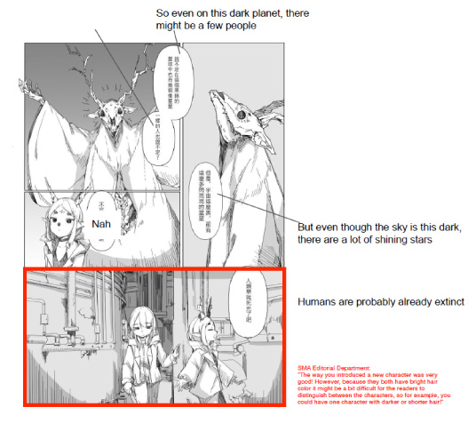
The gap between the dystopian setting and the cute character designs was great. It was easy to read but it was a bit monotonous and hard to focus on at times.

SHUEISHA

The post-apocalyptic world is beautifully depicted, and the character designs are interesting. They're expressive and interact logically. I would have liked the story not to stop at some kind of universe introduction. The whole thing would have been more interesting if there had been at least the beginnings of an issue or a scene that allowed us to get attached to the heroine.

Ki-oon

The drawings depicted a lonely world. The story made me interested in seeing the rest and had me thinking about it after reading as well.

Wacom

View all entries

Webtoon Category1 winner

US$1,700 cash prize / Wacom One / Three-year, single-device code for Clip Studio Paint EX

Comment from the Winner:

Since I was 12 years old, it has been my dream to make a webtoon or manga of my own. I would often share the story of it to my friends and even draw the characters, but I never pushed through it or published it online because I was very shy about it. So when I saw this contest, I thought it was a great opportunity to finally make my own webtoon and follow my dreams. I think Sorajima’s comment on my story was the most encouraging. My story was really analyzed in every detail through their comments. Reading it made me feel very motivated in creating and improving my skills in both art and storytelling. I think it was very fun and I have learned a lot in creating comics and managing my time because I had to manage my time between schoolworks and other contests in schools and this contest, too. In the end, I had fun joining this contest.

Critiques from the pros

This entry received detailed critique from KADOKAWA.

See critique
This is a webtoon that could totally be read on a professional platform. Everything is so masterful, and I am impressed by the quantity and quality of your work. There isn't a single flaw. It is even better than some of the webtoons you could find online. My only concern is that even speaking as a shōjo addict, it feels like I have read this story already. I know these kind of characters, and I wonder if your story could be a bit more than that. But anyways, congrats for your amazing work.

Justine Cunha

It's a simple story but a fun read. The paneling was done in a way that is extremely readable in the webtoon format and I could make it to the end without a dull moment. Every illustration just needed a bit more work, I would say to especially focus on practicing drawing characters.

SHUEISHA

The connection to the light and darkness theme was a bit weak, but I guess it was embodied in the worries of a teen. The colors are a bit muted and create an intense and lively atmosphere. This might have been on purpose, but I thought it was too bad how the main character has bangs that sometimes hide the expression on her face. When you are showing the emotional state of a teen I really want to see the author give it all the to character expressions. If you do that you will communicate more beyond just the character lines.

KADOKAWA

Each panel was carefully drawn and I had a lot of fun reading this. The tempo of the conversation was good which led to its readability. The main character's emotional state changes and becomes more calm, but it would have been good to see her expression change in a more exaggerated way.

BookLive

The drawing is of a good standard, with a nice mastery of color. The squares are also large enough to be readable. The story moves forward thanks to dialogue, rather than just the heroine's monologues of thought, which adds dynamism and keeps the reader more involved. The overall plot is easy to understand and pleasant to read. To go from pleasant to interesting, we'd need to add some real stakes or more powerful emotions.

Ki-oon

A person who is worrying about a huge life change and their future meets someone and then starts to feel more positive about everything. It was relatable. I could tell the character's emotional state not only by their expressions but by the coloring as well.

Wacom

This entry embodied a lot of what is good about the vertical webtoon scrolling format. I also understood who the character was by their expressions, lines, and their actions, so I was able to enter the story immediately. I had a good time reading this because of the various character expressions and the charming characters you drew.

FUNGUILD

The story is very universal and tender. I think many people can identify with it.

Planeta Cómic

The quality of the rendering is rather uneven, sometimes too empty (not enough people on the street when it must be crowded), and often a little weak in the drawing of details and scenery. But some scenes, such as the one in the Halo-Halo store, are technically very well done, pointing to great potential. The subject (the difficulty of choosing one's direction in college) is well-founded, and you quickly get into the character. A little too much monologue, though (redundancy).

DUPUIS

This story was very relatable being about a student worrying about her future and it felt like I was walking the streets with them. The quality of the drawings was excellent and while the story did not have many plot developments, I had no trouble reading it until the end. The panels that you wanted to show off the most were also very high level.

RED SEVEN

This story showed off great skill and an understanding of webtoon expression. The market scene was especially good because it made use of extreme camera angles to show different scene compositions so the reader could understand how busy it was and how the main character felt about it. After that we see them walking through the market while the camera is horizontal again and the background is completely drawn in, and it has a fun atmosphere. The scene where the two are eating while walking through the market with all the foods was great. Also towards the beginning there is a vertical panel expertly used to convey the feeling of pressure coming down on the main character. I think if there was anything to improve it would be towards the end when she gets advice from the older girl and becomes more positive. This was a pivotal scene, but because there was so much dialogue and small panels it didn't live up to the role. You need to think about captivating the reader even during a dialogue scene with larger panels. For example when the older girl yells at her after the main character is being negative, it could have been a wider and larger panel to change the environment and make it more striking.

SORAJIMA Inc.

The character expressions were great! In webtoons you don't have the page-turning action so you will want to add more different compositions to the work. The ending had a lot of this but the beginning had a lot of front-facing shots of them talking. I recommend adding a little more camera work to make this better.

Mangatari

Webtoon Category Runner-up4 winners

Three-year, single-device code for Clip Studio Paint EX

Critiques from the pros

This entry received detailed critique from POCKET COMICS.

See critique
I Loved it, this is the only one that took advantage of the format for the narration. The illustrations I like have a "Tekkonkinkreet" mixed with "The Little Prince" vibe. I feel like the whole thing is a bit uneven, but that's understandable with this amount of work. I love your strong, bright colors, but I would recommend not to go too dark and desaturated for the night parts because it is a bit grey and we lose a bit of the magic.

Justine Cunha

That was good. It wasn't like the story has never been done before but the vertical paneling has good composition and it flowed well. The coloring is also unique, especially when you showed the light from within the container and the darkness outside with contrasting colors. You still need to work on your drawings of the cute patterns and characters, but I will be looking forward to future works from this creator.

KADOKAWA

Many entries dealt with life and death as "light" and "darkness", but this piece took it in a fresh direction with the perspective of heading to your hopes and dreams. The depiction of "darkness" as the universe and night sky and "light" as the hope to one day journey to space in the container was great.

MangaPlaza / Solmare Publishing (NTT Solmare Corp.)

The drawings have a lot of detail, and the color is really beautiful, but the dark parts need a little more contrast as they look too dim, which detracts from the beauty of the drawing.

Planeta Cómic

Artist identity is already well established. Original and interesting choice of character design and color schemes. Unfortunately, the story isn't up to scratch and not interesting enough, even if the dialogues are fluid and not difficult to read.

DUPUIS

The colors you carefully selected gave this piece a unique worldview which was beautiful. However you need to work on how to lead the reader down the page, because there was a part with three horizontal panels which broke up the flow.

RED SEVEN

The way you presented this piece was amazing, and you really thought about how to show the drawings in an appealing way. here was no unneeded blank space so the beautiful composition could continue showing us the world, and the reader could journey inside it. The first time the two meet in the beginning is especially brilliant. The way that the boy's body leaped out of the panel and the composition of the depth of the container drew you in. The reader cannot get bored with the way you manipulate the camera angles. The way that you did bird's eye shots and low shots was very alluring, with the hope-filled scene with the light bulbs to the ragged sitting pose of the boy. However, there was the scene where after they meet, there is a shot from above the room, so, at times, it was hard to understand what was happening because of how creative the shots were. Try to limit information so that the reader can concentrate on the panels that matter. The pairing of this art style with this worldview worked great, in my opinion. I think that you have great composition skills, so in the future, I could see some great collaborations between you and a team you can trust to make webtoons that further pull out your potential.

SORAJIMA Inc.

Critiques from the pros

This entry received detailed critique from SHUEISHA.

See critique
I was drawn in by this being a father and son story. It is a simple story but it was well told within the page limit. Your dialogue choices and the character interactions were interesting too!

SHUEISHA

This was a good dramatic story where you didn't need to focus so much on the light and dark theme. However, I didn't know if this story needed to be in the webtoon format. The art was a bit small and you could have improved the impact by having some panels with close-ups on the characters.

KADOKAWA

The theme was consistent, I understood what you were going for, what you wanted to say, and that made it interesting. The art style is semi-realistic and worked well with the theme. If I had to ask for more I would say I would want some more character design to make the characters more distinct from each other.

BookLive

The work on light makes the whole attractive. The father-son relationship is well portrayed, even if the father remains rather anonymous. He would also have deserved a little more prominence. Nevertheless, we become attached to the hero, who does everything he can to attract his father's attention.

Ki-oon

It was heart-warming to see this story of a dad, tired from work who just wants to rest at home, and a child, who wants to play, and them coming to understand each other.

Wacom

It seemed like you had some experience in showing this game of chess that brings this father and son together. The dad is dealing with the "darkness" of work that society puts on him, and, in contrast to that, he also shows an effort to deepen the bond with his child. I liked how the child is observing this and growing too. There were some things that were cultural, but the feeling of being on the board and the conversation during the game was good. This was a story where you are curious about how this child will grow up.

MangaPlaza / Solmare Publishing (NTT Solmare Corp.)

This story portrayed a son and father relationship through chess very well through its drawings. We see both the son and the father change through chess and the ending was also wonderful.

FUNGUILD

It was very moving to see how this father and son who are so busy with their own lives grow in the end to be more considerate of each other. On the other hand, there were a lot of small panels that I wanted to see larger, so it was hard to read through this without effort. Also there were some scenes where the character acts suddenly.

RED SEVEN

This story has a great composition and layouts! When we reach the ending we see the main character starts to see the world in a different way which was very exciting! The main character is preoccupied with why no one understands him, but then he slowly changes to try to understand his dad. The dad also sees the son trying hard to understand him and decides to go with him. The scene before the last chess match was also very good! I would have liked it if I could have seen the two's expressions closer up in a panel. It would have been nice to see a close-up of when the two of them go to the bathhouse to finish it off! Please try out using some close-up shots!

Mangatari

The plot beats were very intriguing, and it was a good read. I am curious to see how the story unfolds later on. It was interesting. I got the feeling that your art style is still under development. Please put more practice into developing your character drawings!

SHUEISHA

I get it, but the end of the first half (the arrest) was a bit hard to understand in regards to the situation of the main character in the middle part. I thought it wasn't great that you rely on the reader to fill in the blanks to understand everything. In the beginning we know we are in South Korea but after that it seems like the setting loses all nationality and seemed a bit blank. And then at the end I'm thinking "You're ending it here?" You could say it was intriguing so it was a success however.

KADOKAWA

I liked how the image of a glamorous idol is changed to the dark news about the idol and then the main character losing their sense of purpose. It was very striking. I was curious about what would happen after the ending.

Wacom

A band gets broken up at the peak of popularity because of an incident. The feeling of time progressing and them meeting again to decide what they will do next was portrayed as if it could actually happen in reality. I felt the bond between band members and the "light" of their height of popularity. I thought it was too bad about where the story ends, it felt a bit sudden, I wanted to see where it would go.

MangaPlaza / Solmare Publishing (NTT Solmare Corp.)

The topic of this story is relevant to current trends, so I think it was cleverly chosen and will give visibility to the webtoon.

Planeta Cómic

Beautiful introductory scene with the boy band shown perfectly. The main character's admiration for them is immediately apparent. Unfortunately, the graphic quality drops off quite sharply afterward. A pity. A shorter story might have guaranteed more quality throughout.

DUPUIS

Critiques from the pros

This entry received detailed critique from SORAJIMA Inc.

See critique
I liked how it wasn't just that the spotlight was the "light" and the rest "darkness", each spectator was a light. I thought that you could have used the vertical format better to show the lights.

KADOKAWA

The cute illustrations drew me in. I think that you need to work on layout composition and character movement because it was a bit stiff. Also I wanted to know how the character succeeded, as it was really sudden. It was hard to get into the story because of that, so your story will improve if you bring in more of that to convince the reader.

BookLive

I thought it was great how nicely the girl was drawn. I got that you were thinking about the details like hair, costume, makeup, etc. However, I wanted a bit more information on the deep darkness that is pictured at the beginning.

FUNGUILD

The story was clear, easy to understand, and interesting. I think that you could get rid of some of the extra blank space to improve it. It might have been good to not feel restricted by panel lines add in some backgrounds that go past them. The scene where she is feeling unsure about getting more events and then sees the seats packed was pivotal, so you could have added a bit more of a build-up. For example, the heroine, gets struck with stage fright and starts imagining an empty audience and then starts to imagine she isn't fit to be an idol, something like that.

SORAJIMA Inc.

The way that you opened with her ideal was fun. The way the story followed her from the will to start, to trying, to becoming her idea was wonderful. I thought you could have put in more about her inner struggles and thoughts to further elevate it. With more opportunities for her to feel down and defeated only to spring back up again. I also wanted a smile at the end! It would have been great to see how she was feeling at the end!

Mangatari

View all entries

Bande Dessinée Category Prize1 winner

US$1,700 cash prize / Wacom One / Three-year, single-device code for Clip Studio Paint EX

Comment from the Winner:

I don't have the words to express the honor I feel of having won this award nor the words to express my gratitude for those who awarded it to me. I participated in the competition in order to have a first experience in the world of competition, to get into the swing of things as you say. When teachers presented the shadow and light theme to us, I immediately wanted to tackle this one as a symbolism, that is to say, how I could present this shadow and light dynamic in a human relationship. This is what I wanted to do with My two characters Aro and Aina. Aina meaning "life" in Malagasy (my native language), and ARO meaning “protection”. So it's a shadow that protects at all costs its light which gives it life. I wanted to focus on the structure for a smooth reading of the story, but also on lights and shadows to accompany the theme. In the future, I would like to become an artist who is not afraid to get out of her comfort zone. And I think this work helped me get closer to this goal because it was the first time I told a story with action, a little epic and somewhat fantasy. I also want to tell stories that touch me and which can touch others. I thank my teachers for their precious feedback on this project, but also my family and my classmates for their support. I would once again like to thank Clip Studio, jury members and sponsors, both for their inspiring, benevolent and constructive feedback and also for this wonderful prize. Thank you.

Critiques from the pros

This entry received detailed critique from DUPUIS.

See critique
I'm loving both the story and the illustrations. The characters are so well written, and the symbolic use of the lighting is breathtaking. The red background during the fight to enhance violence and oh my, the full page cut in half between light and darkness with the shape of the cloak! It has some Ami Thompson vibes, which I love. I feel like your lines could have a bit more stylization, like the author Cassegrain for example! But anyway amazing work!

Justine Cunha

The last two pages drew me in. The striking illustrations stuck in my mind as well. I think that your character expressions were clever and that your composition is at a very high level.

SHUEISHA

We got a digest of a grand fantasy which was neither a good or bad thing, but I can tell you are experienced. Even without dialogue I could understand the flow of the story. The characters are also not a template image of beautiful guy and girl which gives them more character.

KADOKAWA

Your drawing skill is great and the color balance was very sophisticated. The theme of "light and darkness" was also present in the scene composition, which was good. There was also some romance in the settings that drew your attention. However, the character backgrounds and world were a bit hard to understand so it was hard to get into that world. If you could make us relate with the main character when making the story then the beautiful illustrations and composition would be even more well served.

BookLive

Bravo for the original graphic and character design! The last two pages are magnificent. The story opens with a dramatic moment that immediately throws the reader into the deep end. It might have been a good idea to show why the Queen is so hated and to develop her character a little so that we'd be interested in her apart from her love affair with the paladin-woman. The battle scenes are interesting but too small. This is typically the type of passage that could be developed in double-page spreads to give them real impact.

Ki-oon

The expressions and lines of the queen and knight really show how they see each other. In addition, the smooth transition from the flashback makes you feel closer to the story. There was a lot of the "light and darkness" theme sprinkled throughout the piece, making it a very alluring work.

Wacom

You really drew me into the world with your unique art style. Even though this was in color, there were parts in black and white put in purposefully which created a good variation in the story. Overall it had a heavy atmosphere and severe air that led into the ending well.

MangaPlaza / Solmare Publishing (NTT Solmare Corp.)

Graphically, the work is rather uneven, with some very beautiful, well-constructed pages and others that are much weaker or blander especially the action pages. The texts are too long and lack credibility and naturalness. It would be wiser at this stage to move forward more humbly, with texts that are as short, simple, and clear as possible, and to fully assume the epic fantasy narrative without too many contextual tirades that detract more than anything else from the reading pleasure.

DUPUIS

The oil paint style was beautiful. And when the knight Aro attacks a soldier the red made me really feel Aro's anger. Seeing what happened in the past also made me agree with how far Aro took things. In the last half it was a bit strange how it looked like the crown came out of the floor.

RED SEVEN

The allegiance towards the queen was expressed well. I wanted to reread the work after finishing the last page. The loyalty between the main character and the queen, the expectations of the people, the court's misdeeds, and the subtle love between the two were beautifully expressed! The final panel would have been even better if I could see the queen's awakening even more after the main character fell!

Mangatari

Bande Dessinée Category Runners-up3 winners

Three-year, single-device code for Clip Studio Paint EX

Critiques from the pros

This entry received detailed critique from Cork, Inc.

See critique
This is a strong, sensitive, and graphic point of view. The subject is interesting and the storytelling is amazing. I empathised so much with the main character, and I feel like I wouldn't be the only one. Some frames are harder to "read" at first glance, but to be honest this would be published here in French edition houses without any problem.

Justine Cunha

The way the scenes are set up on each page made a big impact and was very interesting! I think that each page could be its own stand-alone illustration. I wished there could be a bit more pizzazz you could add to get the point across to the readers.

SHUEISHA

I think that everyone has the experience of a sleepless night, but maybe not this exaggerated, but it was interesting. The horizontal paneling was not that easy to read. Since this is so monologue based maybe it would have been better in webtoon form.

KADOKAWA

This work was very topical, I liked how the visuals in the beginning were repeated at the end for a clean finish. The psychological elements and drawings fit well together, and there was a variation in camera work and expression. There was a bit too much textual information, so think about the rough image of your theme and edit down to choose your words to better convey the message.

BookLive

The graphic style is personal but masterful, in line with the graphic novels developing in Europe. The modern distress is well expressed, even if the whole relies a little too much on monologues rather than narrative situations. The hero doesn't really have a personality outside of his anguish and should have been described a little more as an individual to reinforce empathy.

Ki-oon

Little color was used purposefully to show the "light" and "dark" in our daily lives. It was interesting to see the light and darkness in modern society and how the author landed on this subject. I thought this story was very relatable to a lot of people.

MangaPlaza / Solmare Publishing (NTT Solmare Corp.)

The art and color choice brings a unique personality to the pages, a very positive quality for an artwork.

Planeta Cómic

A very demanding story for both author and reader. The drawing and storytelling are of high technical quality, and the subject matter is original and well-written. It could be more enjoyable to read with less text or by making it easier to identify the important text from those that are less so. It also lacks variation and diversity in what is shown. More light-hearted moments, based on dialogue, why not with humor, would finally break the impression of a long, rather heavy monologue.

DUPUIS

The way that you expressed the breakdown of the mental state was beautiful. How you show the other people taken over by evil was still too beautiful so it might be helpful to look at how other art portrays dark and crippling feelings so that you can show a heart being squashed by a demon.

Mangatari

Critiques from the pros

This entry received detailed critique from Tokyo Name Tank.

See critique
You fumbled on the page before the last page! That was way too fast! It's not like the ending wasn't understandable but you needed a bit more time to create the tension before the ending. Or you could have had that last scene with her being handed the wand with a longer shot of them in the woods. You could even have added a small epilogue to the end. If you had wanted to show magic that was not attack magic you could have also edited the beginning/middle down to give more space to the ending.

KADOKAWA

The story is cute, with beautiful colors. The heroine's character is hard to pin down and would have benefited from one or two strong characteristics. The story lacks logical transitions, which is a shame, given the effort put into creating a story with stakes and moments of tension. On the other hand, the panels are easy to read, with welcome camera movements and changes of pace. The story is cute, with beautiful colors. It's hard to identify the heroine's character, and she could have done with having one or two distinctive features. The story lacks logical transitions, which is a shame, given the effort put into creating a story with stakes and moments of tension. On the other hand, the panels are easy to read, with welcome camera movements and changes of pace.

Ki-oon

This story was a heartwarming tale of a character losing her self-confidence and then finding something only she can do. The characters felt alive through their comical expressions. The main character's monologue also made her feel real to me and revealed her stubbornness which drew me into the story.

Wacom

The characters were full of emotional expression. Also the colorful setting also made the "light" and "darkness" easy to understand. The character's change in expressions, the plot beats, the tempo, and finale was all there for me. The "darkness" pictured but wasn't actually a bad thing and I thought that was a good point and left me feeling good even after reading.

MangaPlaza / Solmare Publishing (NTT Solmare Corp.)

Both the color and the drawing are very nice, but I think it's closer to being a manga than a bande dessinée.

Planeta Cómic

The style was cute but I think that you used too many colors. It made me think that the main character was someone else for a moment, and gave the comic a loose feeling without unity. Also the main character's hair color is too similar to the background colors and sometimes she couldn't be seen well. I think this entry would be improved by changing the color palette.

RED SEVEN

The last scene when the character transforms, the scene where the main character gets told the wand is meant to be with her, the feeling of inadequacy, the pain, the unexpected change in her attitude when the boy reveals his true form, it was all drawn well and drew me into the story! I was thinking that I would have liked to see Mizu's face at the end and an ending where it leaves more room for readers to imagine their relationship beyond the ending. This was a great comic!!

Mangatari

This is SO MUCH FUN to read! The graphism is so adorable. It is rare to have comics for children with this kind of deep subject. It has some "Fantôme Fâché" and "Aubépine" vibes. You could go with an even thicker or cleaner line like you did for your cover! It is exactly the kind of comic that is missing right now in libraries, as there are comics for adults for teenagers, but very few for kids. It works perfectly and I really hope I will buy one of your books someday!

Justine Cunha

Colorful scenes and cute characters and then comes the dark emotional state! The way that you differentiated light and darkness in your drawings was clever. The characters were animals but their actions were very human so I think it is easily relatable to readers.

SHUEISHA

This entry worked both as an illustrative piece and comic because of how carefully each panel was drawn. The balance of the colors was also nice. The pop-like characters were cute and very active and the main character made me want to cheer him on! I think that the light and darkness theme was embodied in the character's inner "darkness", but it would have been good to get a clearer message on what you wanted to say at the ending.

BookLive

The drawings were simplistic and pop-art style and the drawings of the emotions of the character were relatable. I thought that his wish to make friends and his timid feelings that were conflicting with this was well expressed in several panels throughout.

Wacom

I love how the author captures mental illness and health. The drawings feature very cute characters, allowing the reader to empathize with them, which I think is a great success.

Planeta Cómic

A very solid children's comic, both graphically and narratively. The world of cuteness is very well mastered, allowing us to move on to more difficult subjects such as lack of self-confidence and bouts of anxiety. Since the reader is young, it would be good if the main character's objective (to bake a cake for her friend) were better announced at the outset to facilitate entry into the story. Likewise, the happy ending at the end of the story only gets a few squares at the end of the last page, which isn't enough. We need to devote more space and style to it so that the reader comes away from the reading fully happy and touched by the happy ending.

DUPUIS

It was simple and had a pop feeling like a picture book illustration. I liked how we knew that the main character had something they wanted and then it reached a well-drawn resolution at the end. In the first page it was hard to understand the character relations and what the main character was trying to do. If you had made it a bit clearer that he was trying to make friends it might have been better.

RED SEVEN

View all entries

Storyboard Category

Storyboard Category Grand Prize1 winner

US$2,200 cash prize / Wacom One / Three-year, single-device code for Clip Studio Paint EX

View full screen

Comment from the Winner:

First of all, I want to thank the jury for choosing this work as the winner. I did this webcomic in collaboration with my friend, and we did it without thinking it would get the first prize. It's not the first time we have participated in this contest, so this time, we tried to put into practice what we learned from our past participation. We decided to use Tachibana's work because her story depicts hope in a discouraging environment. We modified the story's structure a little bit to tell it differently. We also worked with the colors to show the moments when the protagonist felt the light and the darkness in his life, and we also wanted to depict the main theme of this contest by showing the contrast between the personalities of the two main characters. It is very encouraging that our work was selected. It is a boost to continue in this world of comics and improve for future projects. Thank you very much.

The webtoon format was unexpected but why not. The illustrations might have some technical flaws but I love how different your choices of character design and vision are on this story. It is very important to have a strong point of view and originality of storytelling and this is your strength. The colors are beautiful, don't try to frame your boxes with a black line it doesn't do justice to your backgrounds and maybe you could color your character outline to make them fit better in your backgrounds! Good work

Justine Cunha

You used the webtoon format extremely well and it was very easy to read! I think that the character design and story were easily consumable. The camera work was also brilliant.

SHUEISHA

This was the only webtoon format submission for this category. The story was easy to understand, plus the word choice for the monologue and it the way it was finished-up was very good. This was the most satisfying comic adaption of this story. Your expressions were the only thing that needed a bit of work, but it was saved by how easy it was to read this (other entries were the same but this entry had the best ending) and that was what pushed it above the rest.

KADOKAWA

The line and colors are well chosen. It's both readable and beautiful. I like the fact that the characters are not caricatures and seem plausible in their expressions, poses, and reactions. The choice of adding a memory in the middle of the story is clever, giving depth to the mother-son relationship and accentuating the role of the deceased. The last panel is beautiful but perhaps lacks the nuance of suspense implied in the script.

Ki-oon

You didn't rely on telling with words, but instead used art to show us and that made it easy to read. You didn't concentrate on the details of the backgrounds and instead focused on color to show the main character's emotional state and the backgrounds, using the webtoon format very well. I liked how in the beginning the main character has an android-like expression and it transforms into more heart-warming expressions in the end.

Wacom

The vertical-scrolling format worked well with the flowing tempo of this story. The art style also matched the story and gave a warm impression. Instead of doing two-page spreads you had more freedom with the pages and paneling and could do some interesting things. I think that you succeeded in highlighting the original story as well as showing us new possibilities.

MangaPlaza / Solmare Publishing (NTT Solmare Corp.)

I like the character design as they are very expressive in both their faces and in their body.

Planeta Cómic

The scene when the character finds out he is an android and the lead-up to that where the LED light on his head is hidden was very clever. The composition of your panels and the character posing also brought the story to life. It was a bit hard to understand when something was a building and to follow some character actions. This made it disjointed with the following panels, but if you drew that a bit more carefully it would improve.

RED SEVEN

The story progression was carefully drawn, and I was drawn in by the beauty. The theme of family was touched upon and the character learning about the world outside and thinking on it touched my heart. I think you can claim more reader hearts by mastering when to zoom in on character emotions for more impact. It was a great storyboard!

Mangatari

Storyboard Category Runners-up3 winners

Three-year, single-device code for Clip Studio Paint EX

Critiques from the pros

This entry received detailed critique from Minto Studio.

See critique
Really loving your take on this. Your big double page is incredible! You really nailed the kind of Attack on Titan/Gunnm kind of vibe! The compositions of your pages is really interesting I like how the elements like the letter or the stairs become the end of the box, it is really modern storytelling. I feel like your style could be more you, more unique, right now it is classical manga but I would love to see manga your unique way and point of view. Anyway congrats for the amazing work!

Justine Cunha

You have an amazing talent for getting down your vision into art! I think that through character drawing practice your power to express will grow. I think that if you draw the backgrounds more carefully it will also bring up the quality of the whole story. Please keep up practicing and drawing even more!

SHUEISHA

I think it all came together neatly. I think that the emotional point of this story is when the boy android and the bird meet and decide to go journey together, but it was a bit flat and monotonous. The two-page spread of the desolate, apocalyptic world could have stood on its own without any text.

KADOKAWA

The lines, paneling, and composition were cleverly executed and delicately drawn. Also the expression of abstract concepts was also great. The changing landscape goes from a desolate world to one that can foster hope, and the tone of the character was easily understandable.

BookLive

I noticed the care taken with the scenery, especially the idea of incorporating a double-page spread to pose it. It seems to me a necessity to have this double-page spread in a work set in a post-apocalyptic fantasy world. The proportions of the bodies aren't often well balanced, but there's an effort on the characters' expressions. On the other hand, important moments, such as the hero's discovery of his own nature or the ominous appearance of the shadow in the final panel, could have been better emphasized (Ki-oon).

Ki-oon

The amount of detail showed how hard you worked on this piece. The monologue panels are carefully drawn out and I was drawn into the author's world view.

Wacom

I liked how the monotone world expressed the feeling of end times and the art style supported the feel of the story as well. The two points where color was added was striking, but I wish that you had gone a bit further with the panel with the colored eyes. Since this was based on a story, you worked hard at including it all from start to finish, however, there were too many small panels. If you worked out more of a balance then I think the it would improve.

MangaPlaza / Solmare Publishing (NTT Solmare Corp.)

The composition was good at guiding your eye across the page, making it very readable. However, in the middle you didn't prioritize information presented as well. In the scene when the body is discovered and the scene where we meet the android, you could have made the bones and the android larger. The panels all start being the same size at a point in the story, so try thinking of the important story information put it in larger panels.

RED SEVEN

Critiques from the pros

This entry received detailed critique from GAComic.

See critique
The color use was very unique but it came together well. It was interesting how you interpreted the story visually.

SHUEISHA

Your color sense is amazing and I was surprised by how you could show the emotion of the android without depending on his face. You have the power to draw in the reader with your unique color use, and I am looking forward to your future work using this skill.

BookLive

The personal style of the drawing and the choice of high-contrast colors give the whole a special cachet. On the other hand, we discover too early on that the hero is an android, which breaks the revelatory effect at the end and takes away some of the emotion. The long, tedious road trip aspect is well rendered, thanks to an easy-to-read cut with varied scenes. The freeze-frames at the moment of discovering the corpse or the reflection in the mirror are well integrated (Ki-oon).

Ki-oon

The unique style and world view was striking. I enjoyed how the decayed town, inside the room, and the desert were depicted.

Wacom

I really like the color scheme and especially the setting where the story takes place. The desert scene execution is brilliant.

Planeta Cómic

Very interesting and original choices in terms of narration, character design, and colors. Very noticeable drop in the quality of the last scene with the android. Lack of time? Fatigue? A real shame.

DUPUIS

You didn't get caught up in using many words to explain, the world was well expressed, and it worked very well. The story opened with the loneliness of the character having to journey in a desolate world. The way that you showed the beginning electro cardiogram and the mirror scene was very unique. I thought that your use of color and art style brought out the charm of this story the most. I was especially surprised by how beautifully the skeleton scene was depicted.

RED SEVEN

The way this story was paneled was very captivating! I thought that the most striking scene was when he finds the bones of the dead. Also, how you showed the main character's feelings to wait for humans and determination to stay here in the future through other characters in the final scene with the bird was great! I think that if you made more panels like this the story would become even more dynamic.

Mangatari

Critiques from the pros

This entry received detailed critique from MangaPlaza.

See critique
The weather, land, and robot were drawn extremely well, and the contrast between organic and inorganic was very clear. The way that the background was detailed was amazing, and it was clear what you were trying to say from the marriage between the character expressions and the backgrounds.

BookLive

Both the drawing and the story are very well executed. The story could be more dynamic, with some extra risk in the narrative. The drawing would appeal better with a smoother narrative.

Planeta Cómic

The overall style is very dark, a difficult but appropriate choice for this story. You can feel that the author has gone to great lengths to create a meticulous drawing style, with often successful cut-outs. Unfortunately, the narration isn't suited to manga, with large chunks of text more suited to a classic comic-book-style narrative. In manga, it's important to keep to one sentence per bubble or even a double bubble for long sentences. The amount of text determines how much time the reader spends on a page. And in manga, it has to be fluid. Avoid onomatopoeia in kana or kanji. Both author and reader need to understand them, not just see them. So, even if there are few references, dare to use onomatopoeia in alphabet.

DUPUIS

You put a lot of effort into drawing the robot expressions. The backgrounds and scenery were so exquisitely and carefully drawn! The ending scene expressions where the main character and Adam shake hands was also great! You draw so many good expressions. I think you should zoom in on them more to bring in the reader into a large panel. It will create more dynamism!

Mangatari

View all entries

Illustration Category

Illustration Category Grand Prize1 winner

US$550 cash prize / Wacom One / Three-year, single-device code for Clip Studio Paint PRO

Comment from the Winner:

Hi, I’m really honored and grateful to be awarded the grand prize in the illustration category in this year’s international comic/manga school competition, when I first got notice I was beyond elated, and till this day it still feels kind of surreal just like I wanted my illustration “Gaia” to feel like. I approached this year’s theme “light and darkness” trying to portray a story that could be interpreted differently depending on the details that attracted the viewers the most, mainly to showcase that everyone sees the light and darkness in their lives differently When I entered this competition, my intent was to deliver an illustration that I was totally happy with and hopefully to grow as an artist as well, and now thanks to the amazing people from Clip Studio Paint, my pals and family that encouraged me in every step I took, I feel really excited about the bright future. Once again thanks a lot to the judges, and people from Clip Studio Paint, for hosting this competition and choosing me as the grand illustration winner.

The most impressive aspect of this work are the gorgeous colors. They give so much joy to look at. The expression on the girl's face as she plays with the cat is so cheerful that it makes me want to see more of this creator’s work.

BookLive

The colors are vivid, with a strong contrast between light and shadow. Their combination is unique, and that alone left a strong impression. It has the power to draw the viewer into its world and make them want to look at it again and again, right down to the smallest detail. The overall composition is also well-balanced.

FUNGUILD

Beautiful illustration with shimmering colors. You can tell the author is at ease with colors and enjoys manipulating them. However, the theme is not sufficiently respected. Certain details, such as the hands, would have deserved finer work. Finally, we don't notice enough the cat, which should be a little more prominent to work better with the girl.

DUPUIS

The sense of color in this work is superb. The overall gradation of light and dark, centered on the light of the flames and the dark of the cat, is beautiful. The white-haired girl, depicted to blend into the mirrored surface of the water and the waves, harmonizes beautifully as the central presence of the work. The color accents work together instead of getting lost. You can almost feel the breath of the earth and the freshness and transparency of nature, it is very refreshing and inspiring.

SORAJIMA Inc.

The color palette and tonality are the highlights of this work.

Planeta Cómic

Illustration Category Runners-up6 winners

Three-year, single-device code for Clip Studio Paint PRO

What an amazing, impossible to ignore illustration. The mood is amazing, magical, almost a cabinet of curiosities, the level of detail is great, the lighting and the texture, but I think that the illustration could give more information about the character. Is she a modern witch, is this just a fantasy world ? In many participations the title helped or went to complement the illustration but this is not the case here. « wait ». what is she waiting for? I have so many questions ; and the wonderful setting that you put in place deserves to be giving answers. You have the drawing skills, you have a magical world of yours, make sure that we understand your story well. Your illustration doesn't need much more to turn from a beautiful mysterious illustration into the most magical story we want to read in a graphic novel. Great work.

Justine Cunha

Both the lineart and the painting demonstrate a high level of skill, such as the expression of light that draws the viewer's eye to the characters and the depiction of the background that carefully expresses the worldview of the work.

KADOKAWA

The character design, composition, color, and lighting are just perfect.

Planeta Cómic

Both the line and the colors are mastered. I really like the way the heroine looks at the reader; you feel like you're part of her world and her adventure. The light is beautiful and enhances the scenery, especially the butterflies. The peacock feather is also beautifully drawn. The composition is interesting, with a well-identified subject and fun details all over the picture. It makes you want to know more about this world and this character. It would make a great manga cover illustration.

Ki-oon

The expressions of the characters and animals, and the softness of the hair and clothing, are expressed well. The painting feels a bit rough, and perhaps that’s due to the style of the work. However, we feel the standard of the work could be elevated even higher if the details of the work were more carefully finished.

KADOKAWA

A girl and a fawn illuminated by "light." They contrast with the "darkness" that surrounds them. The difference in expression between the girl and the fawn in the work shows the "light and darkness" theme of this year's contest, and I feel that the "darkness" of the innocent girl, including the sparsely scattered flowers around her, is well expressed in contrast to the pure expression of the animal. This is the kind of work that makes you wonder what events might follow.

MangaPlaza / Solmare Publishing (NTT Solmare Corp.)

I found the drawing and composition unique in their ability to convey a sense of urgency without showing the figure's facial expression. The work has wonderful color balance, and it resonated with me.

FUNGUILD

The composition, motif, and color choice are all very good. The work is both eye-catching and pleasing to the eye.

RED SEVEN

The shadowy composition is interesting, like a scene from a film. I also got the message that stories are born even in places where the sun doesn't shine.

Wacom

It was fun to imagine what life was like for each of the characters.

RED SEVEN

The beautiful apartment scenes with glimpses of various storylines give a sense of the story behind each room. You can sense things about each of their lives, such as their age, what they’re doing, and the differences between them. You could enhance this by expanding the emotional range of the characters in the work. This apartment feels centered on joy and happiness. However, I think it is precisely when there is sadness, pain, and hardship that we feel the importance of joy. In that sense, I thought that perhaps having a room where you can feel other emotions might accentuate the feeling of happiness in the work.

Mangatari

This work awakens the viewer's imagination with its freshness and meticulous rendering of detail. In a single image, each character's facial expressions, charm, and individuality are dynamically conveyed.

FUNGUILD

Simple but effective use of the light/dark theme, which could nevertheless have been enhanced by a more expressive use of the two characters. Very good overall quality of drawing and color, very fine work on the details of the armor in particular. Overall within the standards of the professional market in fantasy illustration.

DUPUIS

The expressions and poses of the figures, the details of the clothing and background, and the balance of colors all testify to a high level of artistry.

KADOKAWA

The relationship of these characters can be translated as a yin and yang relationship. Yet, the two are close, and it is wonderful that they are depicted as true friends. Even the creatures behind the character on the left, who I assume belong to the underworld, look very happy. This narrative work allows the viewer to appreciate the distance between the two and see that it is a beautiful relationship! If possible, I would love to see the photos they took! It would be great if the photos could be added to the edge of the illustration too.

Mangatari

Hats off to the high level of expression here. Even though we cannot see their face, their expression is eloquently expressed with their whole body. I think the shading of the wrinkles in the clothes nicely expresses the volume of the limbs that should be under them. It's also great that the motifs in the piece are meaningful. Next time, I would love to see the character's facial expression.

SHUEISHA

Original use of the theme with a dazzled white angel. The choice of the pose with the face hidden, however, reveals a dodging of difficulty, namely showing the face of this suffering angel, with the lighting problems to be managed on the face. It's a real shame.

DUPUIS

View all entries

Past Contestant Achievements

YEONIESouth Korea

Web: https://yeonsanst.tumblr.com/
Twitter: https://twitter.com/YS0ST

They have serialized their fairy tale-style fantasy webtoon "The 0th Wizard" overseas under the pen name YEONIEST. It can be found on Kakao and Tapas in Korea, and on Piccoma in Japan and France.

Participation History

- 2019 Comic Category Honorable Mention「바치나이다」
Chungkang College of Cultural Industries
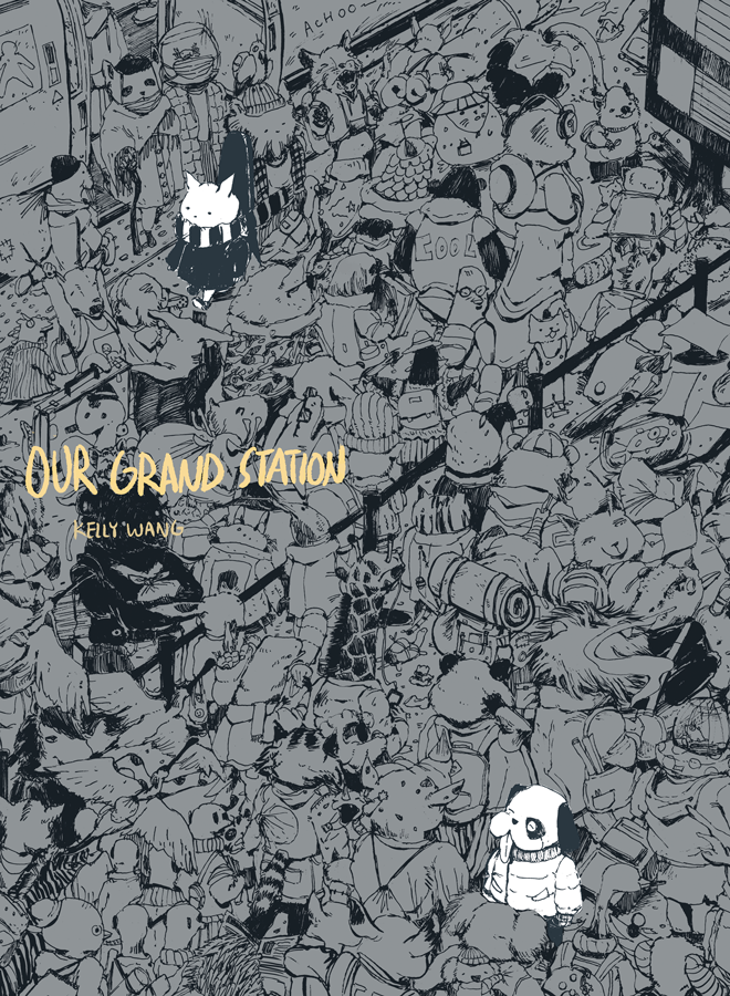
CaoqianUnited States of America

Web: https://www.cchianart.com/
Instagram: https://www.instagram.com/cchian_art/

Received an honorable mention for A GOLDFISH'S DREAM in Taiwan's Creative Comics Collection's 2020 Original Comic and Screenplay Award Contest and published in the anthology, LISTEN. TAIWAN IS SINGING! (2021, published by Gaea Books, Taiwan)
Currently self-publishing their own short stories and plans to publish a science fiction series in 2023

Participation History

- 2020 Overall Grand Prize“Our Grand Station”
School of the Art Institute of Chicago
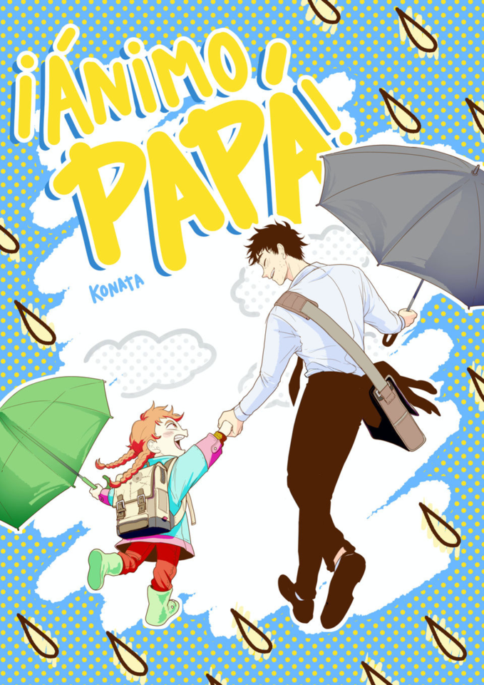
KonataSpain

Instagram: https://www.instagram.com/konata_art1/?hl=es/

Produced two open series in Planeta Manga, published by Editorial Planeta, Spain. They work as an illustrator.
They have planned to release a compilation of their first comic work, "Kohva," for which they wrote the script and drew the artwork.

Participation History

- 2021 Overall Grand Prize “¡ÁNIMO PAPÁ!”
Escola Joso
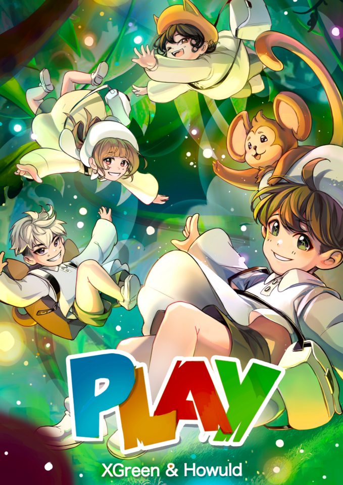
XGreenSpain

Instagram: https://www.instagram.com/xgreenkyun/?igshid=YmMyMTA2M2Y%3D

They are currently serializing "Krymsoul," an action/romance manga set in an Asian dark fantasy world, with Planeta Manga.

Participation History

- 2022 Manga Manga Category Participant“PLAY”
Escola JOSO

See more

International Comic/Manga School Contest 2023

This is a manga, comic and illustration contest open to students worldwide. Winners are eligible for cash prizes, digital creation software, pen tablets, and chances to be featured in media publications!

Contest theme (all categories):

Light and Darkness

Comic Category (Color) An original color comic for all ages (8-32 pages, including cover).
Manga Category (B&W/Color) An original black-and-white or color manga for all ages (8-32 pages, including cover).
Bande Dessinée Category (Color) An original bande dessinée for all ages (8-32 pages, including cover).
Webtoon Category (Color recommended) An original webtoon for all ages (sized 800 x 20,000-300,000 pixels or a height ratio of 25 to 375 for an image 800 pixels or less when the width is set to 1).
Storyboard Category A 4-16 page manga, comic, or webtoon drawn according to the supplied manuscript.
Manuscript text (provided by pixiv) Our hero searches for any other surviving humans in a post-apocalyptic world and ends up happening upon a male android...
(Source: "Dear Living one" by Rikka, from the official pixiv project "Writing Support Project - Happy Endings")
Manuscript text 2 (Courtesy of BookLive) Two rival wizards who used to be close childhood friends, have now crossed paths...
Illustration Category Original color illustration for all ages. There are no size requirements.

Judges & Sponsors

Contest submissions will be judged by an artist panel and sponsor companies. Contest winners are due to be announced in Early July 2023.

Judges

Graphic novelist, character designer, and artistic director

Justine Cunha

ArtStation / Instagram / linkedin

Hello, my name is Justine Cunha, I am a graphic novelist at Dupuis and I also work in animation as a character designer and artistic director ! After graduating at supinfocom, i worked in many animation studios such as Go-n, on entertainment, passion productions, dreamworks tv etc.. I especially love drawing badass female characters and working on fantasy stories !
3rd Editorial Department Dash X Bunko/Vertical Scrolling Manga Department

Taichi Toya

https://www.shueisha.co.jp/

Joined Shueisha Inc. in 2014. After working as an editor for Weekly Shonen Jump, he was transferred to the digital business department. He works in the digital distribution of comics such as "Weekly Young Jump" and spreading availability through e-bookstores. He is currently a member of the Vertical Scrolling Manga Department as one of its initial members from its start in spring of 2022. He currently creates comics and conducts webtoon market research.

KADOKAWA 4th Comic Editorial Department Manager & Vertical Scrolling Comic Department Content Producer

Takashi Hijikata

https://group.kadokawa.co.jp/global/

As a comic/light novel editor/designer, he was involved in the launch of "Comic α," "Monthly Comic Flapper," "MF Bunko J," and "Monthly Comic Alive," and then launched "Monthly Comic Gene" and "COMIC BRIDGE" as editor-in-chief.

pixiv Manga Editorial Department

Haruna Ikeda

https://www.pixiv.net/

Haruna Ikeda works as part of the pixiv Manga Editorial Department, which promotes original manga posted to pixiv. The pixiv Manga Editorial Dept sifts through all the manga posted to the platform and picks up a few special posts to recommend to users. Haruna also is on the judging panel for the pixiv Monthly Comic Awards.
Ki-oon Tokyo Office Representative

Kim Bedenne

Official website: http://www.ki-oon.com/
Twitter: https://twitter.com/kim_ki_oon

Ki-oon Tokyo Office Representative. After working at Kodansha’s International Business Bureau for four and a half years, she once returned to France where she worked for three and a half years as editor-in-chief for PIKA, a major French manga publisher, before coming back to Japan in October 2015 as the head of Ki-oon’s Japan office.

Wacom Creative Business Unit Vice President

Koji Yano

https://www.wacom.com/

Koji Yano was born in 1974 and started his career at Wacom Co., Ltd. in 2001. After developing the FAVO Comic Pack, he became the recipient of the Good Design Award for the promotional website he made in 2012. With a mission to raise the profile of the Wacom brand in the creative industry, he took on his current position overseeing marketing for the Asia Pacific region in 2018.

Gold sponsors

SHUEISHA

SHUEISHA is a Japanese publisher that specializes in manga, fashion magazines, and literary books. They publish a variety of comic magazines from Weekly Shonen Jump and Weekly Young Jump to Ribbon in Japan. As well as being the publisher of the worldwide smash hit, One Piece, SHUEISHA also provides manga fans with the Shonen Jump+, Manga Mee, and YoungJump! apps.

KADOKAWA

An all-around entertainment company, KADOKAWA, runs a wide range of businesses in publishing, videos, games, web services, education, merchandising, intangible services, and inbound sales. The company’s free comic site, Comic Walker, features popular KADOKAWA manga. It boasts more than 4,000 titles ranging from mixed-media works to popular isekai comics.

BookLive

Amassing a stock of over 1 million books since its establishment in 2011, BookLive has become one of the Japan's largest comprehensive e-book stores. Striving for maximum usability for readers, BookLive offers over 10,000 titles available to read for free!
The company also produces original e-books, aiming to create titles that capture the hearts and minds of the smartphone manga generation.

Ki-oon

Ki-oon is a French publishing house founded in 2003 by two manga fans. It is currently the third largest publisher in France, publishing "My Hero Academia," "Jujutsu Kaisen," "Frieren", "BEASTARS," and many more. In addition to purchasing licenses, they also produce and publish original works in a variety of genres, such as "Tsugumi Project," "Léviathan," "Beyond the Clouds," "Outlaw Players," "Lost Children," "Outsiders," and "L'Éden des sorcières." These works are initially published in France and then licensed for Japanese and worldwide distribution.

pixiv

A social network for creators that makes getting creative even more fun! With over 71 million users worldwide, more than 100 million illustrations, comics, and novels have been posted. New, fun projects for illustrators, manga artists, and writers pop up every day.
We are also running an event to support your first contributions to pixiv! Join us!
https://www.pixiv.net/contest/firstpostpixiv

Wacom

Pioneer of pen and display tablets made for creatives, used to create the world’s most exciting digital art, films, special effects, fashion, and design.
Click here to learn more about educational use.

Silver sponsors

MangaPlaza

MangaPlaza is one of the largest providers of digital manga in the U.S. Boasting over 76,000 titles from 40+ publishers, users can discover exciting works, including platform exclusives. We also offer a monthly plan that grants users access to 21,000 chapters for a great deal. Begin your journey on MangaPlaza and find your next favorite series!

FUNGUILD

A comic book publisher with a mission to "bring FUN to life through the power of stories,” FUNGUILD plans and edits original comics and webtoons that resonate with their readership of girls, women, and young men, making them available via various Japanese and worldwide online comic sites.

Planeta Cómic

Planeta Cómic (Grupo Planeta) was founded in 1982. We offer a wide range of the world's best shonen manga: Dragon Ball, My Hero Academia, Naruto, One Piece and Kaiju No. 8, as well as kodomo, seinen, shojo, yuri, and BL manga. We also have our own successful magazine: Planeta Manga. As for North American comics, our Star Wars books and independent works deserve special mention. Both our collection of national graphic novels (Los pacientes del doctor García, Voces que cuentan, Cuatro poetas en guerra) and international graphic novels (From Hell, The Hunting Accident, The Eternaut) are all highly acclaimed.

DUPUIS

Dupuis is a Belgian publisher with over 100 years of history, and the main creator of many great Franco-Belgian comic heroes, such as Spirou, the Marsupilami and Gaston Lagaffe, to name a few. It is also known as the publishing house with the most diverse library in Europe, with titles in teen & young adult comics, manga, webtoons, graphic novels, news and many other genres.

RED SEVEN

RED SEVEN is a company founded with the combined powers of REDICE STUDIO, creators of "Solo Leveling," and L SEVEN, creators of "Omniscient Reader." They aim to provide a superior media experience for our readers and set the full potential of both companies into motion. With works such as "King of Excavation," "The Great Mage Returns After 4000 Years," and "Lady Devil," RED SEVEN aims to realize the potential of both and provide readers with an elevated reading experience. They are looking for all sorts of manga works beyond the webtoon genre they're known for and look forward to your entries.

SORAJIMA Inc.

SORAJIMA Inc. is a manga studio with the largest share of Webtoons produced in Japan. What’s more, while developing its global and multimedia offerings, the studio is also taking on becoming a platform provider and putting effort into its new manga app, SORACOMI, all built in-house.

Mangatari

We are a Manga Artist Entertainment Production company with a vision to create the stage where the next generation of manga artists can be active and accelerate the evolution of Japanese manga. Working closely with manga artists' careers, we push the envelope on manga as an art form. For companies, we provide services such as the Original Story Advertising Manga "Orist" service, which produces manga for commercials. We also deliver manga to publishers through our Team-based Serialization and Comic Production "Manpro" business.

Collaborators

SHOGAKUKAN

SHOGAKUKAN is a general publishing company that publishes magazines such as comic magazines, children's magazines, information magazines, women's magazines, books and picture books. The comic magazine genre covers a wide range of readers from boys and girls to adults, such as CoroCoro Comic, Weekly Shonen Sunday, Sho-Comi, and Big Comic. The company also runs the comic app, Manga One, which has been downloaded over 20 million times.

BOOK WALKER Global

BOOK☆WALKER Global is one of the world's most popular eBook stores and apps for reading over 29,000 digital Manga & Light Novels. Experience and enjoy the latest manga and light novels, mainly from Japan on your iOS and Android devices and/or the web viewer.

EVER GLORY PUBLISHING CO.,LTD.

Founded in June 1991, Ever Glory Publishing Co., Ltd. has mainly had educational- and entertainment-oriented children’s books published and distributed. It once gained authorizations from SHOGAKUKAN, Kodansha, SHUEISHA, and Akita Shoten to issue Chinese versions of comics in Taiwan. As part of its recent focus on training manga artists and holding original manga contests regularly, the company also welcomes aspiring authors to submit their comics and novels whenever possible.

POCKET COMICS

Pocket Comics is a manga app with a large selection of full color webtoons, known as comico in Japanese, Korean and Thai. In English, French, German and Traditional Chinese it is known as Pocket Comics and has been downloaded over 41 million times worldwide.

SILENT MANGA AUDITION®

One of the biggest international manga competitions held in the world, exclusively without dialogue. It is created and organized by COAMIX Inc., a manga publisher founded by iconic creators such as Tetsuo Hara and Tsukasa Hojo. The competition aims to discover, nurture, and publish the next generation of international manga creators.

Minto Studio

Minto Studio is a webtoon specialist, which built up a unique production system through its vast global creator network and 10 years of content production knowledge. It produces works in collaboration with a number of platforms including Kakao Pikkoma, with whom it has a business alliance with.

Tokyo Name Tank

Our goal is to support everyone in creating their own manga while having fun drawing it. We have produced many award-winning and debut artists. In addition to storyboard lessons that cover how to structure a complete 32-page storyboard, we also hold individual consultations and storyboard exchange sessions to answer concerns about the creation of comics.

Cork, Inc.

A creator agency whose mission is to change each and everyone’s world through the power of storytelling. The agency aims to create a world where comics can shine brightly, where excitement is generated from creators and fans connecting directly and building a model for entertainment in the Internet age that goes beyond traditional publishing and distribution.

LINE WEBTOON

LINE WEBTOON is a new global digital comics platform available on both computer and mobile devices. The Traditional Chinese version was released in July 2014 and is dedicated to providing readers with manga content that you won’t want to put down once you start reading! LINE WEBTOON also strives to nurture Taiwanese creators. For more information, see their official website: http://www.webtoons.com/zh-hant/

GAComic

GA Bunko, which has produced numerous light novel masterpieces, has launched a new comic book label, GAComic! GAComic adapts a wide range of genres into comic book series, from otherworldly fantasy to romantic comedy. It has serialized many popular works from Piccoma, other e-bookstores, and manga apps.

Supporters

Japan Cartoonists Association

The Japan Cartoonists Association was established in December 1964 as the only nationwide organization of Japan's manga artists at that time and became an Incorporated Association in 1985 before becoming a Public Interest Incorporated Association in 2014. It is engaged in a variety of projects, such as research on comics, efforts in popularizing comics and comics culture, and comics cultural exchange with other countries.

Manga Japan

Manga Japan is an organization that aims to promote the development of manga culture and artists, contribute to society through the manga industry, promote international exchange, and improve production environments for manga authors and others involved in the industry.

Digital Manga Association

The Digital Manga Association is an organization of volunteers established to explore creative technologies for the creation of digital manga and comics and research copyright issues caused by digitization.

Contest Partners

SILENT MANGA AUDITION®

Operational Support

Graphixly LLC Toutlemonde Production Co., Ltd.

Organizer

Clip Studio Paint

Participating Schools

Note: The following list only shows schools that provided logos.
As of 10/04/2023

Fernando Ariztía Ruíz School

Chile

School of Visual Arts

United States of America

Pearson Online Academy

United States of America

Froggy Manga

United Kingdom of Great Britain and Northern Ireland

Fortismere School

United Kingdom of Great Britain and Northern Ireland

IES MOIXENT

Spain

Dominion High School

United States of America

La Sierra High School

United States of America

Bullard High School

United States of America

EPIC Charter School

United States of America

CEIP Nicolás de las Peñas

Spain

Colchester Academy

United Kingdom of Great Britain and Northern Ireland
Staffordshire University

United Kingdom of Great Britain and Northern Ireland

Pinner High School

United Kingdom of Great Britain and Northern Ireland

Ogden Elementary

United States of America

INFORMATION AND COMMUNICATION TECHNOLOGY HIGH SCHOOL

Philippines

VOXEL SCHOOL

Spain

Virginia Commonwealth University

United States of America

SBSGAMEACADEMYSINCHON

Republic of Korea

koreait school

Republic of Korea

New Bridge Integrated Collage

United Kingdom of Great Britain and Northern Ireland

Portland State University

United States of America

UOW Malaysia

Malaysia

Waxahachie High School

United States of America

Northview High School

United States of America

Cordeb'Art

Switzerland

CCOMMERCIAL EDUCATIONAL INSTITUTION OF ENVIGADO

Colombia

Daejin University

Republic of Korea

Peachtree Ridge High School

United States of America

Omak High School

United States of America

Angelo Rodriguez High School

United States of America

daeil high school

Republic of Korea

Heartwood Charter School

United States of America

Silviu Dragomir High School

Romania

Takming University of Science and Technology

Taiwan

wuhan huaxia Universi ty of Technology

China

The Hong Kong Polytechnic University (PolyU)

Hong Kong

University of the West of Scotland

United Kingdom of Great Britain and Northern Ireland

La Vernia High School

United States of America

Carbondale Middle School

United States of America

Can Margarit Secondary School

Spain

CHONKANYANUKOON SCHOOL

Thailand

IES PANDO

Spain

Cavanilles Botanical School

Spain

Lincoln-Sudbury Regional High School

United States of America

Harrison Preparatory School

United States of America

The Tatnall School

United States of America

EPAC

Switzerland

Schoolism

Canada

Uplandschule

Germany

University Rafael Belloso Chacin (URBE)

Venezuela (Bolivarian Republic of)

Castelar Elementary

United States of America

CIPUTRA UNIVERSITY

Indonesia

Minhang No. 3 Middle School affiliated to Shanghai Normal University

China

MAN 2 KLATEN

Indonesia

University of Dundee

United Kingdom of Great Britain and Northern Ireland

University of Plymouth

United Kingdom of Great Britain and Northern Ireland

North Gwinnett High School

United States of America

University of Lincoln, Lincoln School of Design

United Kingdom of Great Britain and Northern Ireland

Live Oak High School

United States of America

SET Ixworth School

United Kingdom of Great Britain and Northern Ireland

Angelo State University

United States of America

Queen's Grant High School

United States of America

Bilim-Innovation boarding lyceum for girls

Kazakhstan

Galileo Magnet High School

United States of America

JEONGEUI GIRL' HIGH SCHOOL

Republic of Korea

Seochang Middle School

Republic of Korea

Yongsan univetsity

Republic of Korea

Kookmin University

Republic of Korea

AID Berlin

Germany

UNITEC

Colombia

CIC-Elisava

Spain

Loreto Casa Blanca Commercial Institute

Colombia

Carmelo Teresiano

Spain

Long Beach Polytechnic High School

United States of America

Ecoles Pivaut

France

Charles R. Drew High School

United States of America

Miriam College

Philippines

Coventry University

United Kingdom of Great Britain and Northern Ireland

IE Comaruga

Spain

sannam high school

Republic of Korea

Jangchung High School

Republic of Korea

Nesbit Elementary School TK-8

United States of America

ZSO Nowogard

Poland

North Carolina State University

United States of America

INSTITUT SANT ELM

Spain

Pottsville High School

United States of America

Tunas Muda School

Indonesia

Somyong Girls' Middle School

Republic of Korea

Neungdong High School

Republic of Korea

Angang girl middle school

Republic of Korea

Bokdae middle school

Republic of Korea

PASIR PUTIH NATIONAL HIGH SCHOOL

Malaysia

Fort Lee High School

United States of America

Parkville High School

United States of America

HSE ART AND DESIGN SCHOOL

Russian Federation

James Madison University

United States of America

La Salle Bello

Colombia

La Mercè

Spain

Richard-Hallmann Schule

Germany

songwon glrl's high school

Republic of Korea

Seojeon high school

Republic of Korea

Dongseo University

Republic of Korea

Daejeon University

Republic of Korea

Donga Girls’ Middle School

Republic of Korea

HWAAMHIGHSCHOOL

Republic of Korea

Stormonthouse School

United Kingdom of Great Britain and Northern Ireland

Midtown International School

United States of America

iSucceed Virtual High School

United States of America

CASOON NATIONAL HIGH SCHOOL

Philippines

ULSAN ANIONE HIGH SCHOOL

Republic of Korea

Menlo Park School

Indonesia

Omolbanin

Iran (Islamic Republic of)

The Marsh Academy

United Kingdom of Great Britain and Northern Ireland

Nescot

United Kingdom of Great Britain and Northern Ireland

Legacy High School

United States of America

Myeongjin high school

Republic of Korea

okbit middle school

Republic of Korea

ILOI

France

IFP CARLOS MARÍA RODRÍGUEZ DE VALCÁRCEL

Spain

Creixen Terrassa

Spain

Daehwa high school

Republic of Korea

Incheon Galwol Elementary School

Democratic People's Republic of Korea

nammok highschool

Republic of Korea

Sejong Cyber University

Republic of Korea

eihighschool

Japan

Conner High School

United States of America

Madani Boys Schools

United Kingdom of Great Britain and Northern Ireland

West Calder High School

United Kingdom of Great Britain and Northern Ireland

Archbishop Riordan

United States of America

Method Schools

United States of America

Morris County School of Technology

United States of America

Michigan International Prep School

United States of America

FEU Alabang

Philippines

Cuyahoga Falls High School

United States of America

DePaul University

United States of America

Rialto High School

United States of America

University of South Dakota

United States of America

NUESTRA SEÑORA DE FÁTIMA COLLEGE

Venezuela (Bolivarian Republic of)

MJPTBCWR SCHOOL(BOYS) GANNERUVARAM

India

maegokhighschool

Republic of Korea

Sun moon University

Republic of Korea

Salt Lake Community College

United States of America

The Artist Lab

United States of America

SEIEI Jr. HIGH SCHOOL

Japan

Royal Oak Schools

United States of America

Inspired Minds Art Center

United States of America

Nanjing Foreign Language School Yuhua International School

China

Stella da Matta Ambrósio-Profa Public School

Brazil

LINGNAN NORMAL UNIVERSITY

China

The Central School

United Arab Emirates

ginanchorituginanchugakko

Japan

Cleveland Institute of Art

United States of America

Columbia State Community College

United States of America

Suji high school

Republic of Korea

Boram Middle School

Republic of Korea

ab academy

Republic of Korea

Vocational Pre-University Institute of Exact Sciences Vladimir Ilich Lenin

Cuba

MOUDO Luga Children's Art School

Russian Federation

North Mecklenburg High School

United States of America

Advanced Learning Academy

United States of America

Hempfield Area High School

United States of America

Académie Des Beaux-arts

Democratic Republic of the Congo

Daun highschool

Republic of Korea

Northumbria University

United Kingdom of Great Britain and Northern Ireland

Juan Seguin High School

United States of America

Matoaca High School

United States of America

WONMI HIGH SCHOOL

Republic of Korea

SMA LABSCHOOL UNESA 1

Indonesia

Ventura College

United States of America

Grant Arts Education Center

Armenia

United Kingdom of Great Britain and Northern Ireland

Combined junior and senior high school / Secondary school

River Trail Middle School

United States of America

Rye St Antony School

United Kingdom of Great Britain and Northern Ireland

Gaon middel school

Republic of Korea

Jeonghwa Arts College

Republic of Korea

GAEUN MIDDLE SCHOOL

Republic of Korea

waw middle school

Republic of Korea

Sehan University

Republic of Korea

BUNDANG ARAM HIGH SCHOOL

Republic of Korea

Katherine Warington School

United Kingdom of Great Britain and Northern Ireland

D.C. Everest Junior High

United States of America

Minnetonka High School

United States of America

Saint Louis University

Philippines

Crumlin Integrated College

United Kingdom of Great Britain and Northern Ireland

Tesla STEM High School

United States of America

Musaeus College

Sri Lanka

Toko Gakuen

Japan

Walter and Lois Curtis Middle School

United States of America

Progymnazium 131

Russian Federation

Northeast Early College

United States of America

Toorak College

Australia

Havering Sixth Form College, New City College

United Kingdom of Great Britain and Northern Ireland

Provincial Agricultural School Nº 1

Argentina

Kaohsiung Municipal Shihjia Junior High School

Taiwan

LING TUNG UNIVERSITY

Taiwan

PTHS

Taiwan

doraeul high school

Republic of Korea

Baekseok Culture University

Republic of Korea

Jeongeup girls' high school

Republic of Korea

sungshin woman's university

Republic of Korea

SANGJU HIGH SCHOOL

Republic of Korea

WeLearnArt

United States of America

Conalep

Mexico

Albino Marques School SESI

Brazil

Andino School

Colombia

VICTORIAS NATIONAL HIGH SCHOOL

Philippines

Progumnazium №131

Russian Federation

Fuzhou University

China

Orenburg State University

Russian Federation

Sandra day O’Connor high school

United States of America

Larsen Middle School

United States of America

24 STATE SENIOR HIGH SCHOOL BANDUNG

Indonesia

Hart Middle School

United States of America

Colebrook Academy

United States of America

부용중학교

Republic of Korea

樹德家商

Taiwan

ESA Saint-Luc

Belgium

光華高中

Taiwan

The Minster School

United Kingdom of Great Britain and Northern Ireland

Beurko BHI

Spain

국립인천대학교

Republic of Korea

상계고등학교

Republic of Korea

โรงเรียนหอวัง

Thailand

Sioux Falls Jefferson High School

United States of America

Chandler-Gilbert Community College

United States of America

University of Wisconsin - Stout

United States of America

Kansas City Art Institute

United States of America

Girls Leadership Academy of Wilmington

United States of America

Cherryville High School

United States of America

Williams Parkway Senior Public School

Canada

Renaissance High School

United States of America

Mississippi Gulf Coast Community College

United States of America

University of Middlesex

United Kingdom of Great Britain and Northern Ireland

Adrian Wilcox High School

United States of America

ICAN

France

Association des Amitiés Asiatiques

France

미래산업과학고등학교

Republic of Korea

영광여자중학교

Republic of Korea

조선대학교

Republic of Korea

두레글로벌아카데미

Republic of Korea

신암중학교

Republic of Korea

Access Creative College

United Kingdom of Great Britain and Northern Ireland

Vere Technical High School

Jamaica

京都精華大学

Japan

Central Magnet

United States of America

Butte Community College

United States of America

Eastern Michigan University

United States of America

Tresham College

United Kingdom of Great Britain and Northern Ireland

Cherokee High School

United States of America

Rahway High School

United States of America

River Hill High School

United States of America

Yes prep. North Forest Secondary

United States of America

Stony Brook University

United States of America

Lehigh Senior High School

United States of America

양지중학교

Republic of Korea

청강문화산업대학교

Republic of Korea

深圳市第二高级中学

China

국립공주대학교

Republic of Korea

전주용흥중학교

Republic of Korea

상지대학교

Republic of Korea

ECV Bordeaux

France

Academy of Thought and Industry

United States of America

Marquette High School

United States of America

昆明學院

China

台南市南英高級商工職業學校暨進修部

Taiwan

Concept and Comic Art BA, De Montfort University

United Kingdom of Great Britain and Northern Ireland

Tabb High School

United States of America

LUT-yliopisto

Finland

Lima Central Catholic High School

United States of America

University of Texas at Arlington

United States of America

장곡고등학교

Republic of Korea

West Liberty-Salem Schools

United States of America

Herriman High School

United States of America

창원대산고등학교

Republic of Korea

한국애니메이션고등학교

Republic of Korea

Escuela de Artes Plásticas y Audiovisuales

Mexico

San Vicente de Paul ikastetxea

Spain

인천미송중학교

Republic of Korea

玄奘大學

Taiwan

樹德科技大學

Taiwan

Universitas Brawijaya

Indonesia

The Brunts Academy

United Kingdom of Great Britain and Northern Ireland

Mainland Regional High School

United States of America

Opportunity Middle College

United States of America

광주인성 고등학교

Republic of Korea

NIST

Thailand

Seoul Scholars International

Republic of Korea

The North Carolina Leadership Academy

United States of America

공주국립대학교

Republic of Korea

Heartwood Charter School

United States of America

Chester International School

United Kingdom of Great Britain and Northern Ireland

Lewis and Clark Community College

United States of America

St. Paul College of Bocaue

Philippines

Mereside Primary Academy

United Kingdom of Great Britain and Northern Ireland

Barbara Ingram School for the Art

United States of America

實踐大學

Taiwan

ARTFX

France

Wrexham Glyndwr University

United Kingdom of Great Britain and Northern Ireland

West College Scotland

United Kingdom of Great Britain and Northern Ireland

广州城市理工学院

China

Van Nuys High School

United States of America

Stanley Middle School

United States of America

College of Eastern Idaho

United States of America

Little Sun School

Indonesia

Pôle 3D

France

SMPN 1 Purwosari

Indonesia

Eastcoast College

United Kingdom of Great Britain and Northern Ireland

松山高中

Taiwan

Carmel College

United Kingdom of Great Britain and Northern Ireland

Bohunt School

United Kingdom of Great Britain and Northern Ireland

Access Creative College

United Kingdom of Great Britain and Northern Ireland

Universidad Nacional Experimental Rómulo Gallegos

Venezuela (Bolivarian Republic of)

Collin College

United States of America

양정고등학교

Republic of Korea

James L. Germany Middle School

United States of America

Ocean View Nonpublic School

United States of America

ART School for Digital Artists

United States of America

Montgomery High School

United States of America

Liceo Nacional Bolivariano Josè Marìa Vargas

Venezuela (Bolivarian Republic of)

FATHER SATURNINO URIOS UNIVERSITY

Philippines

California State University Northridge

United States of America

國防醫學院

Taiwan

Slope School

United States of America

Lake Travis High School

United States of America

Surigao Education Center

Philippines

Keaes Academics

Thailand

Fourth Baptist Christian School

United States of America

IES BENAGUASIL

Spain

ESDIP

Spain

Glen A. Wilson High School

United States of America

Institut Obert de Catalunya

Spain

Les colibris

France

新北市立林口高級中學

Taiwan

Thomas Wootton High School

United States of America

متوسطة حمدي قويدCر

Algeria

Commonwealth Academy

United States of America

Colegio de santa

Costa Rica

Fruitport High School

United States of America

Heckmondwike Grammar School

United Kingdom of Great Britain and Northern Ireland

Imperial Valley College

United States of America

Princeton Charter School

United States of America

Ravensbourne University

United Kingdom of Great Britain and Northern Ireland

IES LA CANAL DE NAVARRÉS

Spain

This contest is organized by Celsys, the developers of graphic software Clip Studio Paint. Win prizes in the manga, comic, webtoon, bande dessinée, storyboard, and illustration categories!

International Comic/Manga School Contest 2022

The previous contest, which opened in December 2021 on the theme of Admiration, received a total of 1,637 entries from 1,317 schools in 90 countries around the globe.

The winning entries received detailed critiques from sponsors. Please feel free to reference them when creating your entry.