How to Draw Train Tracks and Pathways
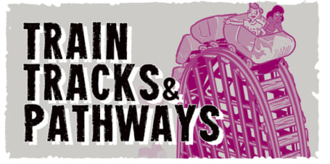
The Etherington Brothers show how drawing train tracks and pathways can transform your drawing! Don't feel held back by correct perspective to create intense warped perspective to create more drama.
Learn how you can draw… or learn how to think when you draw with the Etherington Brothers!
Train Tracks
Train tracks, being made up almost purely of contour lines, can be a great perspective and distance cue within your art.
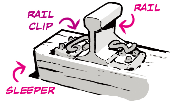
Let’s begin with a quick break-down of a rail/sleeper. There are lots of variations on this, but this is a fairly common set-up.
When drawing straight tracks in one-point perspective, try not to worry too much about measuring exact spacing.
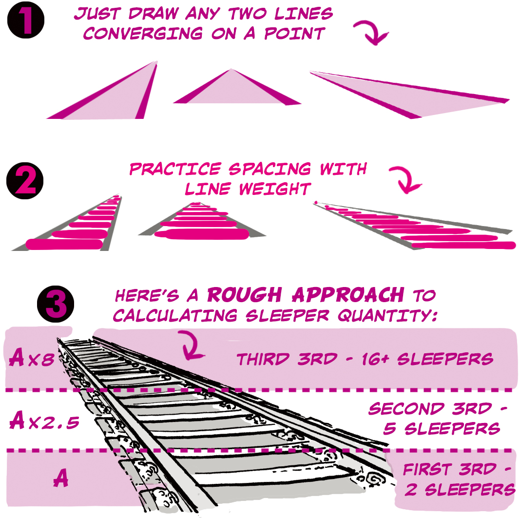
Viewpoint will have an enormous effect on the visual depth you can achieve.
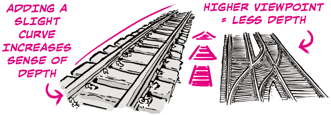
Tracks become far more interesting if we push out of reality and give them a little more life.
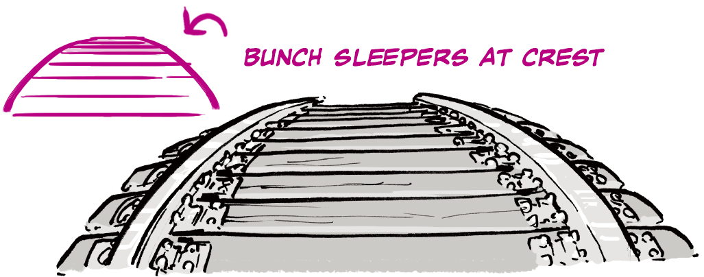
Train tracks don’t really curve much, but we can add more drama by breaking that rule.
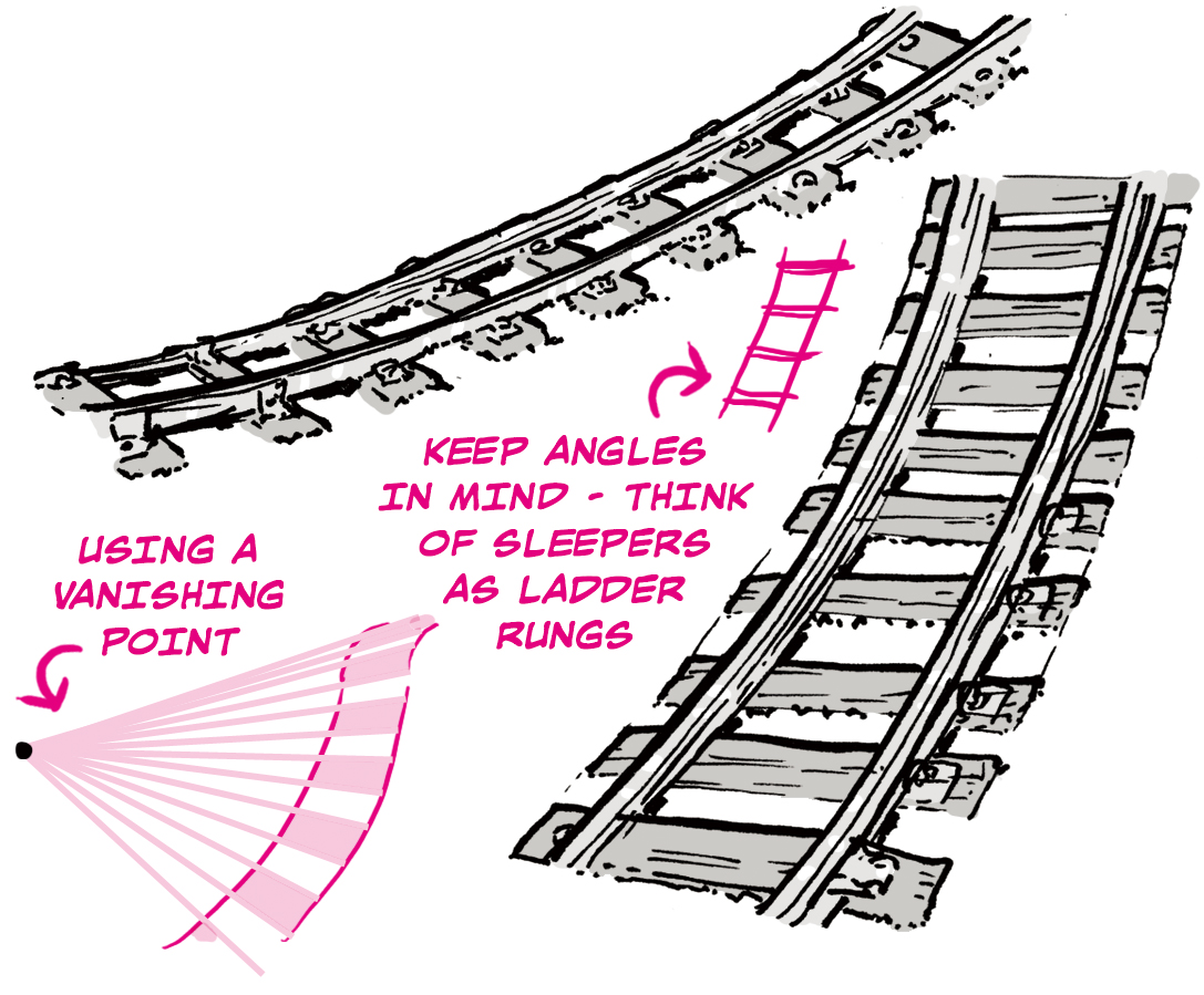
Tracks are based around parallel lines, so it’s easy to add a form-giving twist.
The first approach is with view point:
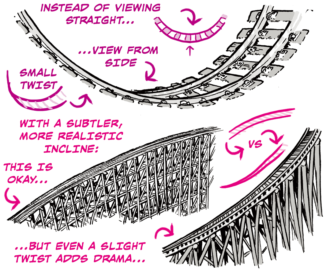
The second approach is to suggest the tracks themselves are twisting:

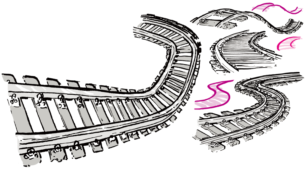
Mix crossovers, exaggerated perspective, and twists.
Pathway
Pathways are an exceptionally useful compositional tool, one of the most effective ways to lead the eye and tell a story.
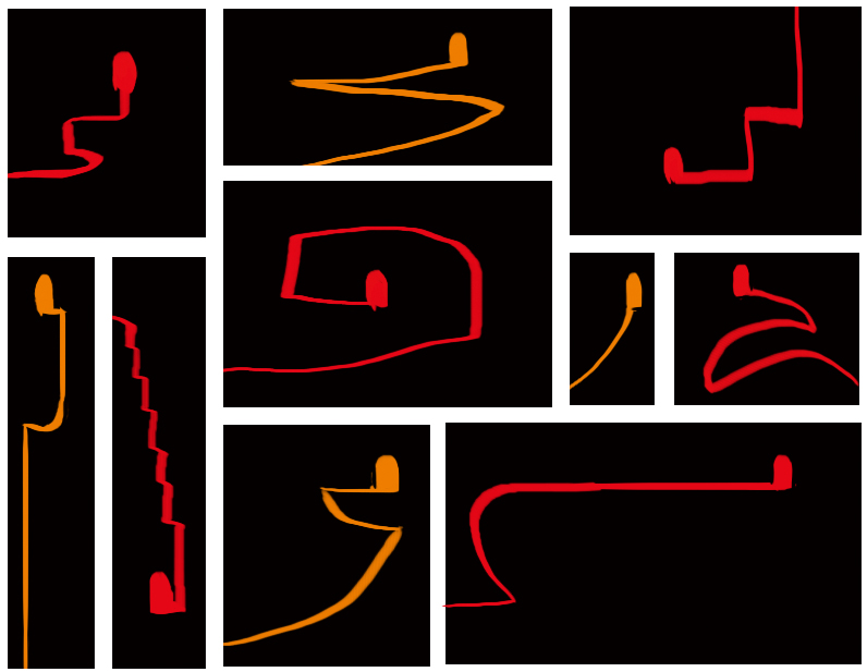
Let’s begin by playing around with dividing a space up with a random line leading to a door.
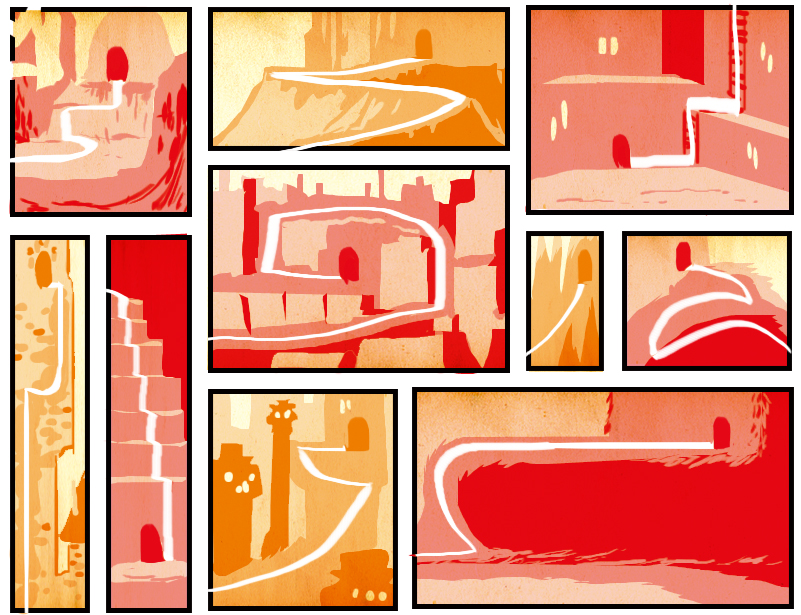
With your random lines and doors in place, try drawing a simple scene around them.
- Now try drawing a random line and door in open space.
- Next draw different random shapes around that same starting point.
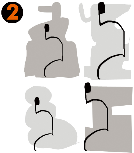
- Sketch up a little more detail.
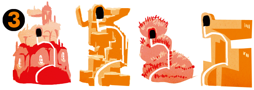
Look! Beginning with a pathway creates instant structure within any design.
Being able to visualise a pathway in three dimensional space from the start will be enormously useful in your layouts.
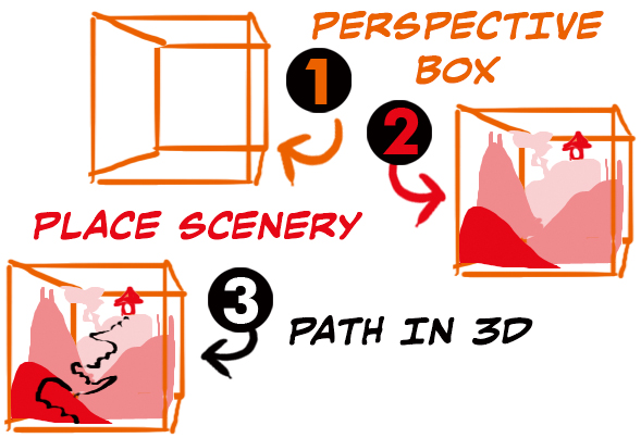
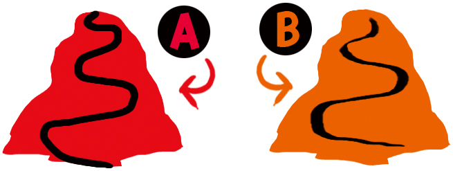
A flat path is affected by perspective just like everything else, and a quick way to show this is simply with thin and thick lines.
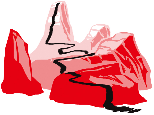
Here’s what happens to your path when viewed from different angles:
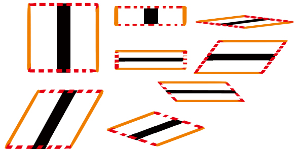
Note that the line becomes thinner when viewed across the horizontal.
Using the above reference, you can see why version B here works better than version A:
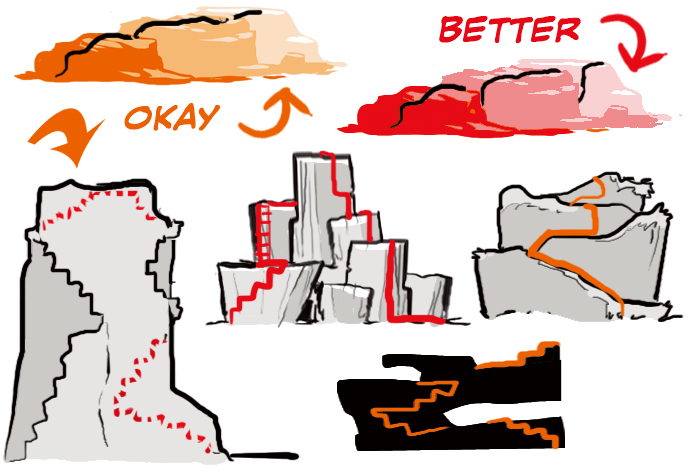
Paths which dip out of sight will not always reappear where you think, so “draw through” to gauge their position correctly.
Using paths as a compositional tool is fairly simple, if you apply some or all of the following ideas…
- Keep the path clear.
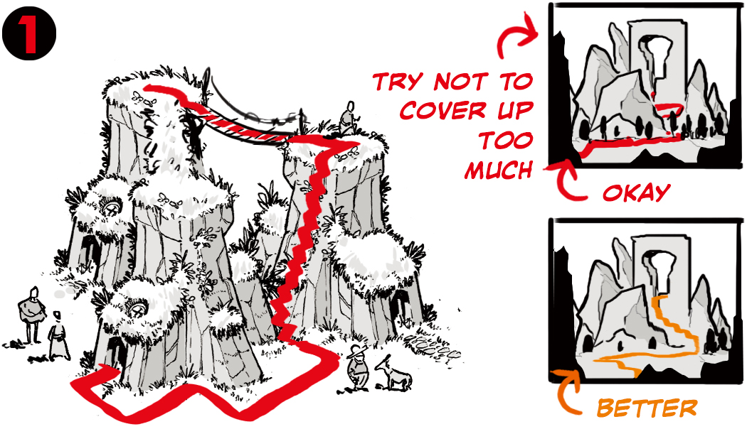
- Path leads to a focal point.
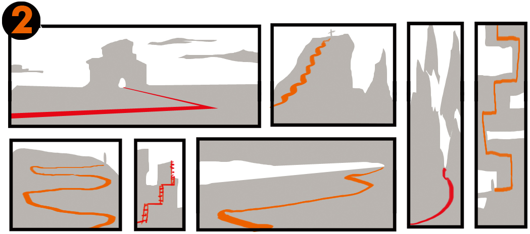
- Path connects levels.

About The Etherington Brothers
The Etherington Brothers are the creators of WORLD’S MOST SUCCESSFUL ARTBOOK & UK’S MOST SUCCESSFUL BOOK of ALL-TIME on Kickstarter. Book-makers, idea sharers. Disney, Dreamworks, etc.
https://theetheringtonbrothers.blogspot.com/


