How to Draw Glowing Effects for Magical Portraits
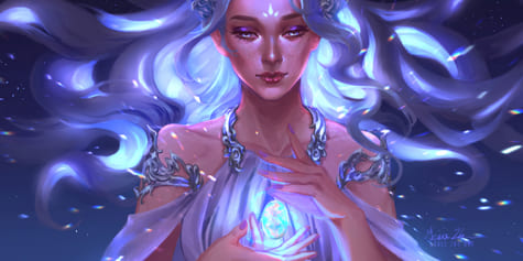
In this illustration article & video on creating luminous effects, Grace Zhu explains layer blending modes & gives color selection tips unique to digital art.
Index
- Intro
- Sketch
- Rough Color
- Lighting Last
- Sketching in Light
- Painting Light
- Detailing
- Special Effects
- Conclusion
1. Intro
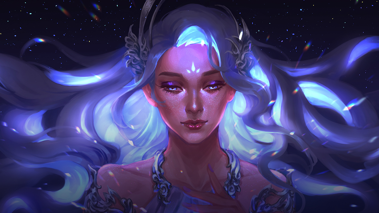
In this tutorial, I’ll be walking you through how to create a magical portrait, starting from the composition to the lighting, then adding spellbinding effects to your portrait. The main focus will be on tips and tricks to make your portrait fantastical and eye-catching.
For this tutorial, I’m using Clip Studio Paint, a versatile software for illustration, comics, and animation.
2. Sketch
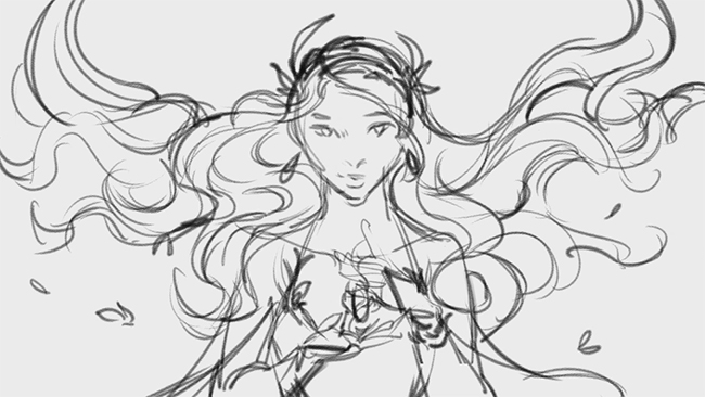
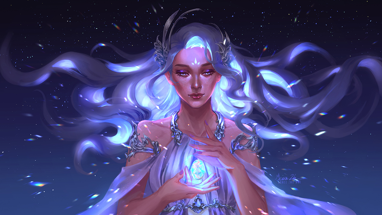
To start, I went with a horizontal composition, mostly because it’s easier to show for a video. Since a horizontal composition emphasizes horizontal lines, in this case, I decided to make the hair one of my main focal points and stretch it out to fill the canvas. I then settled on a symmetrical composition to give a sense of stability, peace, and tranquility. For many people, 2020 has been a tough year and wanted to do something uplifting. All of the curved shapes also help emphasize tranquility and harmony. The choice of flowy clothing and organically-shaped accessories also support this idea. Since all of these agree, it amplifies the intended effect of the composition. I would not add straight lines to a painting like this unless there was a good reason for it.
3. Rough Color
Sometimes I experiment with several color schemes, but I already knew roughly what I wanted for this painting. The gem in the center will be some sort of opal or iridescent quartz, a lot of light blues and pinks.
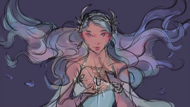
Since I’m centering the character around this crystal, a dark night-themed background will suit it well. The background is a natural night color to support the feeling of tranquility. A different color could be interesting but would draw more attention to the background, which is not what I want in this case.
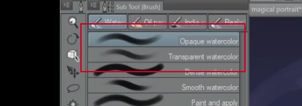
Because this question comes up a lot, I pretty much just use these brushes for the whole painting unless otherwise specified!
4. Lighting Last
It’s not always necessary, but if I’m working on something in an organized way with a particular idea in mind (instead of experimenting as I go), it’s a pretty good idea to separate as much as possible while still respecting the original idea. Painting the light separately lets me focus on just the lighting, experiment with it, and make mistakes in a piece where the lighting is extremely important.
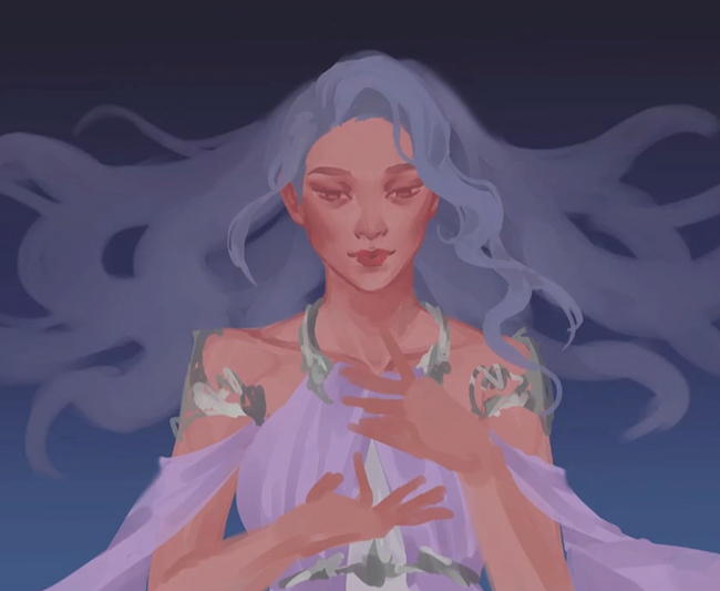
Most of the details at this level are rendered out with a soft frontal light. I keep all the values quite low because the higher values are reserved for the glow. In the color wheel, this is the lower-left area of the triangle.
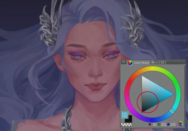
There will be another detail pass at the end. For this pass, the important thing is to have a clean base to work from.
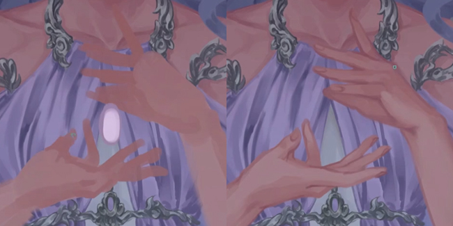
I use a webcam selfie as a reference for the hands. I’ve used this method for a long, long time, and it has never failed me. It is very reliable and a lot less embarrassing than asking a friend.
5. Sketching in Light
I roughly sketch in the desired lighting using an Add Glow layer.
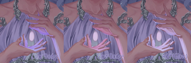
You can experiment with which layer to use specifically (between add and dodge), but I thought this worked best for this piece. Here’s an example of how these can look quite different on the hands, yet still all have the effect of making something look like it is glowing.
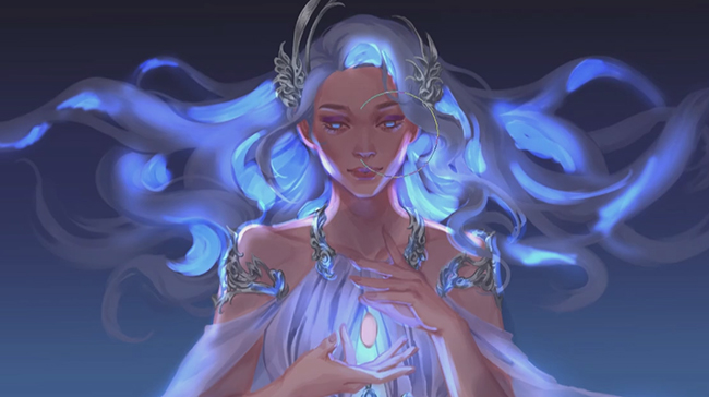
This step is completed on separate layers and very quickly, and once it’s done, the piece starts to come together. If I zoom out and squint, the image is really eye-catching. For a magical portrait, it’s essential to have things glow for absolutely no reason at all. In this piece, I’m defining the glow as the gem and the under part of the hair. This has the benefit of highlighting the magical floating hair, the similarly floating gem, the face, and the hands. I use the lighting to emphasize parts of the image that I would most like the viewer to appreciate.
6. Painting Light
After sketching in light, the next step is to clean it up and make it fit the existing image. Sadly, this takes way longer than simply sketching in the light, but for a painting to look polished, it’s an important step. The key to making something glow is a mixture of hard and soft light. The actual part that glows needs to be very, very bright.
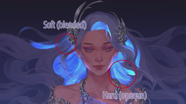
The flat-lighting image from the previous step has less contrast, and all the color values are in the lower half – in other words, they are closer to black than they are to white. I reserve the higher range for the glowing elements. This makes up the hard part of the glow. The soft part is merely taking these glowing light sources and diffusing them into the surroundings. The simplest way is to airbrush everything, but the part that will take the image to the next level is when we pay attention to materials where light is partially blocked, like clothing, hair, and skin.
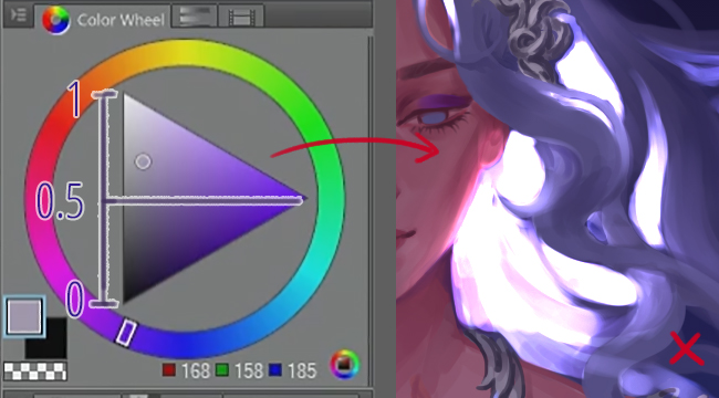
The color I use to paint in the Add (or Dodge) layer is in the lower half of the color wheel value. Why? Well, the Add layer mode adds the value of that layer to all the layers underneath. My layers underneath have values up to 0.5, and if my Add layer is 0.5, then I end up with values up to 1. 1 is the brightest you can go in an image – if your values exceed 1, it ends up being over-exposed, a very common mistake. Once an image is over-exposed, it starts to lose detail that you would have to paint back in later, but it is easy to adjust an under-exposed image’s brightness.
Here’s an example of what it looks like if you paint in the Add/Dodge layer with too bright a color. You can see a lot of the area turns pure white, losing all detail that was there before.
We all know that if you hold up your hand to the sun, it looks super red. Similar phenomena happen with hair and light cloth. I won’t get too technical here, but looking at references for these phenomena and incorporating them into your painting can take an image from good to great. Here I add some red subsurface scattering to the hand.
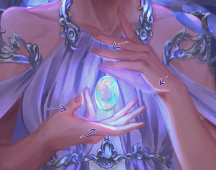
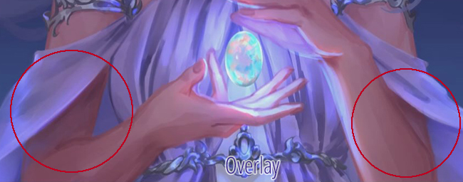
The lighting needs to be clear when you’re zoomed out at this stage, but the details will be fixed later. It’s important to consider how the extremely bright light affects the rest of the scene. The skin will be lit, the metal, cloth. Additionally, the light in the hair spreads out through the rest of the hair as well. Alongside light, it may be necessary to add some additional shadow based on these new light sources. I use an overlay layer to shade places where I don’t think these lights affect as much, adding contrast to the overall image.
7. Detailing
I use the Droplet airbrush to add some stars in the background.
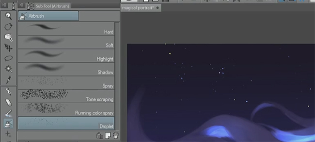
For the face, I zoomed in and brushed on some sparkle with a different airbrush. I continue to paint on Glow Dodge or Add (Glow) layers to add more strong light to the face. Once I’m satisfied, I repeat a similar process for the body and a little on the clothing.
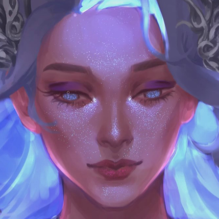
At this point, I also take some time to clean up some details, such as lines and colors that aren’t where they should be. There’s not much to explain here. It’s mostly something that comes from experience. The details make the painting more pleasant to look at over a long period of time.
8. Special Effects
At this point, the image is mostly done – we just need to add the finishing touches.
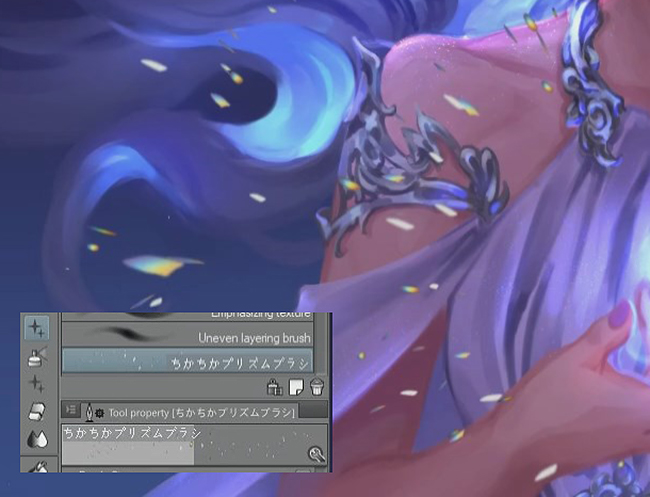
I used this brush (https://assets.clip-studio.com/en-us/detail?id=1752622) from Clip Studio Assets; it has a rainbow pattern with an iridescent look. I use the radial blur to make the effect look like it’s coming more from the middle of the image and set the layer blending mode to Color Dodge to make it look like it’s glowing.
9. Conclusion
Thank you for reading! I hope this tutorial gave you some ideas on how to make your next painting extra magical.
Grace Zhu
https://twitter.com/gracezhuart
https://www.artstation.com/gracezhu
Interested in concept art or what it takes to become a concept artist?
Check out the link below!


