How to Draw Powerful Sword Fighting for Comic panels & Illustrations
Swords can be an effective prop making combat action dramatic & engaging. Use these compositions by The Etherington Brothers to create a powerful sword fight!
Learn how you can draw… or learn how to THINK when you DRAW with the Etherington Brothers!
Physical lines that guide the eye around a page
Sword fights have a unique visual language to them, due to the amazing compositional opportunities created by the bold, straight lines of the swords.
Sword positions can communicate emotion
Swords can also be a vehicle that communicates the mood of a scene or a character’s current feelings.
Swords at Rest
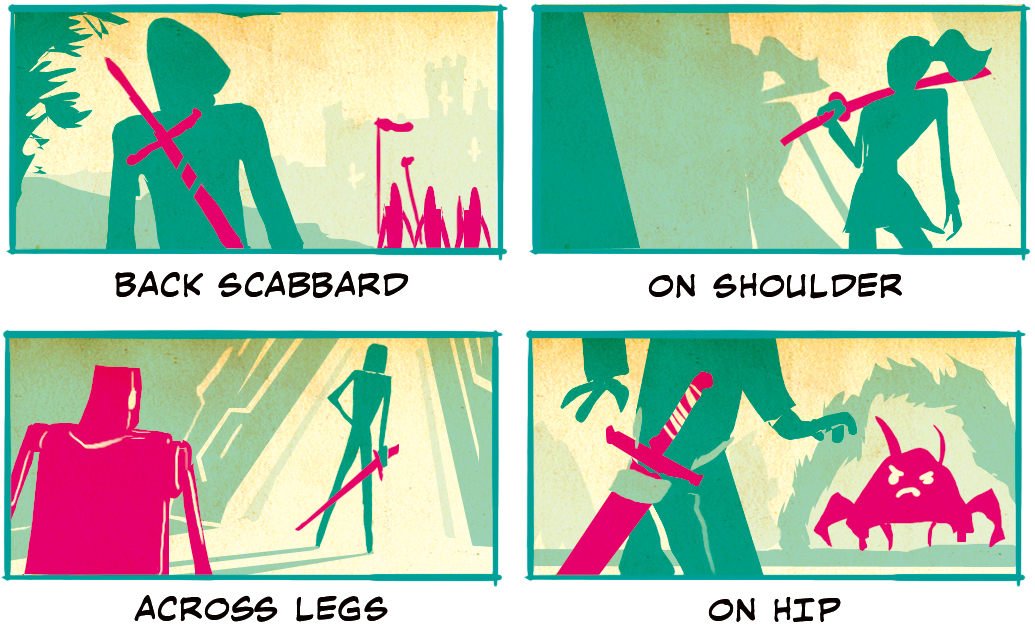
Although it’s tempting to jump right into the action of battle, swords can do a lot of communication while at rest. Tip to the Ground and In Ground give the most passive stance. These characters are ready to fight if needed, but could just be talking as in the former or utterly calm as in the latter.

Panels like Back Scabbard remind us that despite the lack of immediate action, the character is armed and ready. Notice that the sword also points in the direction of the figures in the distance, indicating a possible future connection. On Shoulder is a step in a more offensive direction but still has an air of casualty. This character is probably among allies. Across Legs again inches further. These could be temporary allies. The sword is in a passive position but at the ready, if needed. On Hip is the most offensive of all the panels. It shows a sword and hovering hand at the ready and a shot of its intended target. The message here is clear. Sword, meet monster.
Swords in Action
Now let’s get into the heart of the matter, sword fights! There are different ways to draw swords in action, which we will review below.
Sword Foreshortening
Sword foreshortening allows for dynamic angles in which the whole sword and a good portion if not the entire face and body of the character to be seen. Towards & From Below both have a high emotional impact. We can see the characters face along with the sword, and it’s coming right for us! These kinds of angles allow the reader to jump right into the thick of the battle and briefly experience it.

Diagonal works like Towards but is compositionally different in that it shows a moment in between aggressive actions (e.g., swinging of the sword) rather than a direct jab. This helps move the fight scene along while still keeping the focus on the blade.

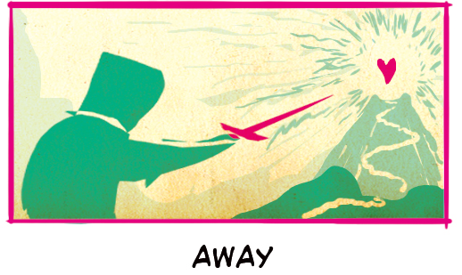
Away is a directional angle that literally points to where the action will occur. In this case, the mountain is where the heart of the battle will lie.
Crosses
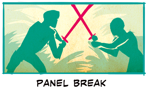
Crossed swords offer a unique compositional form for panels that’s different from other fighting scene options. It can also provide a chance for those crossing swords to get up and personal with each other and even exchange a few words. Panel Break is suitable for this as the tips of the swords aren’t visible, and it lets the audience focus on the characters instead.
Other options include the impactful High Cross and the dominating Horizontal/Diagonal.

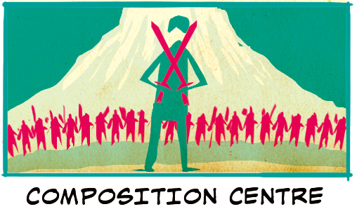
Finally, Composition Centre is a great way to utilize this compositional feature in a different way. It still talks about being in battle, but rather than being in the midst of it, it can be used for preparatory battle scenes that create anticipation while also being visually appealing.
Swords at Right Angles
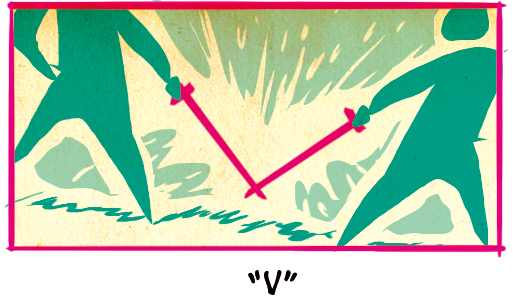
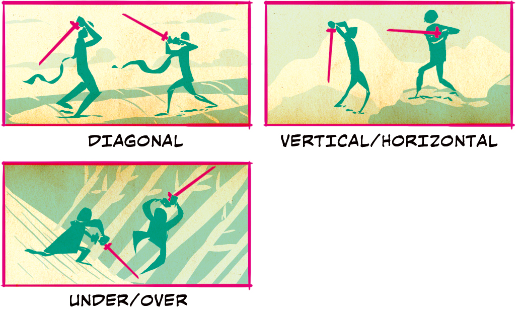
Swords at right angles offer many of the benefits of the other compositions, such as guiding the reader’s eye around the scene from character to character while also providing another fight scene compositional option that is different from other scenes. The V is a form of sword crossing as above, but the focus is on the tips of the blades rather than just the characters themselves.
The other options, Diagonal and Vertical/Horizontal, are good options to show the tension just before a major blow. Under/Over is a good chance to show a camera tilt and a character expertly dodging a swing.
Swords Divides Panel
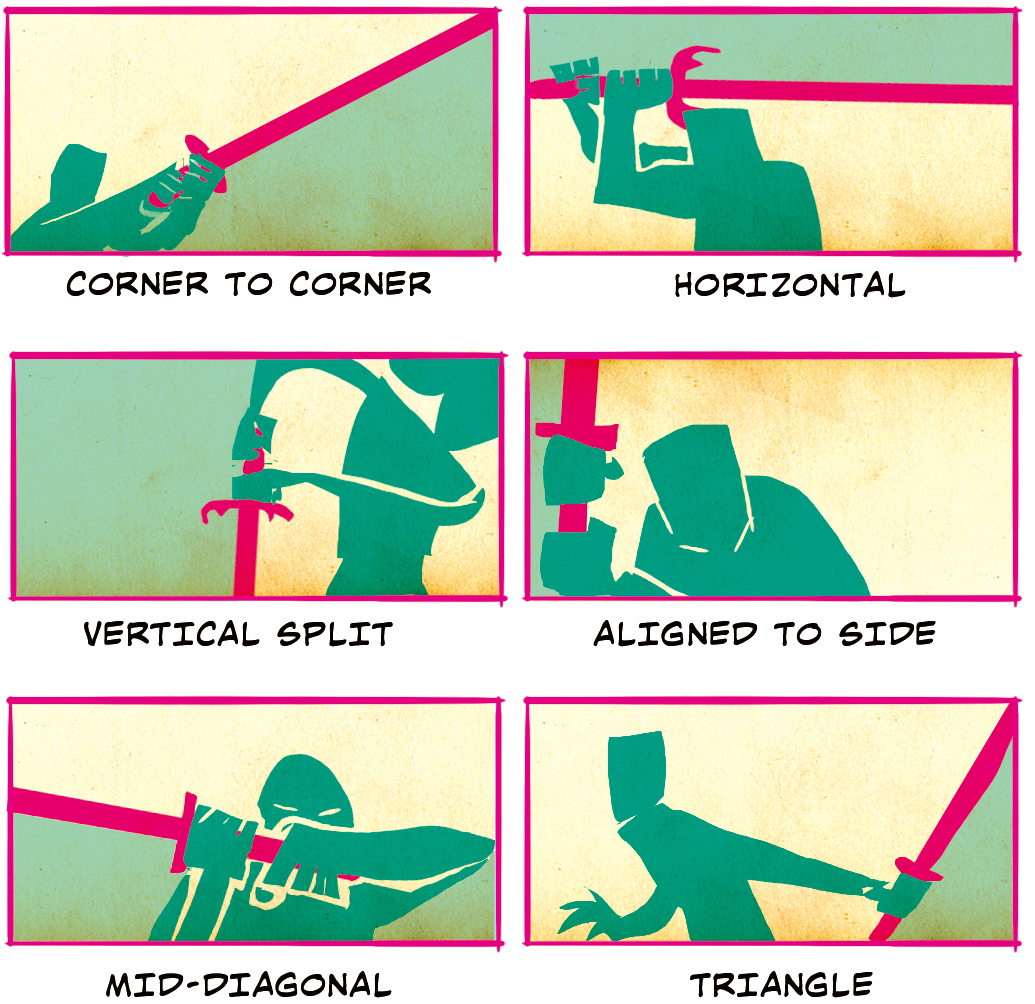
These options are suitable for breaking up the battlefield shots and focusing directly on the character. It’s important that the sword is touching the edge of the panel for maximum dynamism. It’s also a good way to visually connect panels with a strong line. Corner to Corner and Horizontal do this best horizontally while Vertical Split and Aligned to Side do this best vertically. For dramatic shots, nothing beats a Mid-diagonal where the line of sword draws your eyes right into the character’s eye or a Triangle where the character is diving into a fight or finishing a swing.
Continuing Figure Line of Action
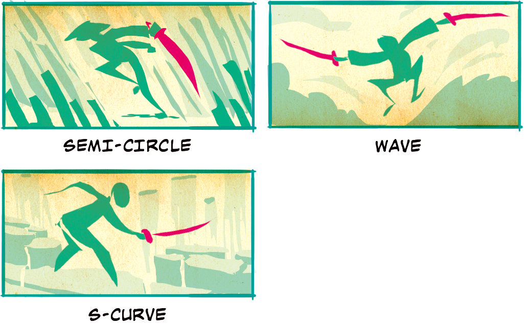
These panel options use the line of action from a figure and extend it through the swords. As compared with the sword in other panels, these swords tend to take on the flexibility of the character following the line as in the Semi-Circle, the Wave, and the S-Curve.
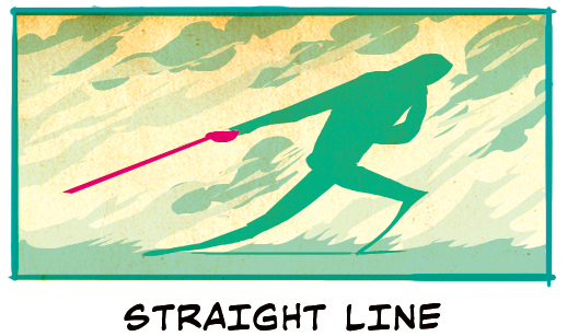
Straight Line is a great option for characters running head-on into the heat of battle!
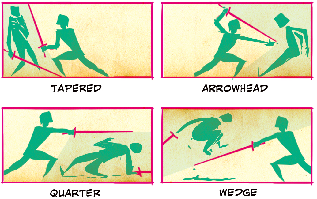
Fit Opponent Into Negative Space
These kinds of compositions are unique as instead of filling the entire panel, we are only focused on fitting the fighting opponent on the defense into the negative space created by the opponent on the offense. Some of these lead to large blank spaces like in Tapared and Arrowhead, and others feel a bit more balanced as in Quarter and Wedge.
About The Etherington Brothers
The Etherington Brothers are the creators of WORLD’S MOST SUCCESSFUL ARTBOOK & UK’S MOST SUCCESSFUL BOOK of ALL-TIME on Kickstarter. Book makers, idea sharers. Disney, Dreamworks, etc .
https://theetheringtonbrothers.blogspot.com/


