How to Draw Pixel Art: A Step-by-Step Tutorial
Want to draw pixel art but don’t know where to start? Dado Almeida, concept artist for games and animation, will teach you how in this step-by-step tutorial.
Index
WHAT IS PIXEL ART?
Before we get into how to draw pixel art, it’s important to understand why it exists and why it is such a popular art style.
Pixel art is the starting point of computer graphics and digital art as we know them today.
Back in the day, there wasn’t a ‘Pixel Art’ style because all art made on a computer needed to be pixel-by-pixel artwork.
As computers evolved, the capability to render images became more advanced, enabling digital artists to create without the limitations of outdated hardware or game consoles.
Therefore, creating art with these limitations in mind is the core of pixel art as an art form.
While no longer a necessary approach, forcing yourself to draw within the boundaries of an old technology or set of techniques can help you as an artist.
Below are some examples of my exploration of pixel art.
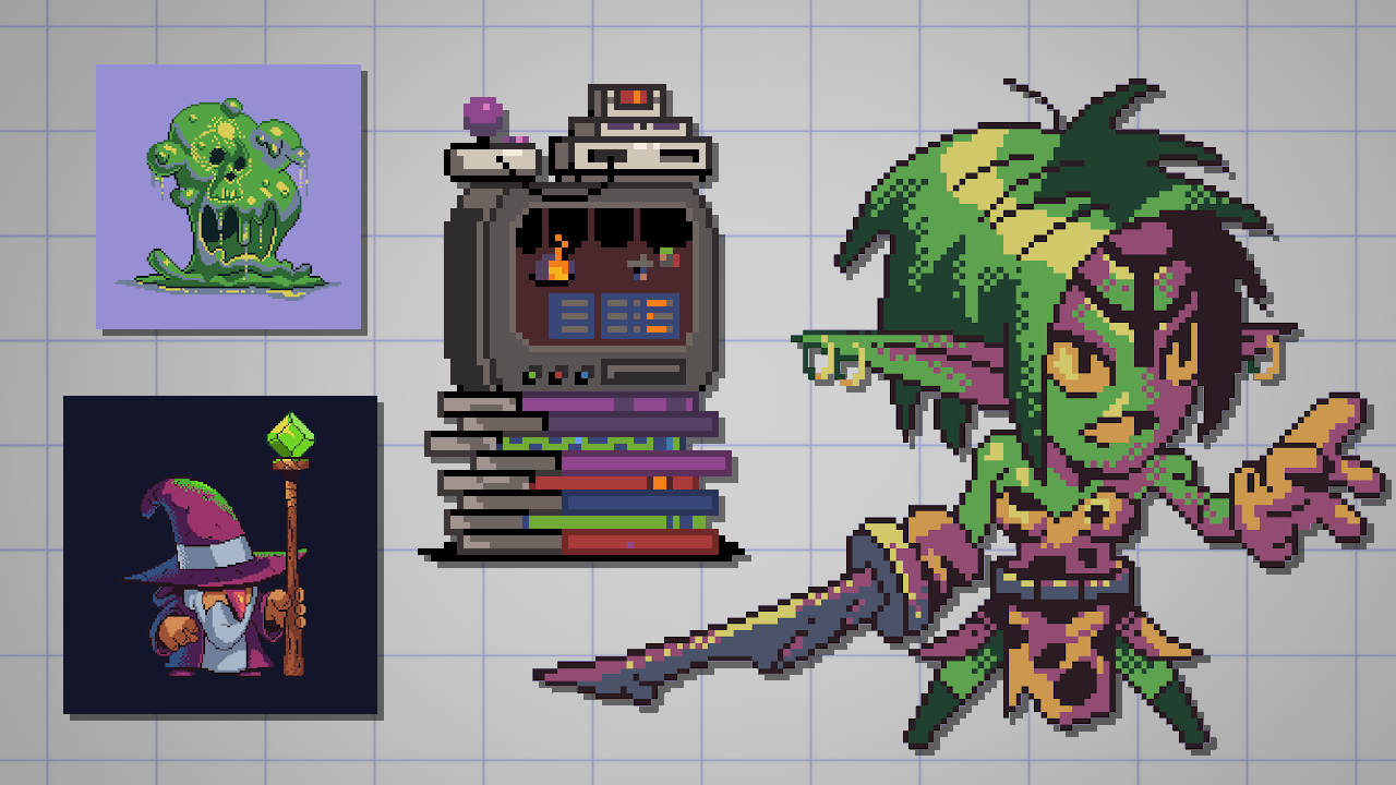
In this article, I’ll highlight some characteristics, basic techniques, and guidelines so you can start making your own pixel art drawings.
All the information here can be applied to any ‘style’ and any software. And that’s the beauty of this subject.
The technical side of this art form is important, especially if you want to make an homage to a video game.
But remember that you don’t need to force yourself to create a 32×32 pixel size artwork with only 3 colors, if you don’t want to.
It’s beneficial to respect the fundamentals and the techniques of old-school digital artists – but it’s not obligatory to work like them.
BEGINNER PIXEL ART EXERCISE
For this article, we’ll work on an approachable challenge.
I want you to create a 64×64 pixel portrait.
That’s it! This is an easy pixel art project.
You can draw yourself, make a fanart or invent a character.
The goal is to create artwork that can be used as a social media avatar.
Start with a small (resolution) file size so the pixel unit is visible. There’s no point in making pixel art where the pixels aren’t evident.
PIXEL ART SET UP FOR YOUR CANVAS
For this article, I’ll be using Clip Studio Paint.
While there are great dedicated tools for making pixel art, Clip Studio Paint is a good example of a modern standard graphics software.
This approach can be easily copied in other drawing apps. So follow along in your app of choice!
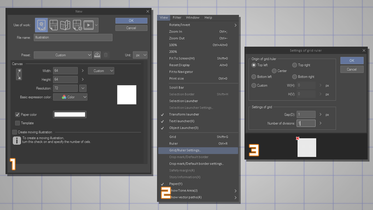
- Create a 64×64 pixel document (1)
- Go to View > Grid/Ruler Settings (2)
- Configure it with the following so you can see a grid with every single pixel. You can turn the grid on/off anytime using the Shift+G shortcut. (3)
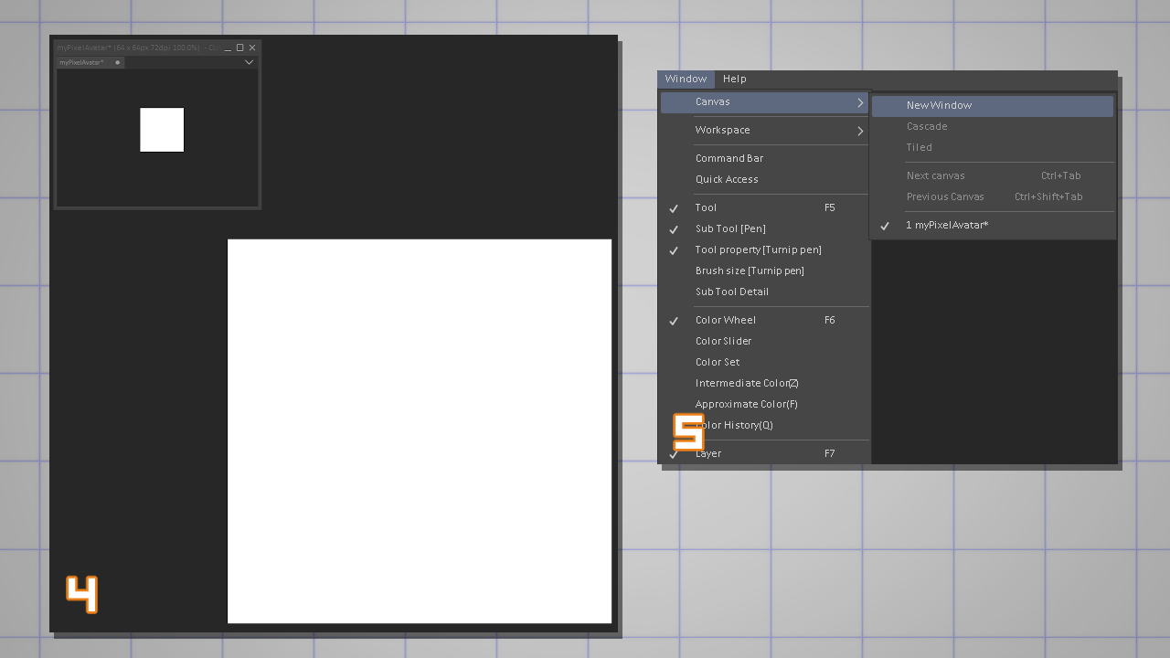
- A good practice for working with pixel art is getting used to drawing zoomed while keeping an eye on the actual-size artwork (4).
- To create a secondary view of your current canvas, go to Window > Canvas > New Window and open a new instance of the current canvas.
Set it to 100% and place it in your workspace (5).
MAKE A PIXEL ART BRUSH
Time to introduce a basic concept.
Pixel art does not work well with automatic anti-aliasing.
Anti-aliasing is a useful algorithm that smooths the edges of a shape.
This is made by adding an extra row of pixels closest to the aliased edge.
As you can see in the example, the anti-aliased edge (7) has an automatic gradient of pixels to give the shape a smoother contour.
The aliased edge (6) is what we’re looking for when creating pixel art. Later, we can soften the edges by adding anti-aliasing by hand (manually).
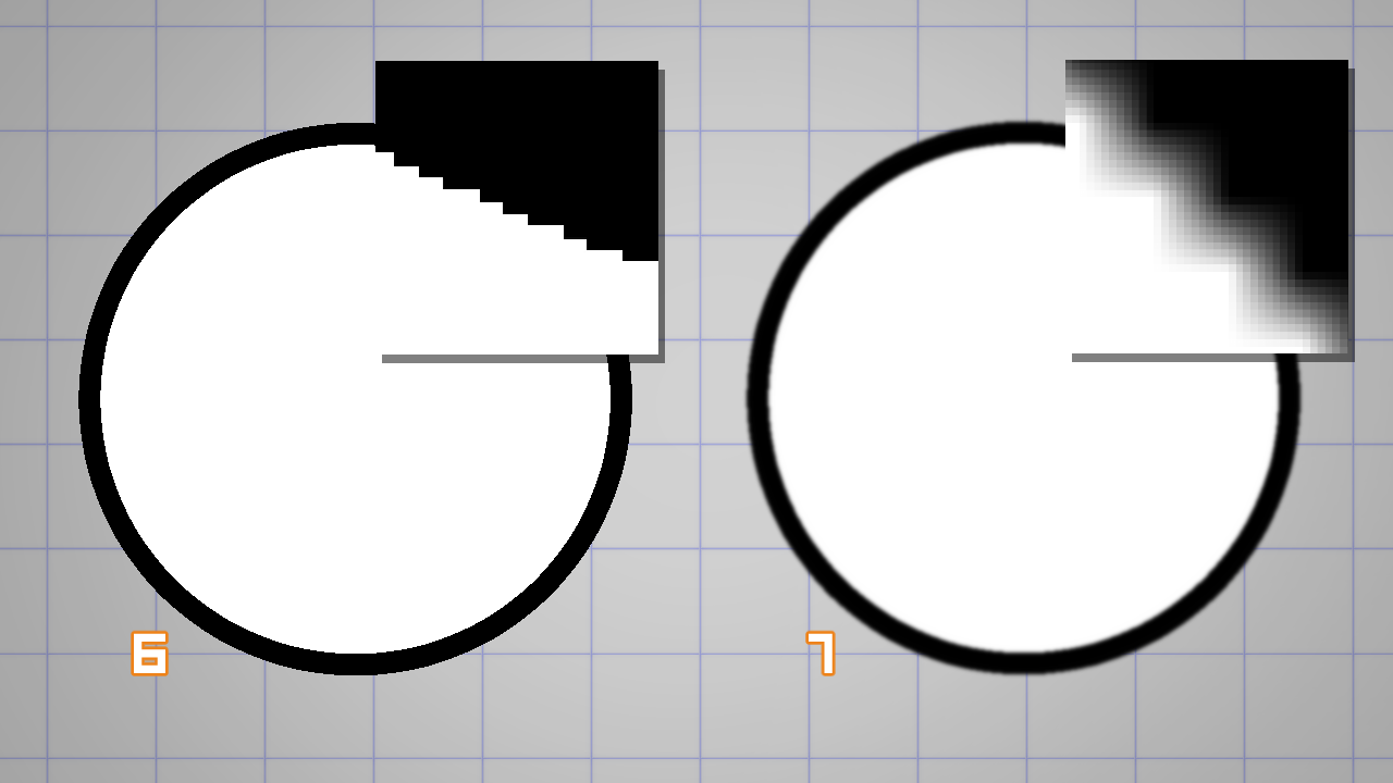
A rule of thumb when using any software to create pixel art is to disable the anti-aliasing setting in brushes, tools and transformations.
In Clip Studio Paint you have to turn off anti-aliasing in the following:
- Toggle the anti-aliasing setting in the Brush Tool Property (8)
- Toggle it on/off with the checkbox for tools like Selection, Fill, Text, eg. (9);
- Choose Hard edges under Interpolation method while using Edit > Transform (10);
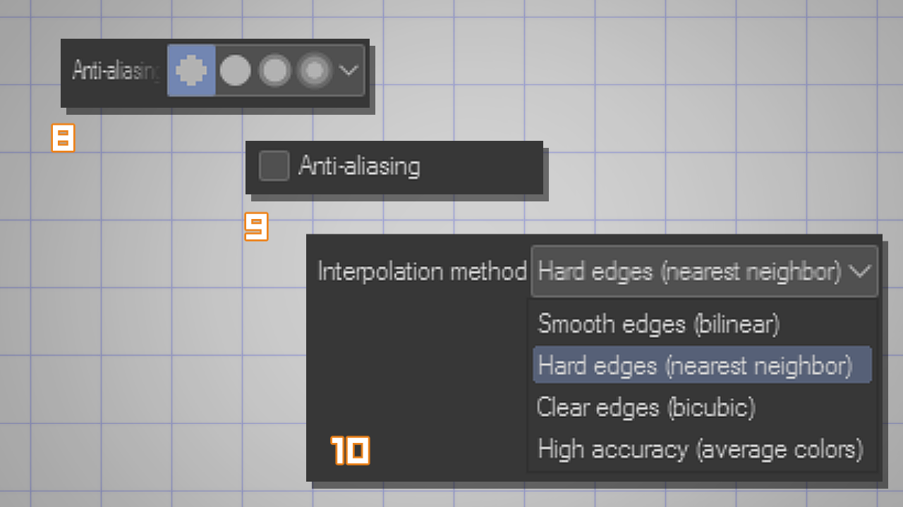
One great thing about Clip Studio Paint is that it comes with a pixel art pen. It’s called ‘Dot Pen’ in the Marker category (11).
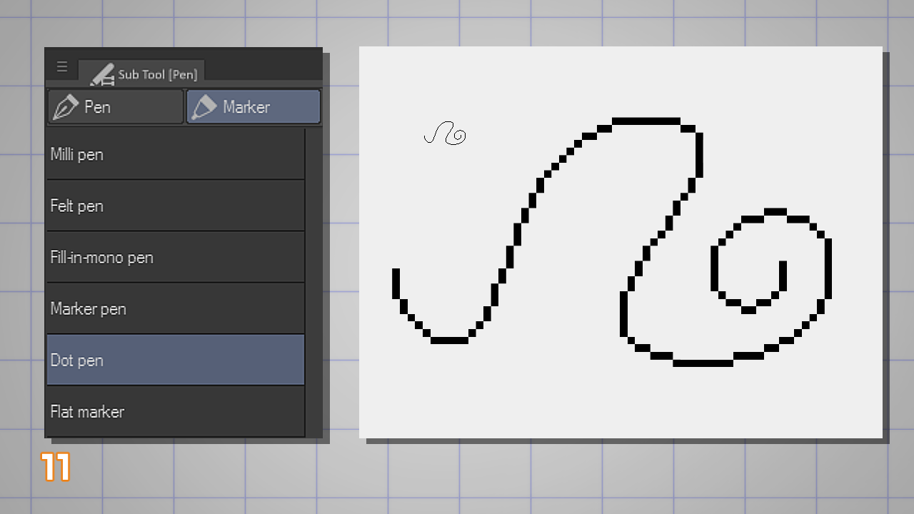
This is the simplest drawing brush available. It has a fixed 1-pixel size, anti-aliasing turned off, and no option for stabilization or color mixing.
I suggest you follow this tutorial using this brush only.
Later, you can duplicate any of your ‘common’ brushes and use them for pixel art (as long as you reduce brush size to lower values and disable anti-aliasing).
DRAWING THE LINEART
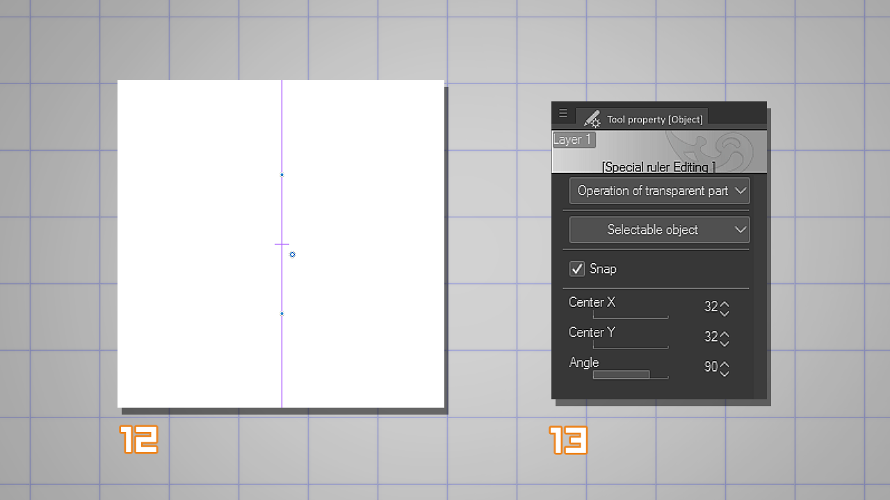
Since this will be a front-facing portrait, I’ll start the drawing using the Symmetrical Ruler (12).
Place the Symmetrical Ruler on the Canvas and, to make sure it’s on the dead-center, use the Object tool > Tool property to input values manually (13).
In this case I changed the Center X and Center Y values to 32, which is half of my total canvas size (64 pixels).
Now, select your Dot Pen again and start drawing.
Since this brush can’t be resized, it’s a good idea to zoom in on the canvas you’re drawing (15) and use the duplicate view as a reference (14).
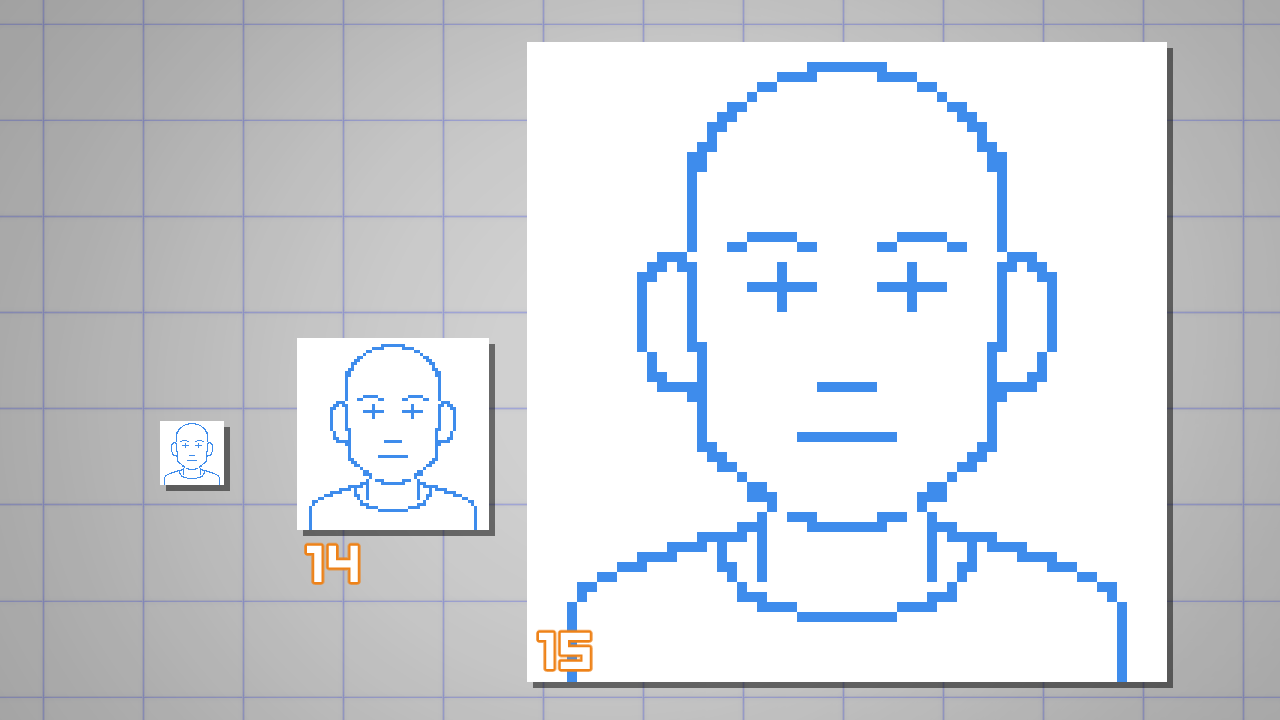
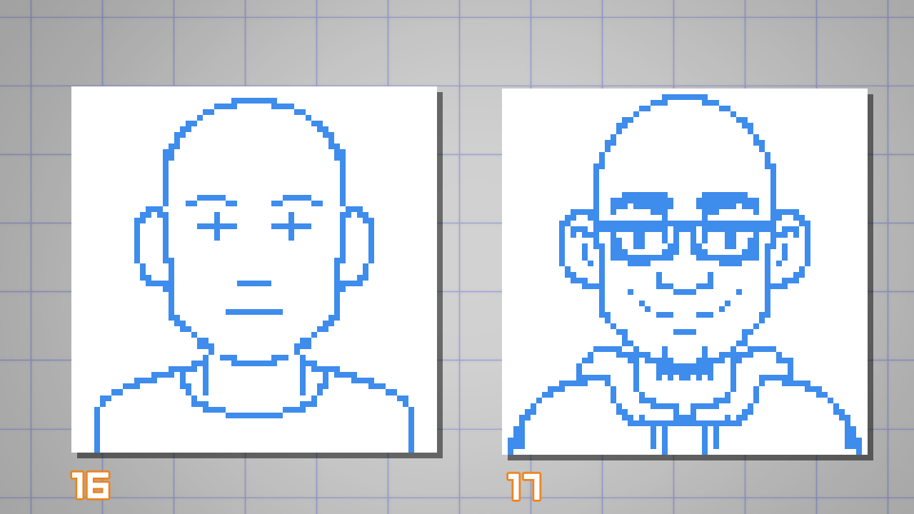
I started my portrait by drawing an initial sketch to find the construction of the head (16) and then I started adding details (17).
There’s no need to use a blue color. I just prefer it because it helps my brain understand that I’m creating a rough for my final drawing.
Once you’re done with the sketch you can proceed with the linework.
Before adding the final lines, let me show you a simple technique for drawing lines and curves in pixel art.
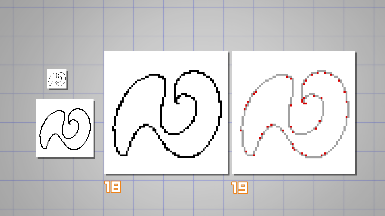
In the example below, the linework (18) doesn’t look smooth because there are a lot of duplicated pixels where it should be a single-pixel line.
You can fix those ‘doubles’ (it’s a term) by removing any adjacent pixels on the curve. In the example (19), I removed all pixels marked in red.
I suggest you return to your sketch and look out for those ‘doubles’ to clean your linework.
Do not worry if the curves don’t feel right. Just remove the unwanted pixels.
TIP: If you need to erase a pixel, you can simply switch to the transparent color while using the Dot pen (I have my shortcut set to X);
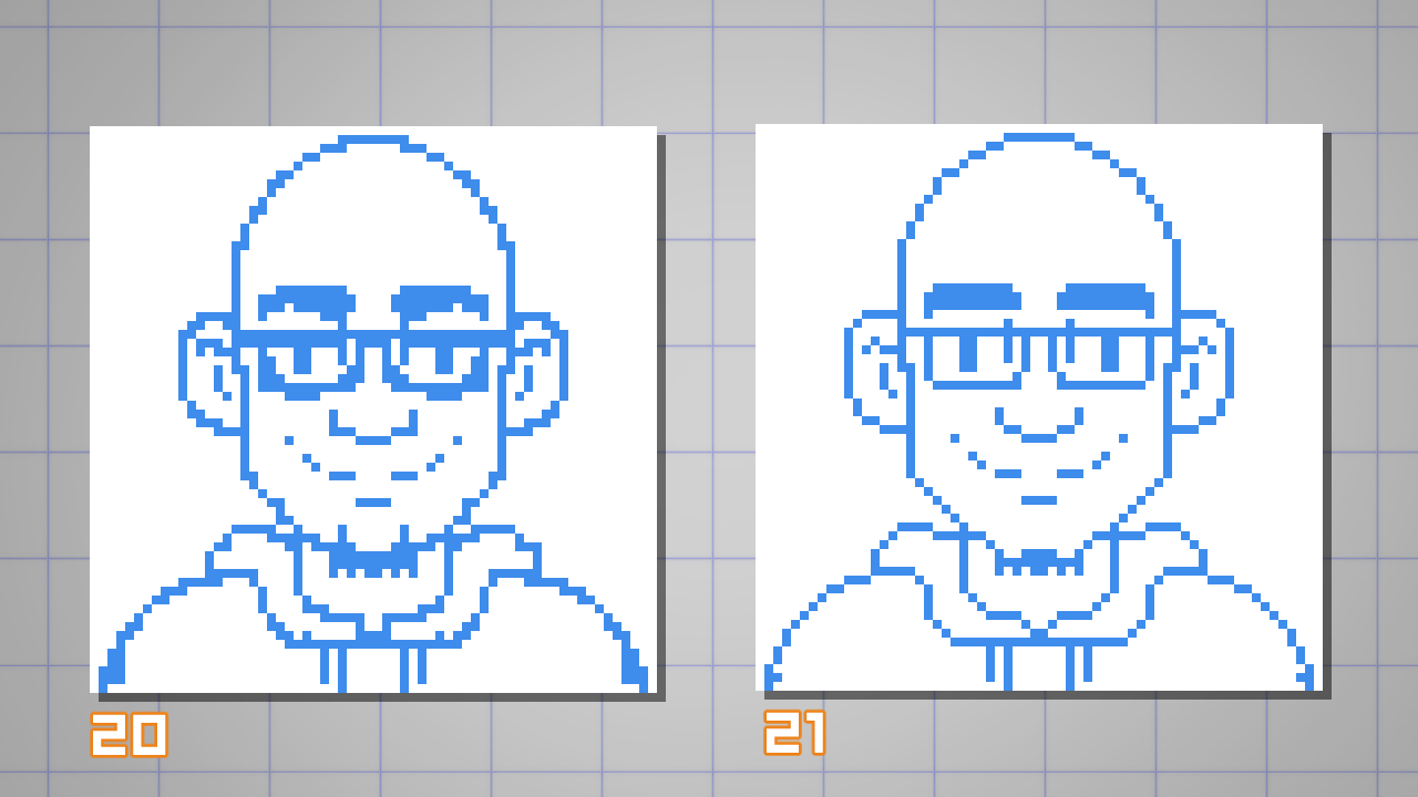
In the example below you can see the difference between the initial sketch (20) and the cleaned-up version (21).
Ready for another technique?
Let’s start fixing the drawing and adjusting some curves.
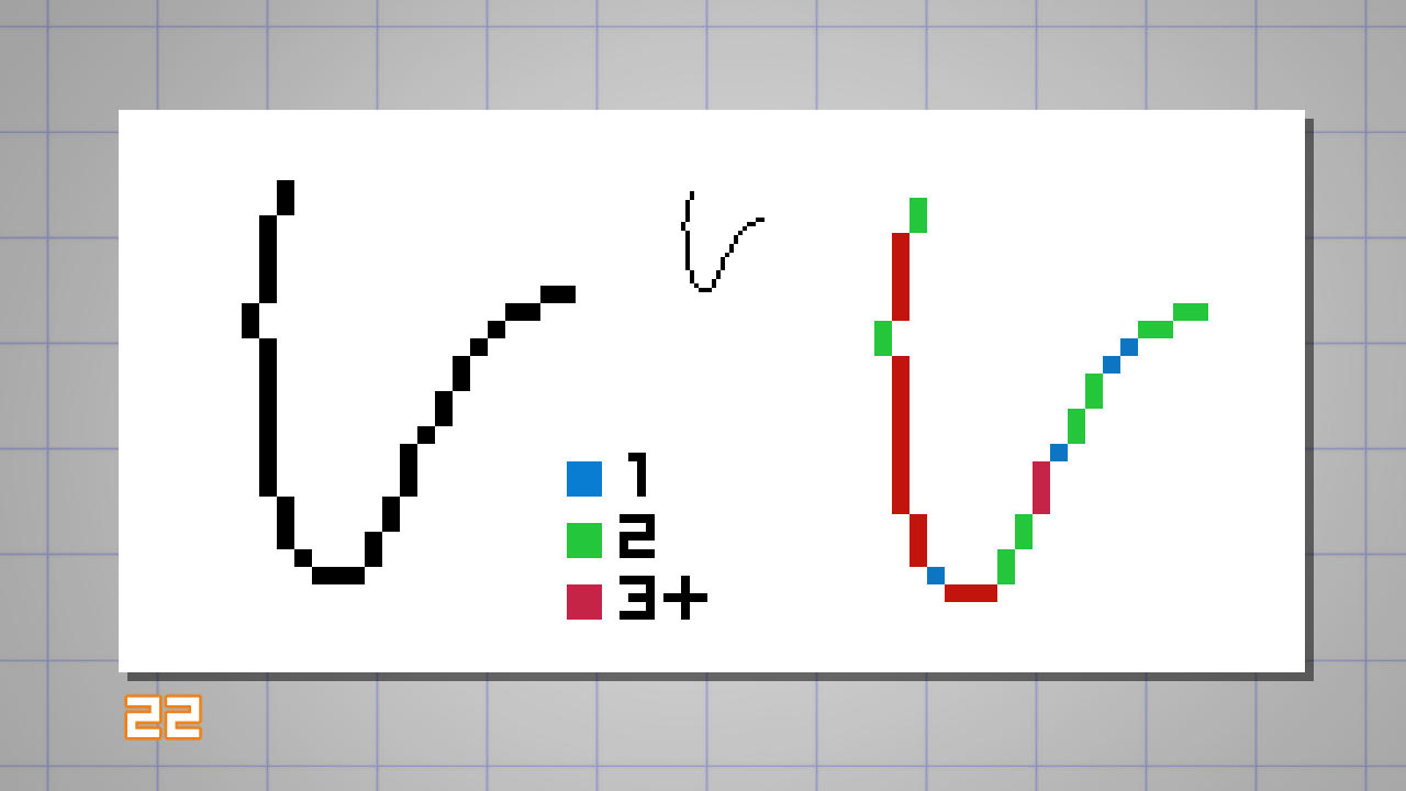
Seeing the example below (22), you can notice that the distribution and spacing of pixels do not follow a logical progression. (eg.: 3, 2, 1, 4…)
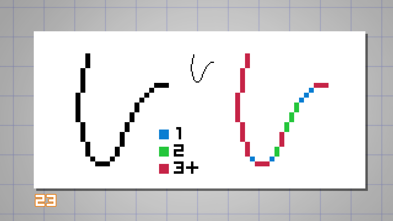
While on this improved version (23), you can see a better progression of pixels to create the curve. (eg.: 1, 2, 2, 3…)
With that knowledge, I suggest you try the following exercise before continuing with your drawing:
Try to draw some random lines and curves with the two concepts you just learned so far: remove the doubles and maintain the ‘pixel progression’.
This will give you a solid grasp on contouring shapes in pixel art.
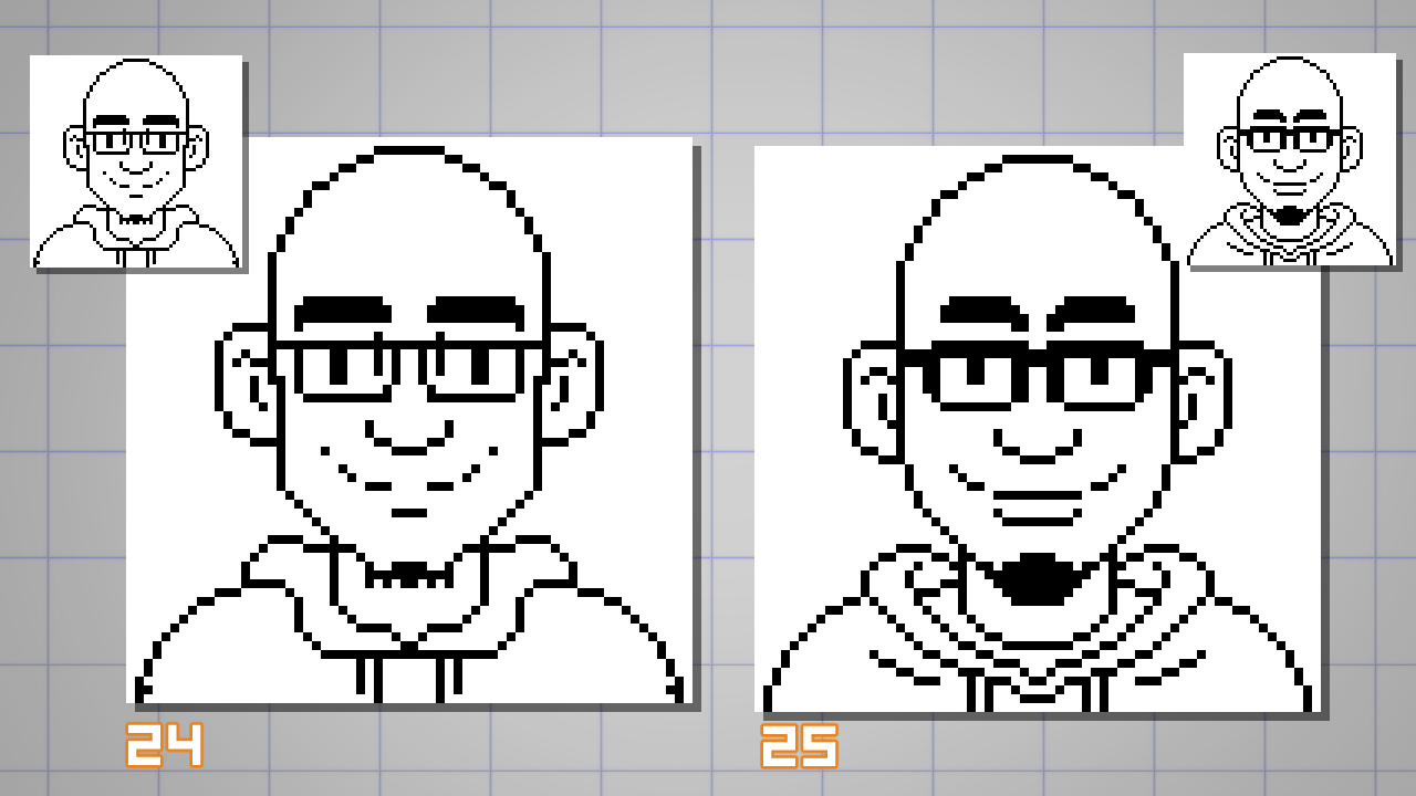
Below is my final linework (25).
I made some minor adjustments to the proportions and curves, removing unnecessary pixels to make the face more readable.
Take some time to compare with the original version (24) and notice where I applied the techniques.
COLOR YOUR ART WITH COLOR PALETTES
The number of colors used on a sprite (a term used to describe an object in game development) depends on how much you want to stay close to a specific limitation of an old technology.
While not necessary, you can learn a lot about pixel art by limiting yourself to a small number of colors to choose from.
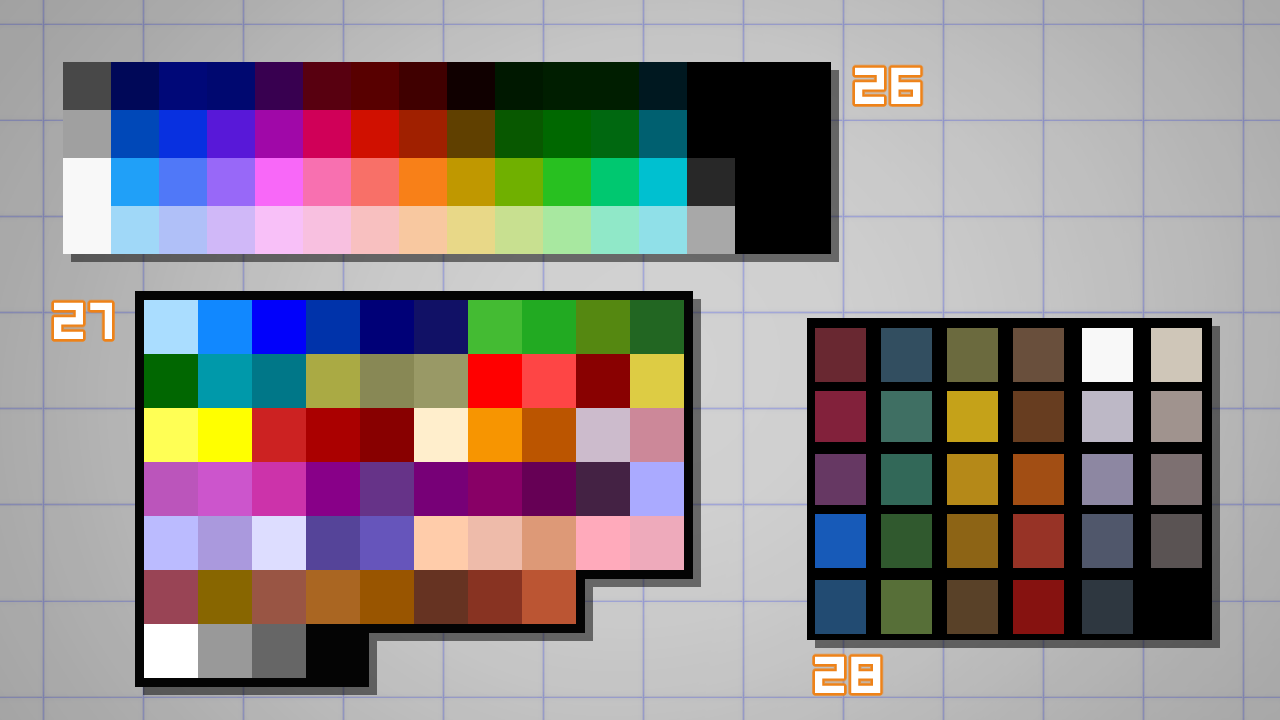
For now I suggest you start with an easy color palette. As a starting point, you can use the 56 colors of the palette used by the NES (Nintendo Entertainment System) videogame console (26). This will allow you to replicate the video game pixel art style.
The color and tone choices on this palette could be better, but they provide a good starting point.
In the examples below you have the PC-98 computer color palette (27) and a personal one I built in the past (28);
Later you can start building your own palette, but always remember to keep it tight and simple.
I start by filling my lines with some base colors (flatting).
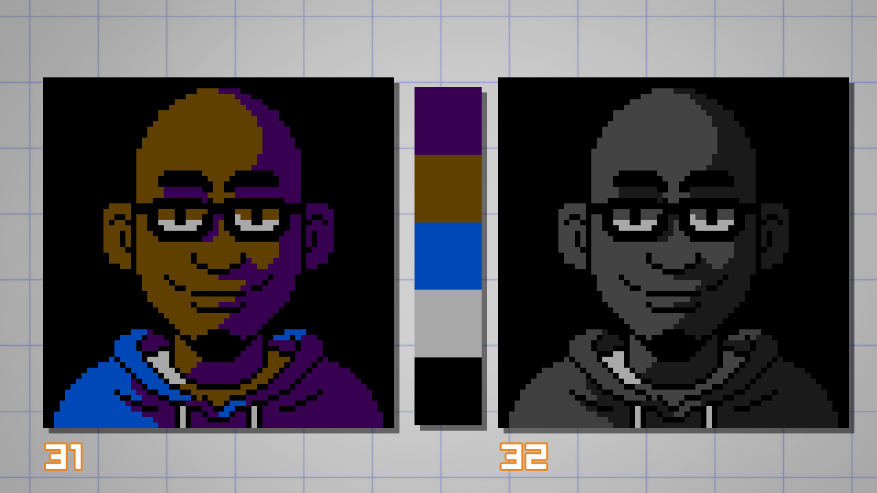
I’m starting with 5 initial colors, including the black linework to paint this portrait (29).
At this stage, remember to configure your Auto Select and Fill tools for the pixel art workflow, disabling Area Scaling and Anti-aliasing (30).

To shade (add shadows) the skin color on the portrait, you don’t need to use only the darker value of a specific color.
I can potentially use any color available as long as the values read correctly.
Here’s a tip – Create a new layer on top of your layer stack, fill it with black and set the layer blending mode to Color.
Now you can use this layer to check the value relationship of your colors (32).
In the example, you can see how I managed to use the old background color (purple) as the shade color of my brown skin (31). I prefer to go with a black background to save one color…
Again, I don’t need to – but I’d like to exercise these limitations imposed by the NES color palette.
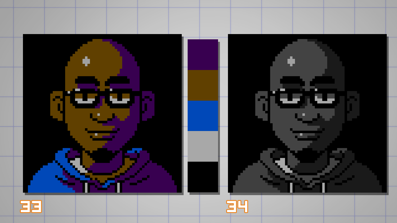
For the highlights on the skin and glasses (33), I don’t need to introduce any new colors because, while checking the grayscale values (34),
I noticed the color of the T-shirt could be used for that.
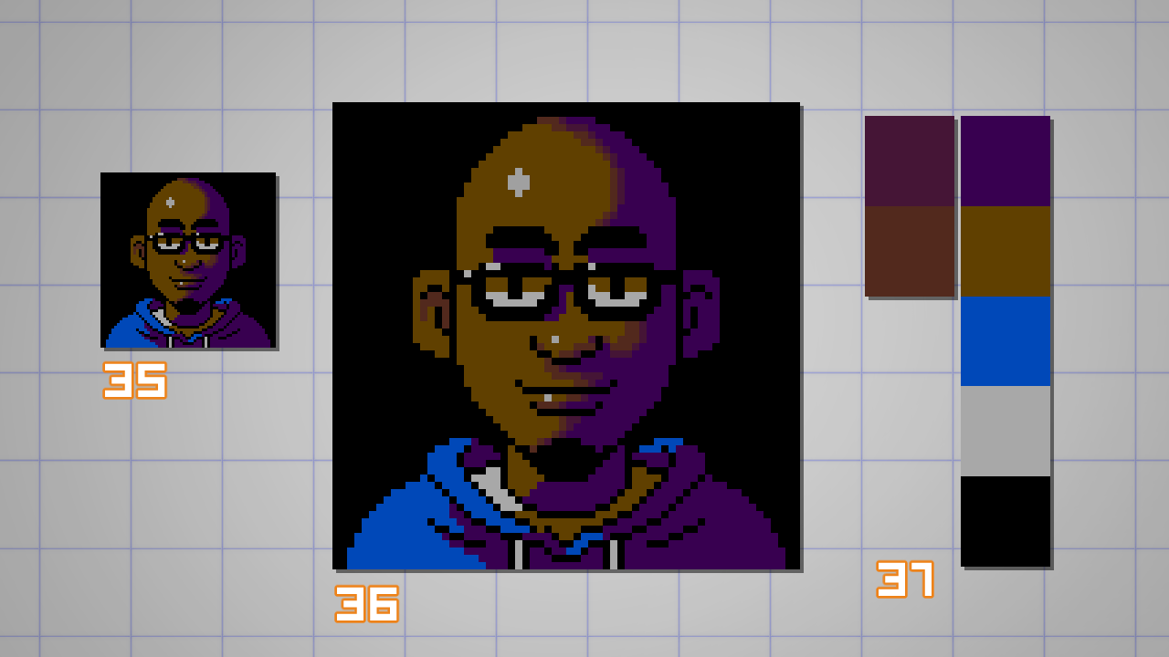
I wanted to add some manual anti-aliasing to smooth the border between the lit and shadowed areas of the skin (36).
Using the NES palette only, I could not find colors that I could use to create this gradient transition.
So here’s where I abandoned the ‘virtual limitations’ in favor of the artwork.
In the example I added two new colours (37), so I can add more details to the shading.
I can’t stress this enough, but it’s really important that you make these decisions while looking at the artwork through the real, not zoomed-in, canvas size (35).
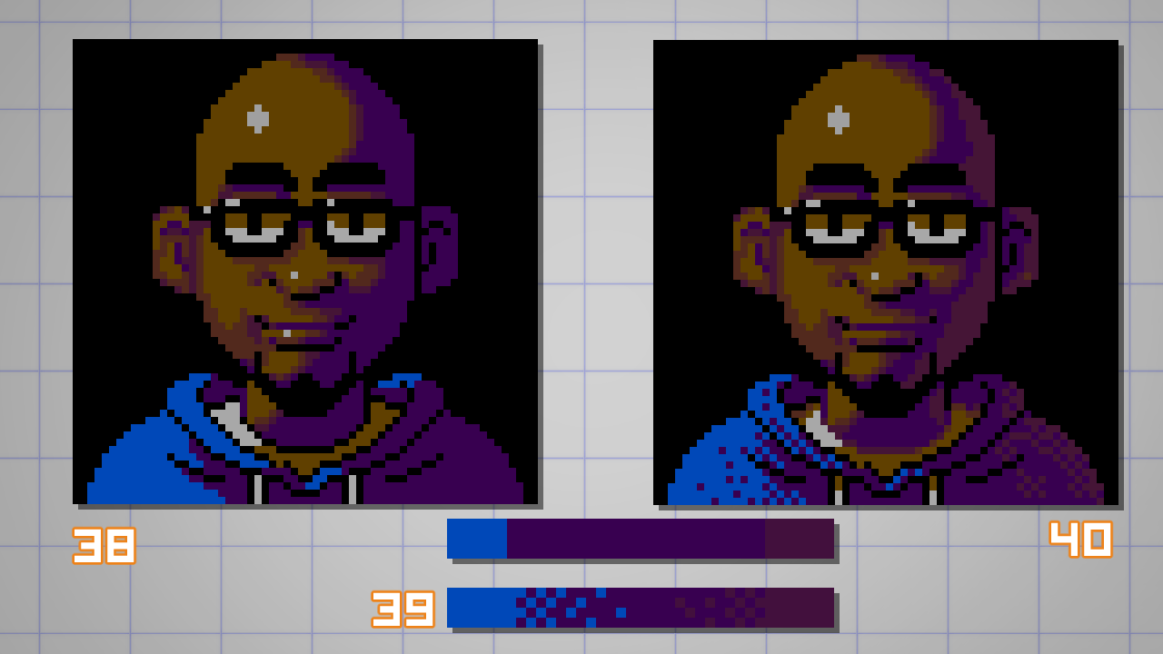
Using the two new extra colors, I increased the rendering on the face adding more volume, wrinkles (‘cause I’m getting old) and softening some shadows on the lit side of the portrait (38).
On the blue jacket, I decided to use the dithering technique to create the sensation of a gradient without adding colors (40).
By breaking up the solid transitions on a checkerboard pattern I can make the illusion of an in-between color (39).
Dithering is an advanced technique and this is just a basic usage of it.
As you can see, the effect creates a textural effect that can be problematic if used on skin or smooth surfaces.
I found it appropriate to use in the jacket (made of cloth), because I can benefit from the rough texture.
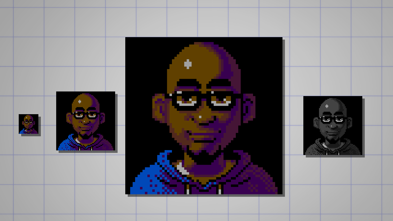
After some tweaking, I managed to paint the portrait fully.
I’m very happy with the final result because I was ablt to fit a lot of details into a 64×64 pixel artwork with only 7 colors.
ps.: I also had enough pixels and colors to fix those weird-looking cartoony eyes. X-D
EXPORT YOUR PIXEL ART MASTERPIECE
Last, but not least…
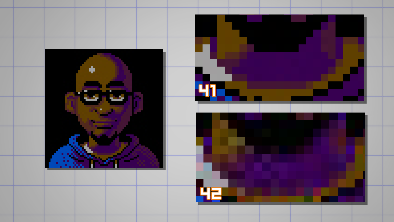
When saving and exporting pixel art, use the GIF or PNG format.
Avoid using the JPEG format, especially with any level of compression.
This will destroy all the love and care you used to create your pixel art.
Look at the examples below: a 99% compressed JPEG (41) may look okay from a distance, but it adds some unwanted colors.
An 80% compressed version (42) will make any pixel artist bleed. So please, don’t do that. 🙂
When it comes to posting on social media, you have to deal with the automatic compression of the platform.
For Instagram, you’ll have no option because the system automatically converts and resizes the image to a low-quality jpeg.
On Twitter, you’ll have a sharper, almost perfect image if the exported file is 506 pixels wide in PNG format.
That’s it.
I hope you enjoyed this tutorial and that you had fun creating your first pixel art drawing.
Below you can find my minuscule, yet incredible, piece of art. 🙂

If you create yours, please let me know.
This tutorial was on how to make pixel art in CSP, but you can use a simple, single dot brush in Photoshop, Procreate, Ibis Paint, or any other app to follow this tutorial as well.
– dado
Artist Profile
Hi. I’m Dado (Dadotronic) Almeida and I draw and paint 90’s-videogame-inspired art. As a freelancer artist I create concept and production art for games and animation.My indie career is devoted to personal projects like Claws and Tusks (comic) and artwork that I make for fun or commissions. I also like to teach and share my discoveries about digital art, computer graphics, and mental health for artists.
https://dadotronic.com/
https://twitter.com/dadotronic
https://www.artstation.com/dadotronic
Interested in character art & design or what it takes to become a character designer?
Check out the link below!


