Pro Artist’s Guide to Comic & Manga Layouts, Paneling, Flow
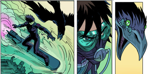
Learn pro artist Steve Ellis’s secret to impactful comic layouts! Master paneling and page flow for smooth, engaging storytelling for comics and manga.
Index
How to Use Comic Panels to Create a Story
As a comic artist, I have come across many different ways to tell a story. A good story needs pacing, flow, and balance. When composing a comic or manga, this balance can be achieved through character movement, character acting, or how and where we choose to begin/end scenes and sequences. But one of the most overlooked tools in storytelling is the panel or frame, and its silent partner, the gutter.
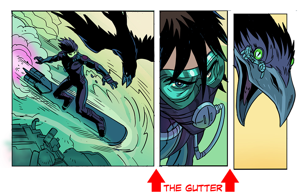
The panel is the border that wraps around a single moment or scene in a comic or manga. Its job is to contain an illustration that puts forth an idea, shows action, or moves the story forward in some way. Usually, the contents of each panel are a complete thought, but sometimes that thought can fill a whole page or be as short as a single speech bubble.
Beyond its contents, the panel is a storytelling tool by itself. By containing that idea or scene, it is separating that idea from the one before and after it. It’s literally a wall that says to the reader “here is a complete idea, read it and move onto the next.”
What to consider for your comic or manga layout:
There are tons of comic layout examples and manga panel templates out there, but they may not always suit the story you want to create. Whenever you are drawing panels for comics or manga from scratch, consider these questions:
-
-
- What are the beginning and endpoints of the page?
- What needs to happen between those two points to tell the progress from beginning to end?
- How many steps will tell that progression best, and what needs to be included in each step?
- In what way can I translate those steps into comic panels or frames?
- How do I expect the reader to move from one panel to the next?
- How does the last panel lead to the next page?
-
Thumbnailing Your Comic Layout
Begin with thumbnails to help visualize your story and move you through the page. Layout each panel individually, and as if they were all the same size. After that, decide your insets (a smaller, bordered panel that sits above a larger panel) and big panels from there. Which scenes should be bigger or smaller? Where can I get rid of the border, and what kinds of frames should I use?
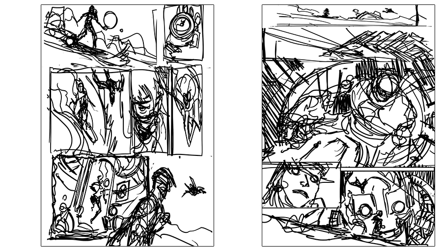
Make sure that the panels lead the reader from left to right and down to mimic the usual reading pattern of a western-style comic book. If you are making a manga, you might go the opposite direction, from right to left. All the action within your panels should lead you across the page or down to the next tier of panels.
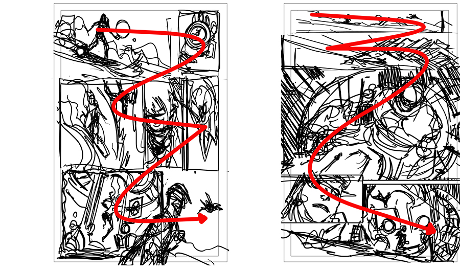
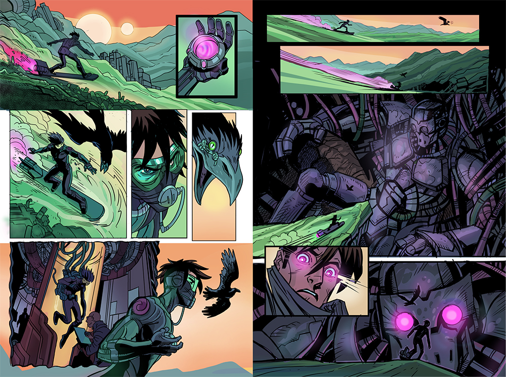
The final page should read something like this:
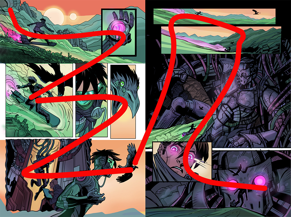
Guide your reader through your comic page by imagining page flow as a line. Example double page comic spread.
Types of Comic Book Panels
There are different panel types which are all useful tools for storytelling. These are pretty standard, but can be used in multiple ways and combinations to create drama in your story or emphasize a plot point. Also, adding various panels to an action can draw out time, show detail, or show the steps of the action that were otherwise unseen. You may also use progressions such as a “zoom in” can also create excitement or tension when telling a story. Choose the right comic panel for each scene.
Some useful panel types and why we use them:
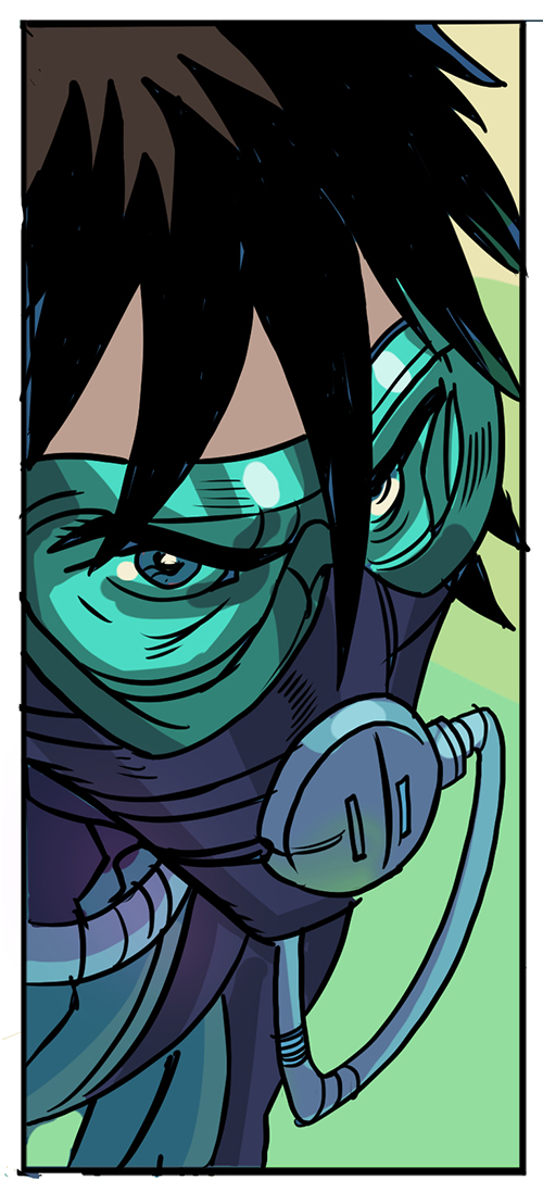
- A close-up or zoom-in headshot to highlight a character’s facial expressions
- A close-up of character or object (in this case, as an inset panel) to imply importance and bring attention
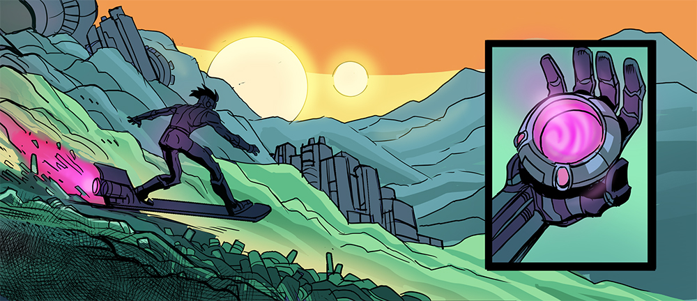
- A distant shot for establishing scenes or showing wide action
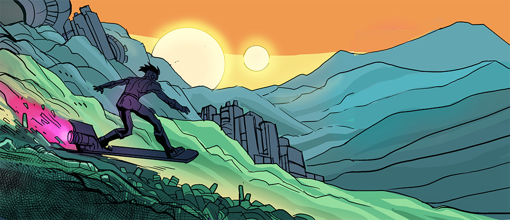
- A silhouette shot gives an opportunity for drama and lets users focus on key information within the scene
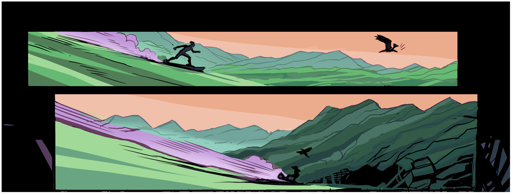
- Overlapping panels to show progression of an action or scene
- Diagonal or irregularly shaped panels that bring drama
- Splash panel or a panel that takes up an entire page to show a pivotal point in the story
- “One character foreground, one character background” to highlight two characters’ relationship or add tension
- Broken panel, where an action or character extends beyond the border or frame, to show intense movement
How to Panel a Comic: The Gutter
The space between panels is called the gutter. If each panel is an idea, the gutter’s job is to be the space between ideas. Basically, this gives the reader time to absorb the contents of the first panel before moving on. Gutters control the pacing of your story.
Traditionally, a gutter is always the same width, which implies a fairly smooth transition from panel to panel with no accent or alteration to the reading. On the other hand, a wider panel borders give the reader more time and space to rest and think about the story. This creates “in-between” moments.
Example of a borderless panel or panel with no gutter:
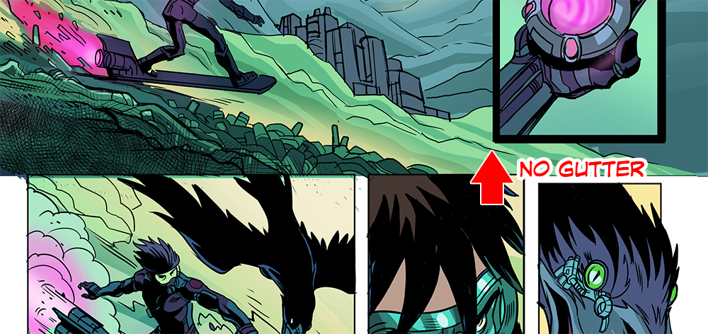
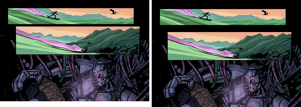
Overlapping panels:
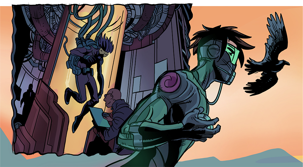
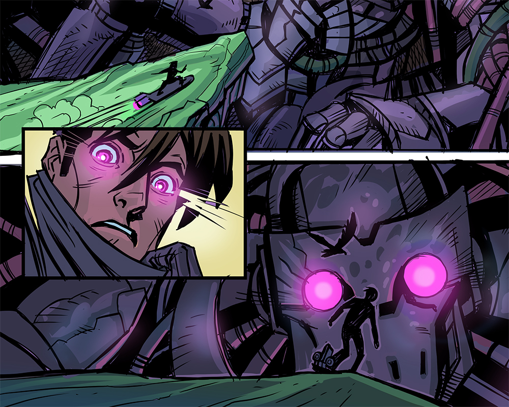
Removing panel borders tends to make the contents of two panels bleed together. It’s as if the two actions are happening at once or immediately after one another. To lead the reader from one picture to the next and create a sense of speed within a story, try overlapping panels. However, it’s a difficult trick, because you need to make sure that elements of each panel don’t disrupt the other. Additionally, you don’t want to confusing readers and making it hard to separate the beats of the page.
Examples of overlapping panels:
Varying Gutter Width:
Effective gutter usage can increase the realism of a scene and express time.
Other Ways Panels can be Used to Tell a Story
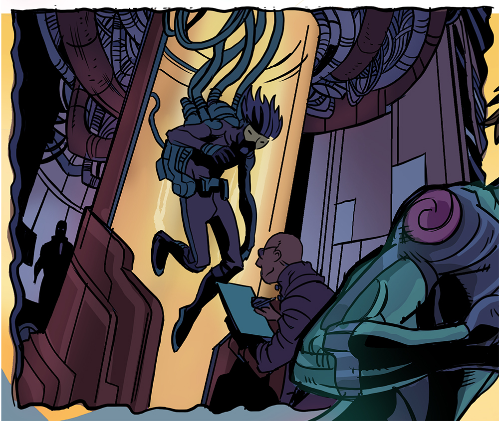
Changing the shape of a panel and its borders can be a great way to introduce drama and switch scenes or locations. For example, using different styles of borders to show that characters are in a new world, state of being, or even to represent a shift in time, like a memory or a premonition.
If you want to draw a flashback in your comic panel, using wavy or fuzzy borders can imply recollection. You can even put the scene inside a thought bubble and use that as a panel! For premonitions or even action sequences, try using shocking broken up lines for your border.
To frame or not to Frame:
Should you always limit yourself to comic panels! Of course not! Sometimes a powerful effect can be created by dropping out a frame, in order to emphasize a specific object or action. This pairs well with a standalone object, or a silhouette. These objects would extend to the edge of the paper, and beyond the “safe” area of the panels. See below for examples of unframed objects, or objects going beyond their panel.
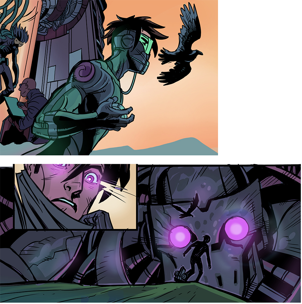
Lastly, combining all of these types of panel and gutter techniques will result in building a strong comic page layout, with a well-told story like this:
Note that these are just some of the ways to approach storytelling in comics and manga. Experimenting with different types of paneling techniques can be a good way to test run a storytelling device before committing to a final page layout. Also, for beginner comic or manga artists, it doesn’t hurt to start by using layout templates. You can also learn a lot simply by reading your favorite comic books or researching how professional manga illustrators do their panel layouts.
In conclusion, creating your own sense of pacing and movement between panels will come to you as you work and develop your style. So, go out and tell some great stories!

About the Artist
I’m Steve Ellis, an American Comic artist, and Illustrator. I’ve created the Werewolf Western series High Moon and the adventure series The Only Living Boy and The Only Living Girl. I’ve also done illustration projects for Marvel, DC, Image, Wizards of the Coast, Fantasy Flight Dark Horse, Blizzard, and many more. I love helping people with their art so contact me through my site or Instagram for help!


