Essential Tips for Drawing Folds and Drapery
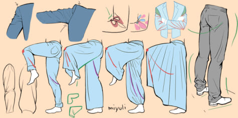
This illustrated how to draw clothes tutorial by comic artist miyuli covers basic concepts and approaches for drawing fabrics of all kinds.
Folds and wrinkles depend on the form they fall on. They are not uniform. There are many different types and factors that influence them.
There is no single rule on how to draw folds—The best way to understand drapery is to do as many studies of folds as you can. The more realistic you want to draw and paint wrinkles, the more references you will need. Understanding some common principles will make it possible to draw them convincingly in a more stylized way, like in an anime clothes style.
I’ve collected some pointers and commonalities here that I’ve come across so far.
Fabric materials
It is very important to consider the materials that you draw when dealing with folds. They all have their very own characteristics that help to decide where to put the appropriate folds. Their texture dictates how diffused the shadows are.
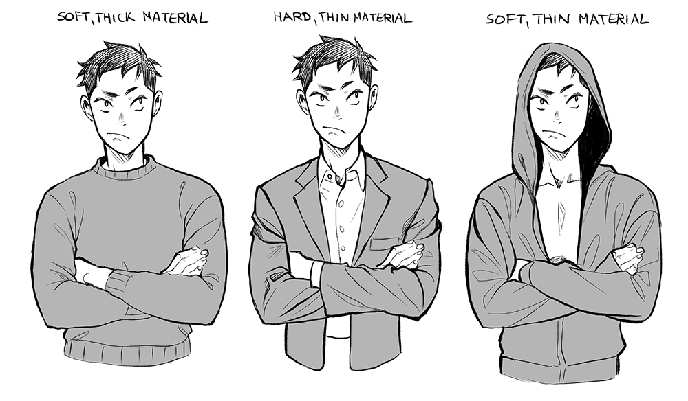
- Thicker material has wider folds that are usually less visible.
- Stiffer materials are usually pulled more at the bending area or at the seams.
- Soft and thin material produces the most folds, especially around the bending areas.
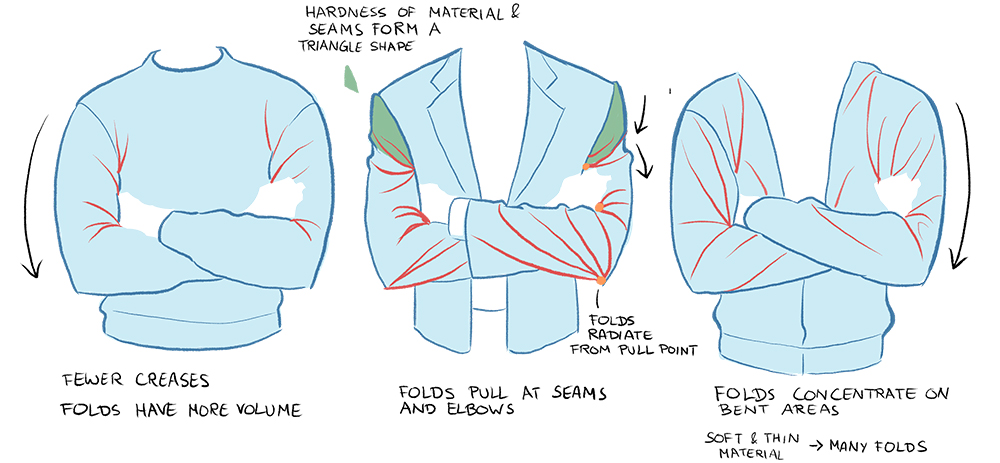
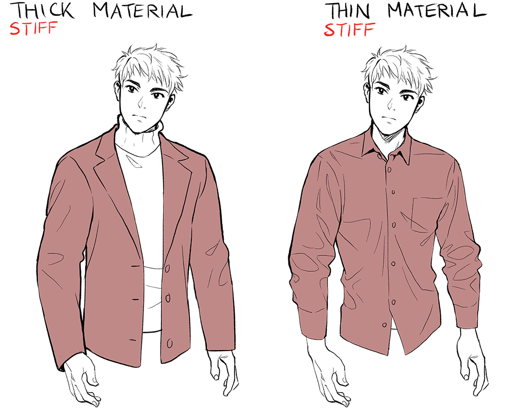
The amount of folds also depends on how heavy the fabric is and what kind of material it is made of. When drawing fabric it is a good idea to consider how thick/thin, hard/soft, heavy/light and smooth/textured the fabric is first.
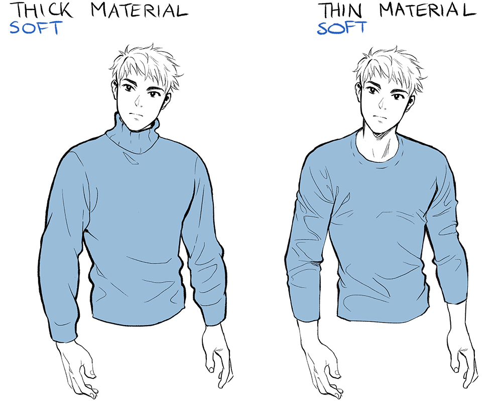
Heavy fabric causes folds of a different volume and different width. It is also more idle and shows fewer folds even when moving.
All clothes have their own arrangement of parts, which heavily influences the formation of folds.
It’s good to familiarise yourself with common placements of seams. You don’t need to draw them all, but it is better to have a good fundamental knowledge of the construction.
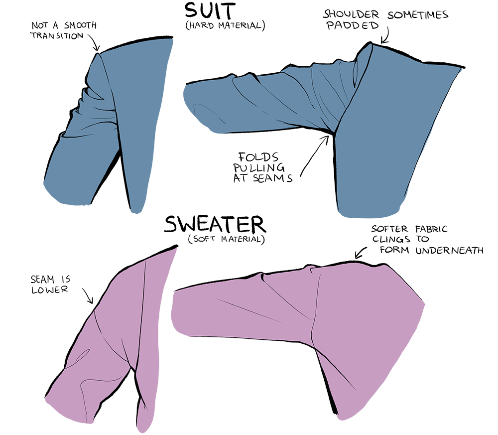
Folds tend to pull at prominent seams, especially on clothing like suits where the transition between seams is quite noticeable at the shoulder.
Sweaters usually have their arm seams much lower and the folds don’t pull at them as much.
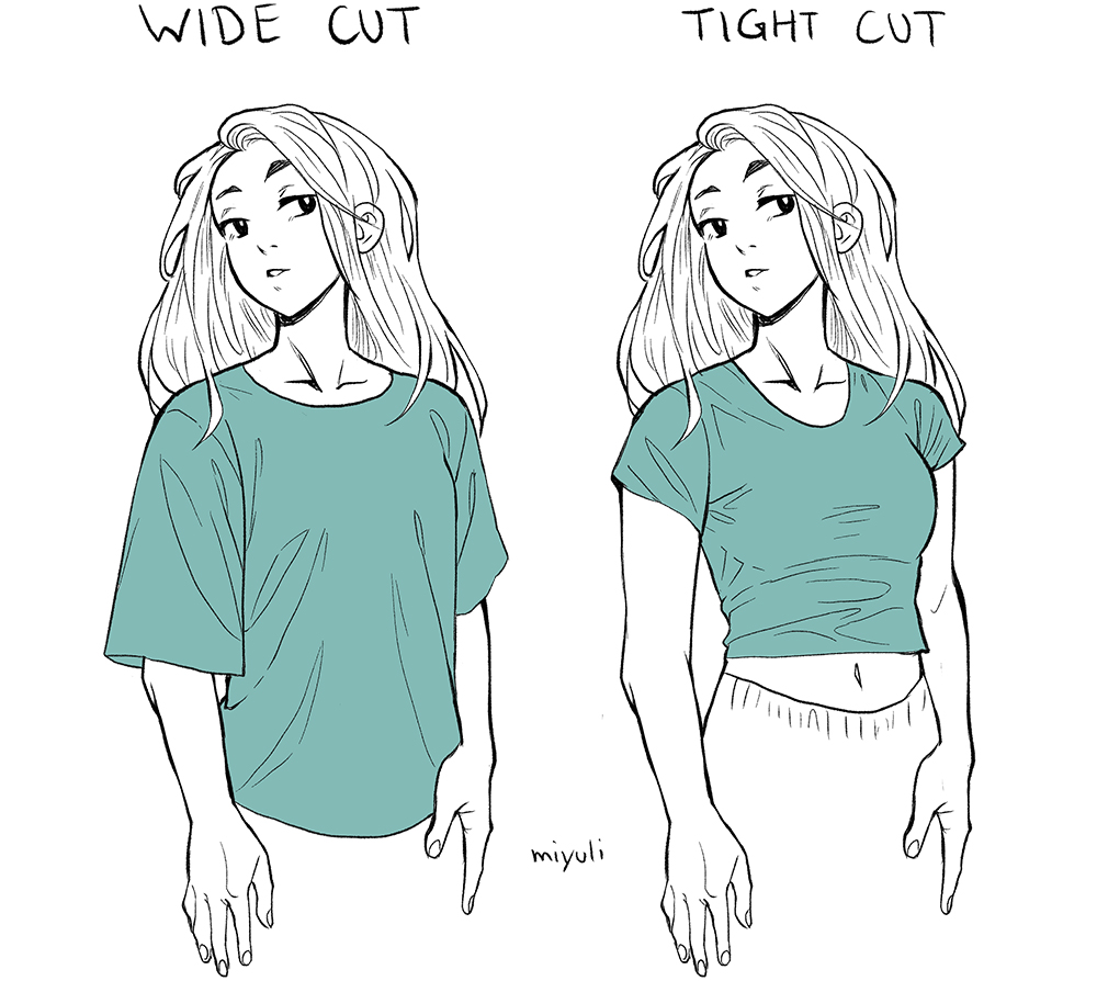
Clothes with a wide cut show different folds than clothes with a narrow cut. A tight cut follows the form of the body and wraps around it. Baggy clothes show a lot of droopy folds that go from the pulling point towards the ground.
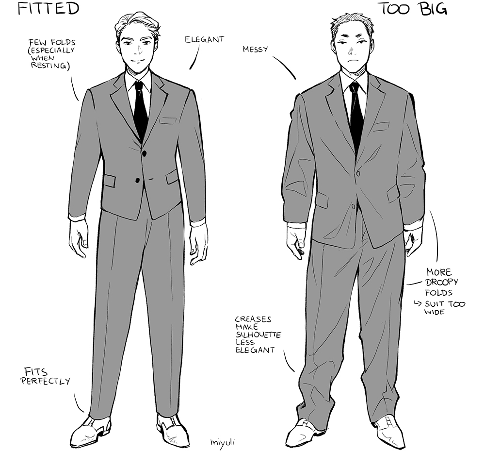
Clothes are often designed with folds or lack thereof in mind.
Fitted material is designed to look elegant with as few folds as possible. When clothes are too tight or too loose there are more folds that give a less elegant appearance of the clothing, especially when looking at the silhouette.
Worn-out fabric tends to crease more than new or well-maintained fabrics.
Note: When drawing clothes and folds, it can help to consider what material fits the character’s personality first.
External influences
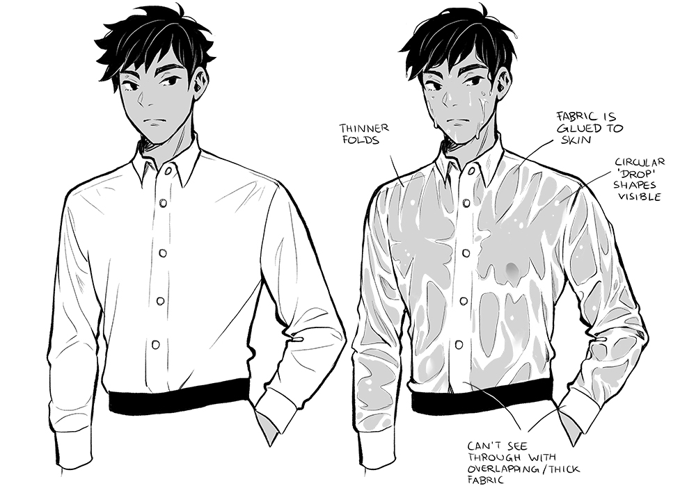
Folds can be heavily affected by wind or water.
Wet cloth acts differently from dry cloth. It tends to stick more to the form underneath. The water makes the light material a lot heavier, so it does not move as easily anymore. Thin fabric becomes see-through.
Upper body movement
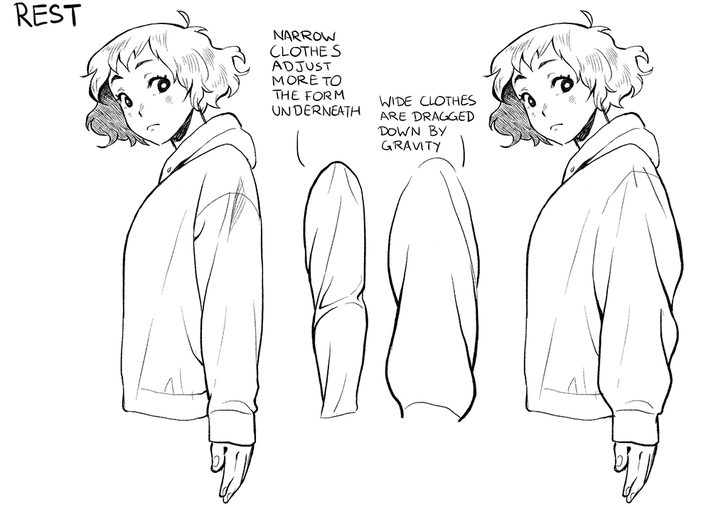
When the body is resting the fabric is usually dragged down by gravity. More prominent droopy folds appear the wider and lighter the fabric is.
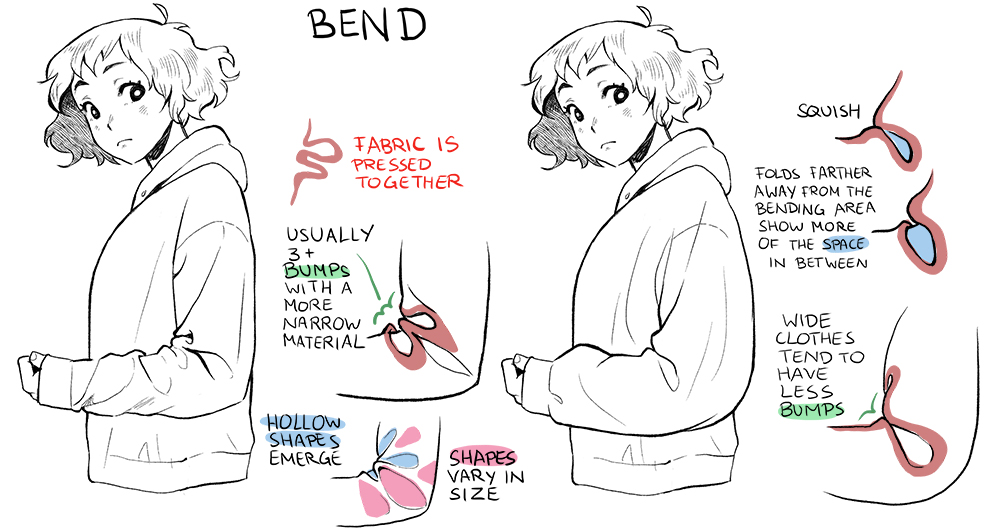
When bent the fabric is pressed together and creates hollow shapes that vary in size.
There are more bumps with more narrow material. Wide material tends to squish together with fewer folds.
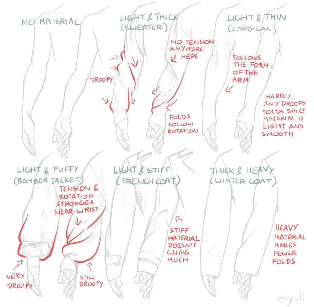
The material adapts to the forms’ movement. Folds usually follow the twist. It can be very helpful to emphasize the movements.
Note that the lighter and thinner material in the example above shows fewer folds since the arm is still mostly resting.
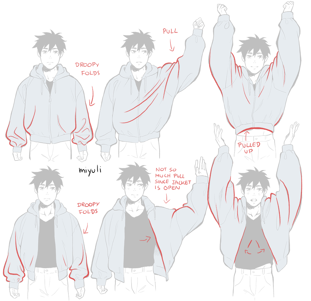
The arms heavily dictate the pulling areas where folds emerge.
Opening a jacket absorbs some of the pulling when the arms are raised.
Drawing pants
The fabric of the pants is supported at the waistline.
Pants start wider and narrow down to the knees because they adjust to the bone structure of the legs.
With narrow pants, creases are usually visible at the knees.
When drawing bumps in the fabric it’s good to show their origin and volume. It does make a visual difference when you can imagine the folds in a 3-dimensional space.
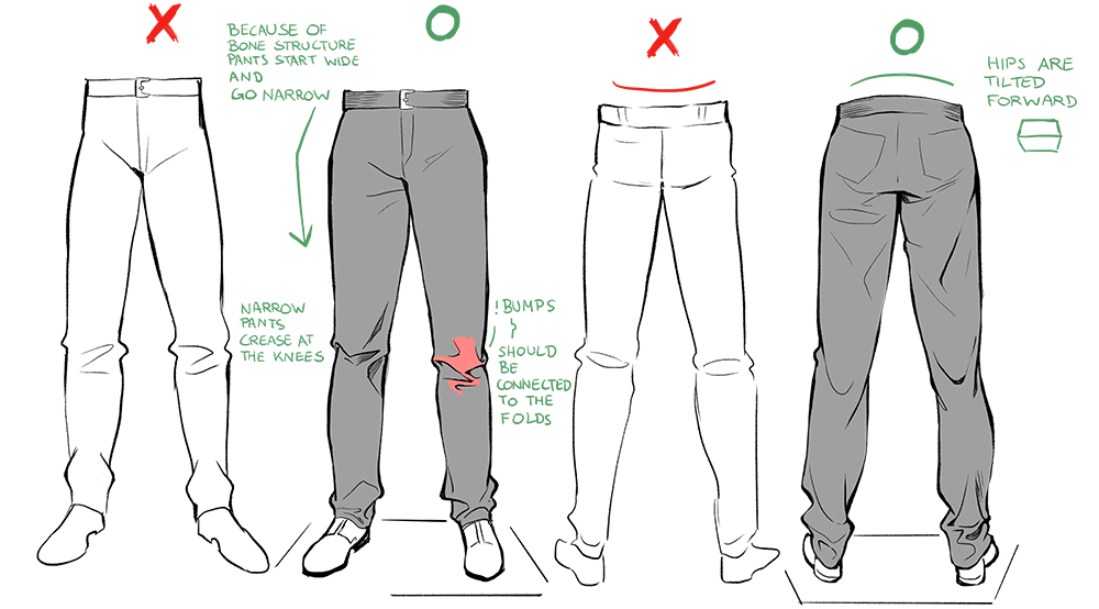
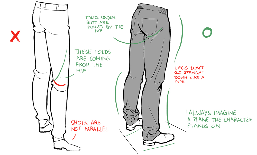
From the back, you can see creases forming under the butt region that go up to the hip.
The folds at the knees are also visibly pulled by the hips from the back view.
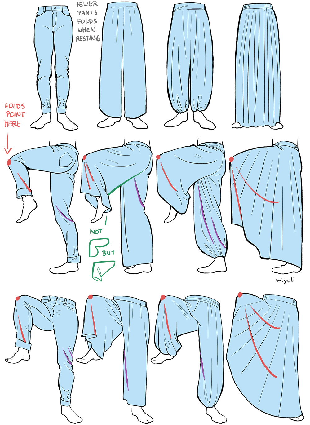
In general, when the body is just standing and resting, there are less dynamic folds.
When a leg is lifted, the knee becomes the strongest pulling point.
Be careful of the forms that the pant legs create when the leg moves.
Shadows and Highlights
Depending on the thickness of the material the shadows around the wrinkles appear slightly different.
When shading folds, it’s good to use a combination of soft and hard edges.
When painting, pay attention to how smooth and soft the material is. The smoother it is, the more it reflects light and has a brighter highlight. Rougher and more textured materials diffuse light.
The darkest area is usually where forms are pressed together and an occlusion shadow appears. This also applies to very deep creases where light does not reach.
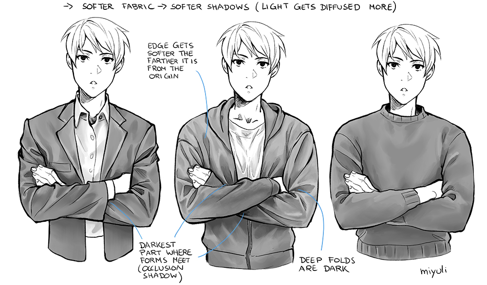
Here are some quick tips that I noticed while shading materials.

The shading, like the width of the folds, varies between soft edges or highlights depending on the material, so it’s good to familiarise yourself with as many materials as possible to build up a rich visual library.
Miyuli is a freelance illustrator and comic artist.
https://www.patreon.com/miyuli
https://twitter.com/miyuliart
https://www.instagram.com/miyuliart/
Interested in character art & design or what it takes to become a character designer?
Check out the link below!


